Meet the Team: Juhee Lee by Anastasia Salazar

Juhee Lee: Writer at Anastasia Salazar Ltd.

Q: How’d you get into writing?

A: Arguably because of my terrible memory. I forget things easily and I’m extremely sentimental. So I’ve always obsessively written everything down. Writing started with diaries when I was little, to poetry (per sentimentality) when I got older, to music reviews and narrative journalism in high school and college. Copywriting and content writing are my newest writing territories, and I’m learning and growing in this area everyday.

Q: What’s your favorite part of the writing process?

A: A lot of the writing process is trying to untangle a giant ball of yarn in your brain. You have these thoughts and no idea how to translate them into cohesive words that other people can understand. When that magical moment of untangling happens, it is as satisfying as an ASMR video or a nice long cheese pull. Then, you get to read it again, and bask in the fact that you put those words together.

Q: What books are by your bed?

A: Right now I’m reading The Midnight Library. I love books about books (super meta, I know), and also with an element of magical realism (cue all the Haruki Murakami). I was always the dorky kid with a book under her arm, loudly declaring that you never know when you’ll have time for some reading!

Q: What are your go-to sources for inspiration?

A: I always feel more energized and inspired after some quality time with nature. Hiking into the mountains or seeing the ocean has never steered me wrong when I feel completely stuck with that big ball of yarn in my brain.

Q: What do you love about language?

A: My first language was Korean, then I learned English, and then Spanish. I think this has always been the root of language frustration as well as interest for me. Not knowing how to express something in one language was frustrating, but I could find another way to say it with other words or through another language. It’s this ambiguity and open-endedness that I love–it’s a puzzle with no answer key. But when you find a way to express to your heart’s content, that’s the best feeling in the world.


Q: How has your work as a Speech-Language Pathologist influenced your writing?

A: I got so used to speaking in codes from a young age. Speaking in Korean with my family, and speaking English with my friends. This pattern continued through my career as an SLP, communicating with parents, teachers, physical therapists, children with special needs, etc. It requires a lot of versatility and that’s served me well in writing too. I love shifting my tone from outlet to outlet. It’s like trying on different costumes, but with your words.


Q: What are your hobbies?

A: The better question is, what aren’t my hobbies? As a curious person, I’m addicted to new experiences. However, my oldest and most consistent hobbies are running, writing, reading, and hiking. 

Q: Favorite YouTube video? Or a fav social media account?

A: When I’m really tired or sad or feeling otherwise not so great, I like to watch this clip of Anderson Cooper having uncontrollable laughter on live television. It is still 100% effective in making me crack up.


Q: Anything else to add?

A: You can find a sample of my work and some more nerdy pictures and words here.


Anastasia Salazar Ltd. is an independent design studio for tailored branding and digital designs. Reach out to learn how we can help you fuel growth and maximize your brand’s impact.

Branding Trends Then and Now by Anastasia Salazar

Aimless social media scrolling has become an unavoidable byproduct of this digital age. And even though it’s probably a strange habit you’ve tried to break, it’s a great way to learn about novel and unique products. Maybe you’ve even scrolled your way to ads for some niche products like Magic Spoon, a decidedly adult cereal that’s keto-friendly and is high protein and low sugar. Such is the state of branding today: differentiate or sink.

But it hasn’t always been this way. Branding in the 50s was directed toward a post-World War II crowd newly wooed by the wiles of mass consumerism. In today’s busy world with numerous competing brands and many avenues to reach consumers and make sales, the act of buying and selling have evolved unrecognizably. For the whys and hows of the shifts in branding, read on.  

Consumer Behavior Then

Branding in the 1950s was based around the premise that every purchase was a way to earn your way to the ultimate prosperous American life. This meant investing in flashy items that helped innovate daily modern living, like cars, TVs, and fridges. Although they were big purchases, the consumer hoped to invest in goods that would last a long time. With the growth of the suburb as well as a recovering economy, Americans were investing in a comfortable, elevated everyday home life through innovative products (e.g., pocket-sized radios, comfortable shoe soles, and plastic dinnerware sets). Their spending represented their desire to support a sense of family and home, showing off their suburban pride.

Consumer Behavior Now

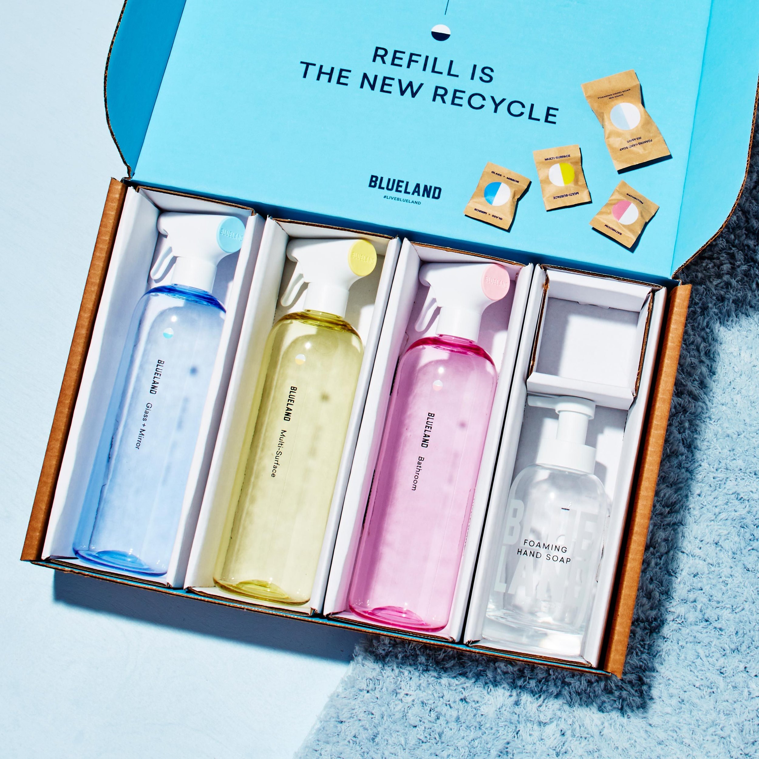
The modern-day consumer looks for brands  that address big-picture or societal problems  and speak directly to their lifestyle. Thriving trends in branding like subscription boxes, niche products, and monthly renewal services and products are all a result of the wealth of direct-to-consumer brands in today’s world. Smart companies like Myro and Blueland combine the best of all worlds, offering refillable bath and cleaning  products shipped to you regularly via a subscription. As a contrast to the 50s, many brands address values and ethics, like diversity & inclusion, animal cruelty, or fair trade. Sustainability in particular has become an important pillar of modern brands, as consumers search for products that speak to their beliefs and lifestyle.  The explosive success of companies like Imperfect Foods demonstrates the change in the trends in branding, and the types of products and services consumers value now (sustainability, efficiency, and a lifestyle associated with such a product or service).

Trends in Branding Then

As the wave of American consumerism crescendoed in the 50s, branding followed suit, mostly in the form of TV ads and billboards. Because there were not as many companies producing the same product, there was less of a need for distinction and differentiation than today. This resulted in trends in branding that appealed to the general public rather than a specific target audience. The mode of ad distribution mattered too. Tt wasn’t possible to gather much data or target specific audiences with the main avenues of advertising, such as TV and billboards. Product functions and features were the selling points here: cigarettes that tasted great, soda that quenched your thirst, and the wide variety of jello flavors. In addition, Americans were coming out of a war and economic depression through joint effort. This, along with a suburban spirit, meant ads centered around an “us” identity, rather than a distinct one. Brand concepts were sparse, as were targeted ads for niche markets.

Trends in Branding Now

While consumers today still want goods and services with high-quality functions and features, purchasing decisions aren’t that simple in the modern times. With the development of technology and a saturated market, the modern consumer is bombarded with clashing brands all the time. Companies must turn to thoughtful branding. Successful companies must harness the power of data and consider customer interests through the available data. What problems do they want solved? Which products are they searching for? What social media accounts are they following?

In addition, today’s branding addresses issues larger than just the product. Today’s consumers want to know not only that the product will work the way it was promised to, but also that the company producing it is an ethical one that makes sustainable decisions and stands for values that align with their own. They want relatability, and a clear personality with which they can identify. Today, a cohesive brand identity, a clear mission, and a relatable story of how the brand was founded create communities. And those communities foster a sense of belonging. If you were wondering why Red Bull has a record label, magazine, extreme sports sponsorships, YouTube channel, electronic music school, and more, it’s because they are busy creating multiple relevant touch points that build an entire ecosystem. 

The Takeaway

The 50s were a time of big ideas: the hula hoop, I Love Lucy, and the credit card, to name a few. But playing up product features to a vague audience is a trend that you can leave in the past. With the saturated market and the ever-changing waves of technology, it’s all about differentiating and creating a community around your clear identity.

Anastasia Salazar Ltd. is an independent design studio for tailored branding and digital designs. Reach out to learn how we can help you fuel growth and maximize your brand’s impact.

6 Branding and Design Success Stories by Anastasia Salazar

With seemingly unlimited information and options your consumers have these days, it feels impossible to stand out from the rest. When there’s an overwhelming supply of companies providing similar solutions and products, branding and design can give you just the edge your company needs. 

RELATED: How Branding and Design Drive Real Growth

According to Insider, there are four factors to determine the success of a brand. Insider identifies : “Customer obsession, ruthless pragmatism, distinctive inspiration and pervasive innovation.” In other words, you should be providing a service that is useful and original while creating thoughtful experiences and a sense of community. With branding and design as key players in meeting this criteria, developing a successful brand is no longer out of reach.

Branding Rockstars

For some real-life inspiration, take a look at these companies that built authenticity around their brands through noteworthy branding and design:

Burger King: In 1999, Burger King was suffering from an outdated logo and misguided attempts (in-house internet cafes and new menu items) to boost dwindling sales. Fast forwarding to 2021, it hoped to communicate an internal transformation including increased quality, fine-tuned taste, and a commitment to environmental causes. In a rebrand that shook the design world, Burger King leaned into a retro look, providing a homey and authentic vibe to the brand. As they committed to removing artificial flavors and colors from their menu, they also revamped their color palette. They traded in unnatural colors such as blue, and introduced colors authentic to real food instead. This, along with rounded fonts pasted boldly across packaging and photos of real employees, communicated a more playful, sincere, and comforting feel to Burger King consumers. It shifted the somewhat negative paradigm of modern fast food back to the good ol’ days of easy camaraderie at the local drive-thru. The rebranding resulted in a revenue increase of 7.9% in Q3 of 2021 from the quarter of the previous year. 


Airbnb: Airbnb Co-Founder and CEO Brian Chesky stated in 2020 at the height of the pandemic, “When we started Airbnb, it was about belonging and connection. This crisis has sharpened our focus to get back to our roots, back to the basics, back to what is truly special about Airbnb — everyday people who host their homes and offer experiences.” Differentiating itself from the confines of a sterile and uncomfortable hotel stay, it wanted to feature cozy and welcoming experiences in real homes. Pivoting and expanding their services in a pandemic era of reduced travel, the company offered experiences hosted by locals, ranging from cooking classes to hikes in the area. Providing consumers with a practical way to book both lodging and activities was an innovative move, offering both convenience and a sense of community. This warm and inviting feeling is symbolized in their logo by a simple and modern “A,” which combines elements of a heart, a location pin, as well as the “A” in Airbnb. Overall the brand creates a sense of belonging that has become essential to their success. Airbnb established itself as a revolutionary in the hospitality industry, with lower costs and a home-away-from-home experience to boot.


Target: In 1987, Target could hardly compete with Walmart, which led the retail industry with incomparably low prices. Rather than risk sustainability by lowering their prices further, Target rebranded to capitalize on a “cheap and chic” concept. With new designers (designing exclusive collections) and low prices as well as experiences like a vertical fashion show, it differentiated around the idea that great fashion didn’t need to drain your budget. To further increase relevance for their consumers, Target’s campaign of “Target run and done” drew attention to their stock of groceries and other basics, available through order pickup or drive up. In 2018, it was reported that Target increased its sales by 6.5% when compared with the previous year, demonstrating the benefits of branding in hard numbers.


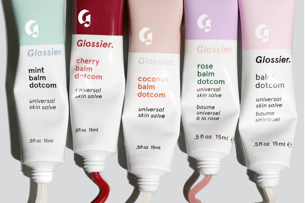
Glossier: With the tagline of “Skincare & beauty products inspired by real life,” Glossier has garnered a millennial-heavy following since 2014 with its on-trend branding and design. One key component of this  successful brand was that it centered itself around the consumer, empowering their natural beauty and creating products based on consumer needs. With content created by real-life Glossier fanatics on social media and the brand’s beauty blog, “Into the Gloss,” a band of loyal consumers began to form. Putting digital marketing at the forefront, consumers saw everyday folks with different skin tones and textures applying makeup and skincare. Glossier quickly became more than just the sum of its products through customer-driven products, conversations, and content. It became a lifestyle with which people defined themselves (there’s that “customer obsession!”). As buzz around the brand grew, the company also expanded beyond just four products at its foundation, to the over 40 products it offers now. By 2018, Glossier boasted a revenue of over $100 million, and a fanbase of over 2 million followers on Instagram in 2022.


Chobani: Founded in 2005 with a mission to supply nutrition and quality while serving the community, Chobani has caught the attention of the yogurt-loving public with its branding and design. Chobani’s striking visual system paid homage to the quality of its natural ingredients with its soft, delicate illustrations in organic shapes and colors. In 2021, these intricate illustrations made up a series of ads centered around sustainability and community, amplifying its messaging pillars loud and clear. A beautifully crafted (and free!) 84-page cookbook offered a way to “bring warmth and togetherness to your table.” Complete with polished illustrations, photography, and design executed with great care, the cookbook stood as a testament to the importance of building customer relationships, and also as a brand creating a world much bigger than just yogurt. A coherent brand identity, ingenuity, and a sense of community ensured that this successful brand continued its upward path, with revenues increasing 5.2% between 2019 and 2020.


Warby Parker: You remember the hype around Warby Parker. Its novel idea to bring a trip to the eye doctor into your home was so alluring. The successful brand rocked the eyewear industry at its inception in 2010 by lowering prices for stylish designs, all while instilling the belief that “buying glasses should be easy and fun.” Warby Parker backed up this claim with services such as a free home try-on program, a 5-minute virtual vision test at home, and friendly associates in stores to help consumers find the perfect glasses. It also sought to be socially conscious, donating a pair of glasses for every pair purchased. Warby Parker conveyed ethical low costs that didn’t take away from style or quality by revealing exactly how their glasses were made. Innovation, convenience, ethics, and low cost (of both time and money) bolstered Warby Parker’s status as a trailblazer in the eyewear industry with over 145 retail stores in the U.S. and Canada to date.


When you put in the time to develop your brand story, the possibilities are virtually limitless. A solid brand identity backed up with consistent and intentional messaging will result in loyal consumers that are more likely to take notice. It’s no longer about creating a great product at a lower cost than the competition; it’s about building a successful brand that speaks to your community and urges it to invest in the story.

Anastasia Salazar Ltd. is an independent design studio for tailored branding and digital designs. Reach out to learn how we can help you fuel growth and maximize your brand’s impact.
How Branding and Design Drive Real Growth by Anastasia Salazar

So you’ve got a really great product but you find yourself in a saturated market with too many competing companies to name. That je ne sais quoi you’re desperately needing is branding and design, and the benefits of branding and design speak for themselves. Here’s how to take your company to the next level and increase revenues in the process.

What Branding Is

Branding for a company goes beyond a beautiful logo, which is just one component of branding. Here’s what branding consists of:

  • Visual identity: Your visual identity is what your brand looks like. This includes your typography, color palette, illustration style, photography, style, and logo.

  • Tone of Voice: This is what your brand sounds like, encompassing your messaging and expressing your personality across assets.

  • Experiences: This is how the audience feels about your brand through various interactions. Think both digital and in-person experiences like discussions that take place online, or what the consumer might experience as they walk through your retail store. 

What Branding and Design Does for Your Company

Consider branding and design a way to put you in the driver’s seat in every aspect of communication about your business. By investing in branding and design, you’re organizing your company around a central story and communicating it consistently to consumers, as well as your own team. Here’s how branding for a company can make up the backbone of your company.

  • Develops Intentional and Consistent Messaging: Branding involves developing brand messaging that is purposeful and true to your business. With every asset you put out, having clear messaging ensures your story is told with a consistent tone and voice.

  • Communicates within Your Team: When communicating with each other and to consumers, clear branding ensures a united front. Being aligned on common company values not only helps team projects run smoother, but it also rallies the team around a common purpose (which is even more important for large teams).

  • Communicates with Your Audience: One of the benefits of branding is that it takes the consumer’s guesswork out of trying to understand a brand story. Branding puts you in control of how consumers feel about your brand.

  • Displays Your Branding Visually: The design then takes your well-developed story and converts it into a visual representation of your brand identity. If done well, the design should mirror and elevate your values, story, experiences, and messaging visually.

How Branding and Design Drive Profit

Branding for a company has a lot of benefits. But how does it help increase revenue and grow your company in the long run? Here are some of the ways that branding and design can positively affect your profit.

  • Differentiates Your Company: In the age of digital advertising and saturated markets, stellar branding and design is key to getting recognized. This is especially relevant in B2C companies, where consumers have more opportunities to directly compare your products with other similar ones.

  • Creates a Sense of Community: Coherent branding results in coherent assets, which results in delivering consistent messaging to the consumers. By doing this you create a community who understands and identifies with your brand, which builds loyal customers.

  • Builds Credibility: This is one of the benefits of branding that is crucial for newer companies. A younger company with fewer years under its belt profits from having a unique brand that people notice. Building credibility is also extremely important for the tech and health industries, where consumers are asked to trust companies with sensitive information.

  • Keeps Your Brand Fresh: This is especially relevant for older companies. Even if you’ve perfected your tried-and-true products, branding keeps your brand from going stale.

Over time, great branding and design can lead to:

  • Boosting affinity and loyalty

  • Increasing demand from existing and new customers

  • Humanizing your brand

  • Increasing sustainability

Creating Deliverables Without Branding Work

Working on brand strategy is like building an even foundation for the beautiful house that is your company. Each part of the foundation is an invaluable part of the creative process that cannot be rushed. A shaky foundation will result in:

  • Wasting resources on figuring out the look and feel of each individual asset rather than working from a common tone guide.

  • Unclear guidelines for many members of your team

  • A disjointed and confusing message

  • Lack of confidence in creating intentional design and copy

  • Creating less than satisfactory deliverables

The Difference Maker

Branding and design is essential work that helps lift up the business you’ve worked so hard to perfect. It is giving your brand a personality and building the relationship you want to build with your consumers. When you put in the work to build a brand identity, it will save you time and money in the long run and manifest into measurable growth.


Anastasia Salazar Ltd. is an independent design studio for tailored branding and digital designs. Reach out to learn how we can help you fuel growth and maximize your brand’s impact.

9 Inspirational Business Holiday Cards by Anastasia Salazar

The holiday season is upon us again, and ‘tis the season for making decisions on holiday cards that delight, excite, and showcase your playful side. Business holiday cards are a fun way to go beyond sales and business transactions; they are an opportunity to reach out in the season of festivities and celebrate together. If you can be creative and intentional while also reminding clients what you’re all about, the cards will be all the merrier. Get festive with these tips and ideas for the best way to say, “Happy Holidays!”

What Makes a Memorable Holiday Card?

  • Be Festive: This may sound obvious, but agency holiday cards without festive energy may blend in with other assets and risk being ignored. If it’s a holiday card, it should look and sound like one.

  • Spark Joy: Don’t forget about the core purpose of any holiday card. It should make you feel happy when you get one. Of course the other principles are important, but first and foremost, holiday cards should feel lighthearted and incite excitement for the season ahead.

  • Be True to Your Brand: Business holiday cards are an opportunity to remind clients what you’re passionate about. If environmental causes are at the core of your values, this is the time to use that environmentally friendly paper or feature advocates that align with your causes. Whatever you decide to send, keep your company values and culture in mind.

  • Have Personality: Trade in the stock images for customized designs that give your holiday cards some character. Add a fresh take to classic holiday imagery by playing with different materials and textures, creating your own flavor to the candy canes and string lights we all know and love.

  • Be on Brand (But Throw in Some Glitter!): The tone and visuals should resemble that of your branding, but you can (and should) infuse some holiday spirit. It’s okay to deviate a little from your traditional color palette and celebrate the occasion; just make sure it still sounds and looks like you.

What Should You Avoid?

  • Sales Pitches: While holiday cards might add value to your brand and eventually lead to more sales, the primary focus of business holiday cards is not to sell. Instead, let loose and offer a warm greeting.

  • Specifying Religions: Unless your business is founded upon a common belief system, it is unwise to specify religions on agency holiday cards. Acknowledging only one holiday in the month of numerous holidays risks excluding clients and prospective clients.

  • Using Swag Exclusively as Logo Carriers: Desirable swag requires plenty of thought and top-notch execution. Flimsy, clunky, or disposable products with oversized logos will likely become junk that is tossed.

    RELATED: 30+ Business Swag Ideas That Make Awesome Holiday Gifts

Business Holiday Cards We Love

‘Twas Twenty Twenty: Colle McVoy provided a moment of reflection for the eventful year that was 2020 by tucking facts and news about the year into a hidden picture game. Players walked through fun facts by clicking on hidden items in whimsical illustrations. Some relatable facts about the year of quarantine (“Animal shelters across the country saw a 90% increase in foster pet applications.”), and some heartwarming facts from some dark times (“1 million people found laughter during isolation by posting pics of costume-themed garbage bin outings”) made for a cozy gift.


Just Curious: Curiosity invited folks to celebrate the season by way of dialogue. With a brand philosophy centered around the idea of asking questions, this question-based game not only provided a way to reconnect with others but it also served as a clever nod to their brand messaging.


Window Gift Guide: In this season of giving, Empower put their windows where their mouth was, using their windows as panels of a gift guide of products from local businesses. Empower’s windows put their support for local businesses on display, communicating their brand values and providing an interactive way for clients and passersby to reflect on their lists.


Fight the Boredom: This gift of anti-boredom provided respite from the endless days of quarantine in 2020, complete with recipes, card games, quizzes, and a physical deck of cards. Pound & Grain sent greetings that were thoughtful and timely.


Celebrity Advent Calendar: Primacy sent celebrity videos via Cameo for an online advent calendar, each celebrity sharing snippets of their year. Recipients were able to feel a sense of connection with familiar celebrities each day, and the company was able to feature celebrities of their choice, opening the door to select those with beliefs or causes that align with their own.


Gift Box: Bindery sent out cupfuls of cozy by way of holiday cocktail and mocktail kits, including branded spoons, marshmallows, mugs, and more. Rather than ill-fitting clothes with large logos that end up at the back of your closet, Bindery incorporated their logo tastefully in polished bottles and packages.


Nog Pong: A brand messaging of imagination, creativity, and energy were fully embraced by Saatchi & Saatchi LA in creating Nog Pong, a variation of beer pong using egg nog. Players made shots via a robot, and watched live online as they made shots. Shot-based donations were made toward a dog rescue foundation, shrewdly displaying their easy-going work culture and their brand values simultaneously.


Written in the Stars: AKQA created a beautiful way to send a greeting to loved ones by carving them out in stars. This card allowed users to project 3D messages into the virtual “sky,” boasting their skill in design and allowing for users to connect with one another.


The Great Excheeriment: Agency holiday cards were sent from Bozell to clients for their personal use. In a practical move, the cards showed off their design chops while also providing opportunities for brand recognition when those letters were sent out. Also, who wouldn’t be happy to have some extra cards for that long list of friends and family members?


The holiday season brings with it a wealth of possibilities in the realm of business holiday cards. Taking the opportunity to show some heart and creativity will surely reach your clients with sincerity. Add in the bonus of showing off who you are as a company, and you’ve got all the ingredients of a business holiday card that will be remembered all year round.

Anastasia Salazar Ltd. is an independent design studio for tailored branding and digital designs. Reach out to learn how we can help you fuel growth and maximize your brand’s impact.

How to Thrive in Branding for Tech Companies by Anastasia Salazar

ASL_Design-Blog-Tech-Branding-v1_Website.png

If you named a few cloud storage platforms, you’d probably name a few of the top tech companies, like Google Drive and Dropbox. But looking at the sheer number of companies offering similar products the question is, what’s the secret to becoming a known and trusted brand? 

It’s true, strong tech brands back their value through their features, products, data, and the cold hard numbers. Even so, this is all for naught without consistent communication--that’s where solid branding becomes key, especially for start-ups.

Branding helps build recognition and customer loyalty by showing consumers that your company is valuable and trustworthy. But branding for tech companies is unique--for one, you’re often selling a product or service that you can’t touch and feel. And while infographics and product illustrations can help explain how your platform works, it’s often harder than showcasing a physical product.

The Must-Haves of Good Tech Branding

Showing Humanity: In an industry selling digital products and services, it’s important to show that you’re human. Have fun, and show off your personality a little bit. Take Dropbox for example. At the beginning of the COVID-19 pandemic, they sent digital care packages to their partners filled with activity books, reading material, art, and self-care and meditation information. In an unconventional move, Dropbox offered a digital warm hug that set them apart.

Considering Your Medium: Don’t forget that many of your deliverables will be digital. This means understanding that branding will need to be scalable, with a digital color palette. Creating grid structures and reusable modules are good options when you need a consistent system for digital assets that move fast.

Tapping into Your Data: Top tech companies often have a lot of data at hand. You can use this information to tailor your approach. Decisions informed by data create ads, headlines, and content that are more relevant to your consumers. 

Building Trust: Trust is essential in tech--not just when it comes to reassuring your audience that your product can deliver on the hype, but also because consumers and businesses share personal, sensitive information through tech products. They need to know that their personal information is secure when using platforms like a cloud storage service, and this requires building trust. This is where strong, well-thought-out branding comes into play--combine an authentic brand voice, polished visual system, and a great product to boot, and a loyal consumer base will follow.

Successful dovetailing of branding and product design defines top tech companies. Spend more time on product design than on branding, and the customer is bound to see the disconnect. Branding should represent the quality of the product, and the product should perform the way that it was advertised. Sincerity and transparency are key in building customer trust.

Building trust doesn’t just benefit consumers, though. A company that is trustworthy is a company where employees want to work, too. In an oversaturated market, people take note when a company is credible.

Being Consistent: Consistent messaging and visual systems go a long way toward building brand affinity. Do the extra work of developing a brand identity with clear guidelines, and you’ll ensure that design work gets done quickly and fits with your overall vibe. Updating guidelines regularly will help everything stay on-brand, allowing you to do right by your business and products.

Being Flexible: While consistency is critical for tech branding, you also want to leave room for a certain amount of flexibility. With so many creative assets--digital ads, landing pages, company swag, and more--you don’t want design that gets repetitive or stale. You can opt for a variable typeface, for example, that works in a variety of settings while shifting weights and widths depending on the application.

Tech Branding Done Right

In the tech world, companies too often forget that buying something is an emotional decision. Conveying a distinct personality can set you apart from other brands, and get you that emotional buy-in you need from the consumer.

Here are a few examples of companies that lean into a clear and distinct brand identity:

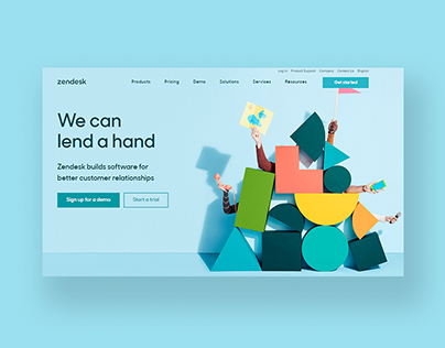
  • Zendesk: The warmth and personable feel of Zendesk makes customer service approachable and down to earth. The easy and helpful tone distinguishes Zendesk from other B2B companies, which generally tend to have weaker branding than B2Cs.

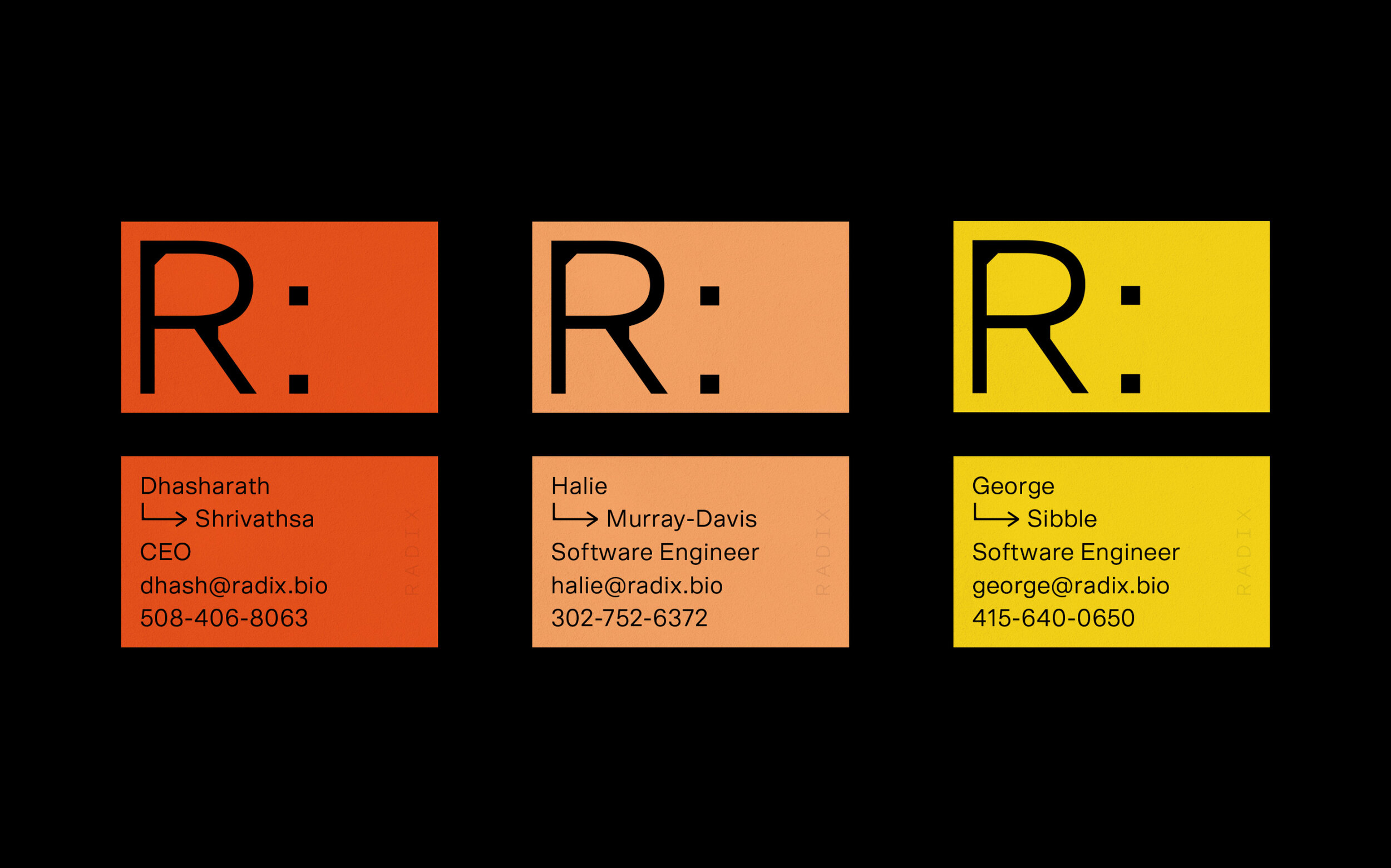
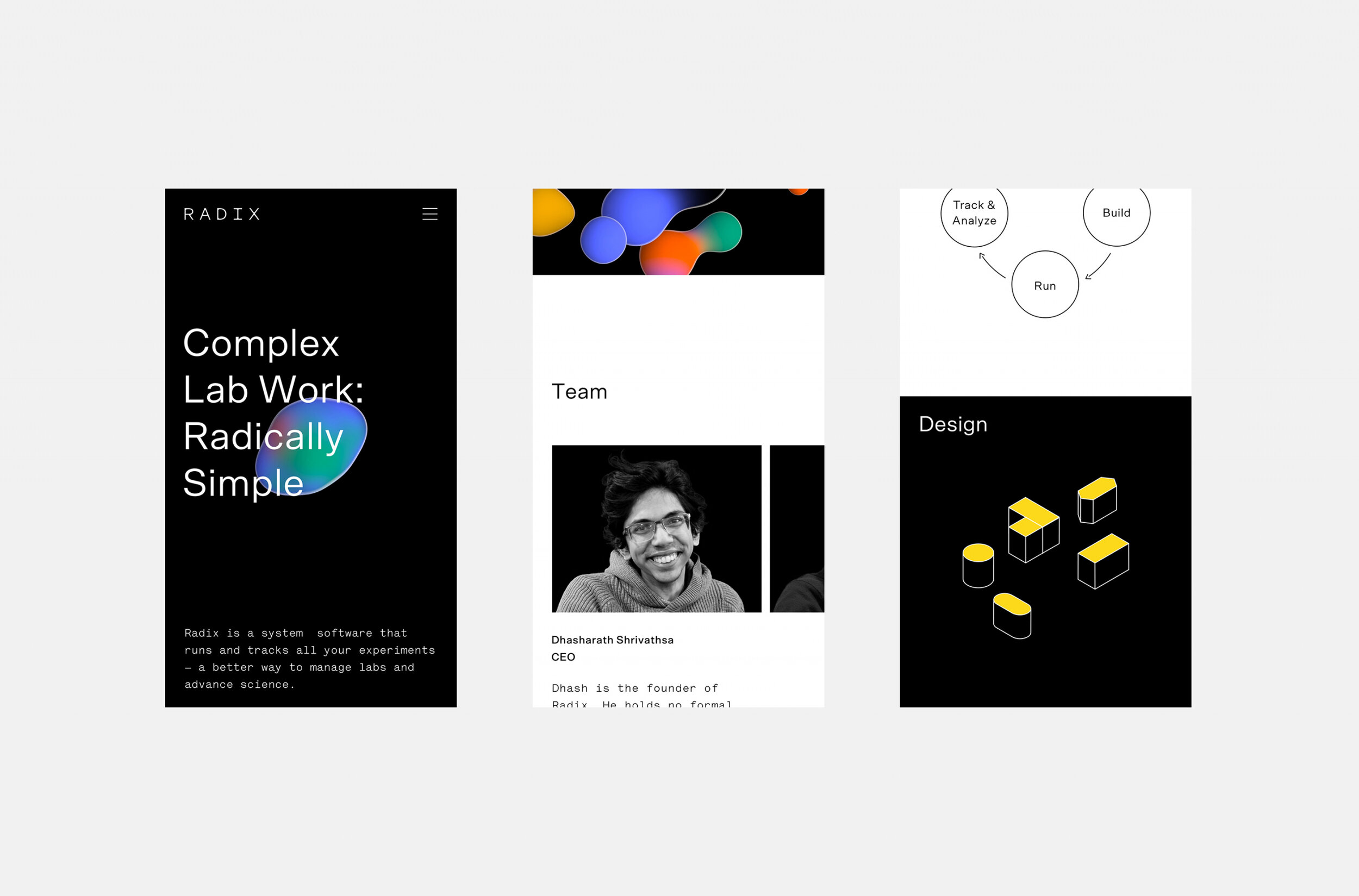
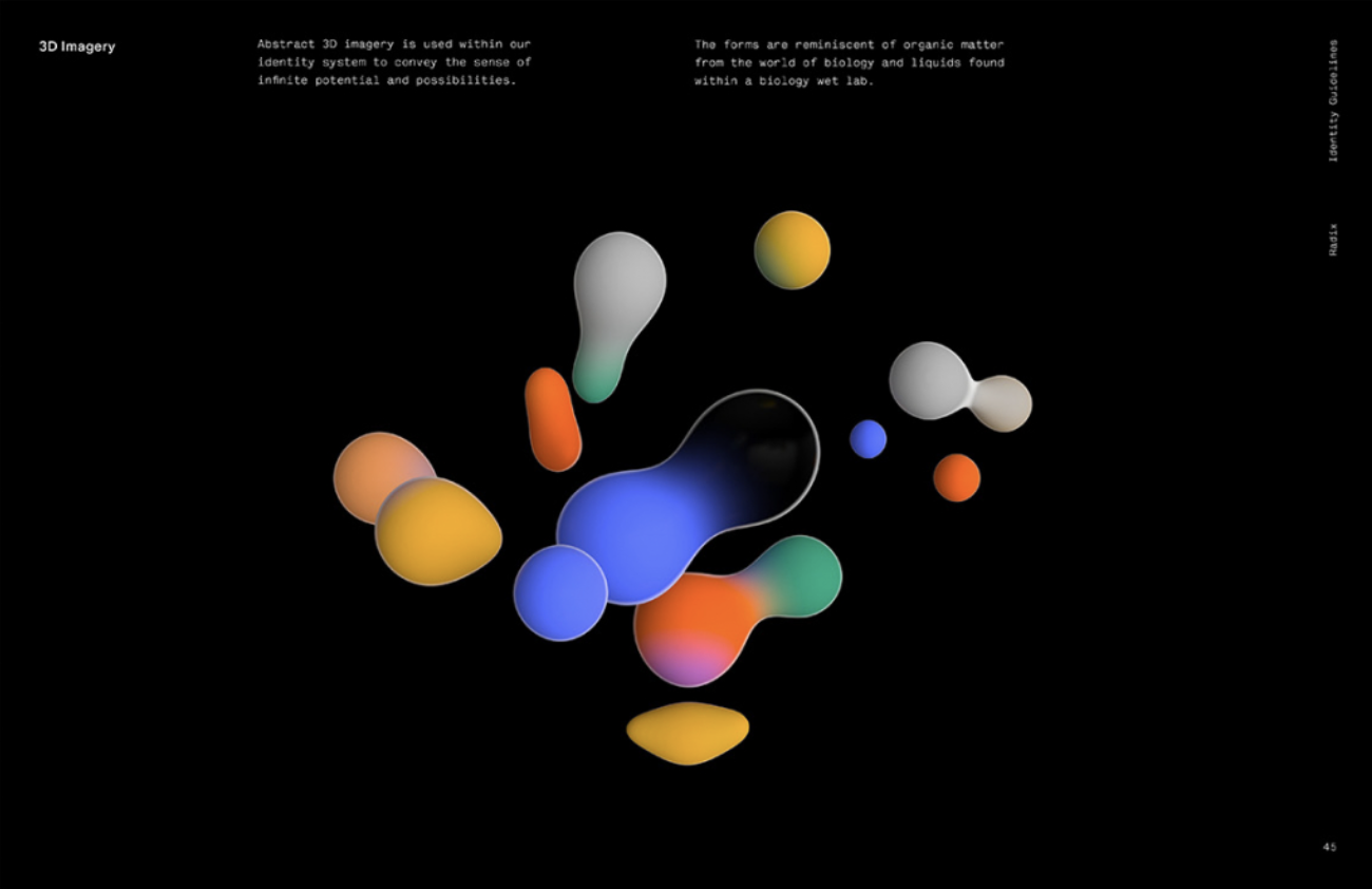
  • Radix: Immediately, the muted tones and black background catch your eye from the jewel or cool tones and white background of other tech brands. Throughout the assets, the morphing droplet graphics tie together to create a strong voice that screams “science.”

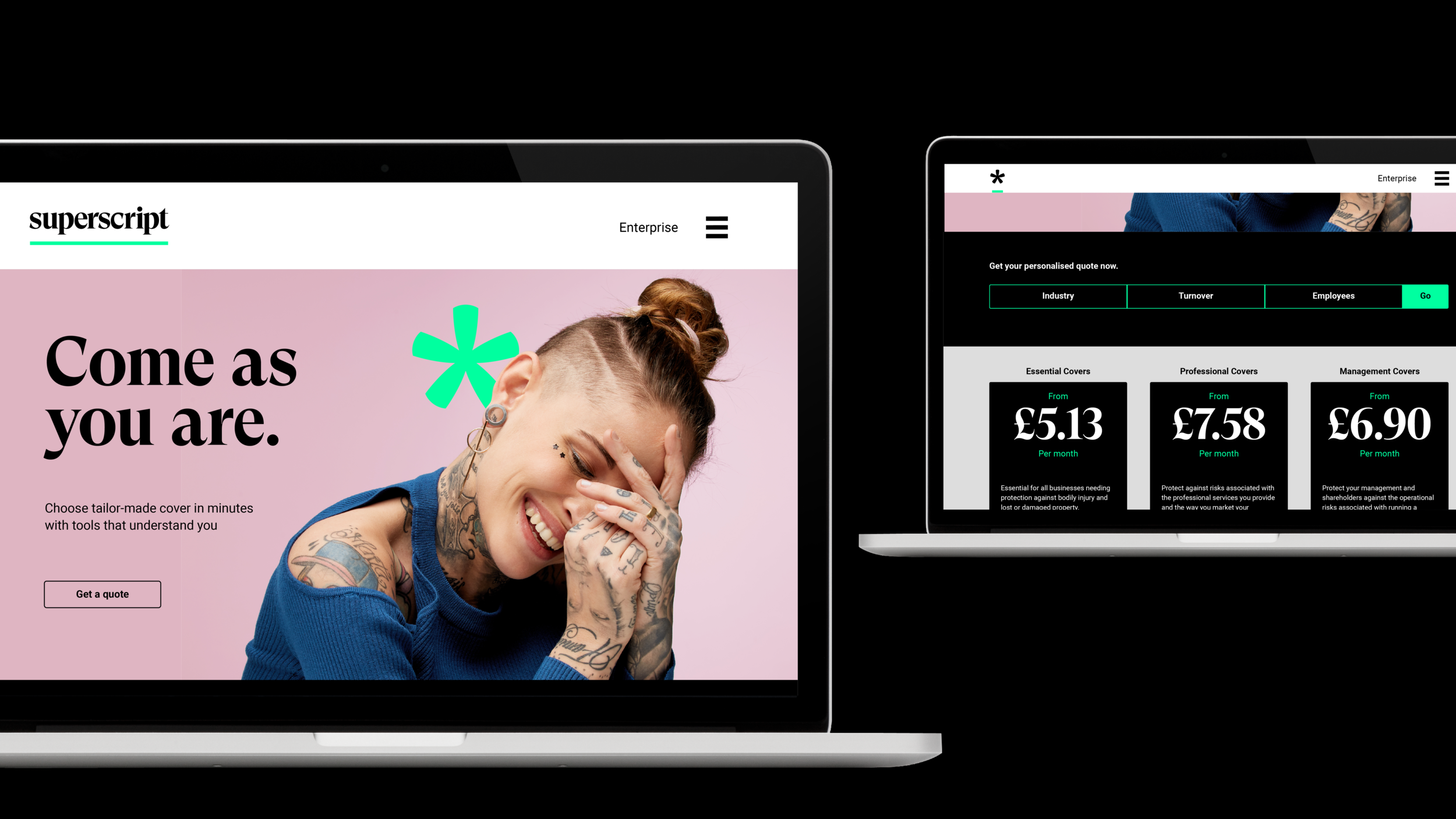
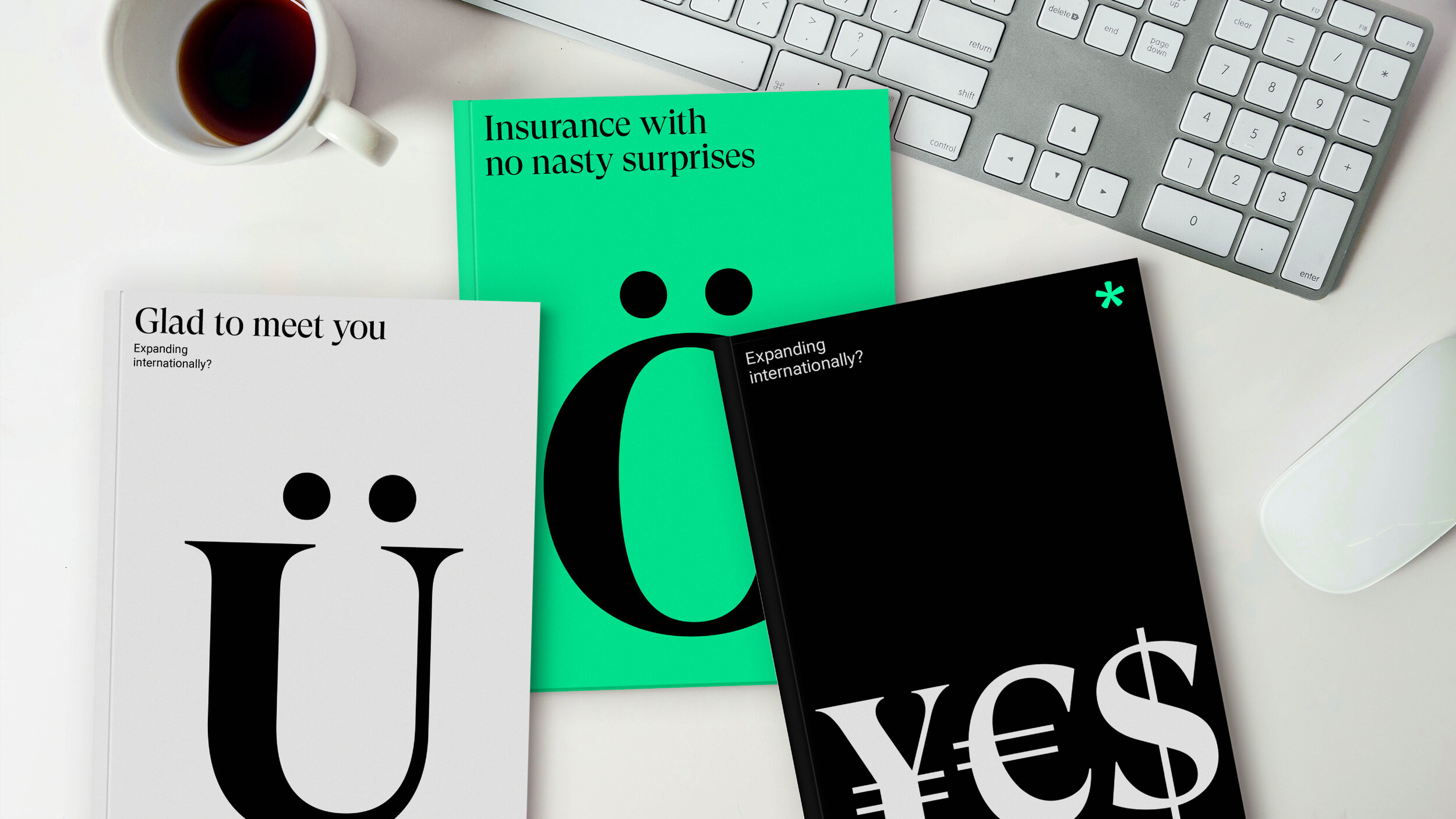
  • Superscript: The serif typeface used so effectively is just one component of why Superscript is effective. Superscript is undeniably eye-catching with a flexible design system.

What Doesn’t Work

Effective branding also means avoiding the makings of a poorly thought out visual system. Here are some common branding mistakes that you should avoid:

  • Generic stock images of devices

  • Bland, blue-tinted color palettes

  • Overuse of gradients

  • Simple geometric logos, lacking care and finesse

  • Unremarkable sans serif typography

  • Buzz words like “disruptive” or “unicorn”

  • “Dorky” avatars

  • Generic logos from 99designs (the ultimate sin, outweighing all others on the list!)

Of course, there are some exceptions to the rule. Overused elements like the color blue and geometric logos can be executed thoughtfully. Reclaiming the geometric logo by adding some personal touches, or using the color blue strategically can breathe new life into tired patterns.

The Bottom Line

Branding is vital to the success of a tech company. Settle for good enough, and you’ll risk blending into a plethora of tech companies doing the same. Vying for consumer confidence will be much harder if they feel like you haven’t put enough care into creating a sincere and consistent brand. But starting with thoughtful branding that is trustworthy and consistent should put you on the path to a loyal consumer base.


Anastasia Salazar Ltd. is an independent design studio for tailored branding and digital designs. Reach out to learn how we can help you fuel growth and maximize your brand’s impact.

Brand Taglines: What They Are & How to Come Up With Them by Anastasia Salazar

Without even mentioning the names, I’m guessing you know which companies these phrases are associated with:

  • Just do it

  • I’m lovin’ it

  • Taste the rainbow

Such is the power of brand taglines: the short, punchy slogans that capture the essence of a brand.

Brand taglines are more than just catchy sayings, though — they’re an important element of your overall brand identity. A good tagline quickly and efficiently sums up who your company is and what it’s all about. Taglines also fill an important gap that other parts of your brand, like your logo and company name, don't. They help solidify your brand personality and communicate your values, which rarely comes through in your name or design alone. Truly great taglines can even elevate your company to a memorable household name.

While I can’t promise coming up with a tagline will launch your business to stardom, I can assure you that it will only bolster your brand. In this article, we’ll discuss the traits of a great tagline, go over some examples, and share some tips for coming up with a tagline of your own — read on below.

What Makes a Tagline Work?

There’s no one single way to define a good tagline, but to me, the best brand taglines:

  • Clarify what a brand does

  • Differentiate the brand (in terms of purpose, values, emotional response, etc.)

  • Are clever and memorable

A tagline that checks all three of these boxes is top-tier as far as I’m concerned, but even if it’s not a perfect trifecta, it can still be good. I’d recommend aiming for at least two out of the three criteria above.

Taglines should also be:

  • Easily pronounceable and spellable: If your tagline is too much of a tongue-twister, it’ll be harder to stick in the minds of your target audience. If it’s not easily spellable, it makes typos more likely.

  • Concise: Taglines are, by definition, short — a longer phrase is more like a brand story or vision.

  • Distinctive: Your tagline shouldn’t sound generic, or too much like another brand’s tagline.  

  • Communicating your message: Taglines should provide a glimpse into the heart of who you are, what you value, and what you have to offer.

  • Pleasant to say/hear: A tagline that rolls off the tongue is much more memorable than one that sounds clunky.

  • Something you can stand behind: Your tagline should come off as a natural extension of your brand, not just a clever saying. 

The safest taglines are usually more direct in describing what a company does. Concrete taglines like this are often particularly good for brands that are just starting out, or ones without much name recognition. If you do choose to go in a more conceptual direction, make sure that other parts of your brand — like your logo or the imagery on your website — clarify what you do. 

A punny or pithy tagline can be a little bit riskier, but it can also be more memorable. It’s usually best suited for brands that are playful enough to back it up — if the only place you express humor is in your tagline, it can come off as off-kilter or even inauthentic.

Tagline Examples

Before you start brainstorming your own brand taglines, it’s always good to check out examples from other brands. Take a look at the following examples and note what you like, what you dislike, and what you think may work well for your brand.

Brand Taglines I Love

dsc_channel_art_template.jpeg
  • Shave time, shave money - Dollar Shave Club: Such a clever way for Dollar Shave Club to explain their unique proposition value — perfect for their playful brand.

  • Melts in your mouth, not in your hands - M&M’s: This tagline’s actually been in use for more than six decades, having first been coined in 1954. The words have a rhythmic, almost melodious feel, which gives it major staying power.

  • Say ‘yes’ to the world - Lufthansa: This tagline does such a great job of evoking adventure and awe — it makes you want to drop everything you’re doing and go book a trip.

  • The world's most comfortable shoes - Allbirds: It’s a bold claim, but it works well since they have such an excellent product to back it up.

  • Think different - Apple: One of the most inspirational taglines I can think of — it makes Apple feel like more of a way of life than a tech hardware company.

  • America runs on Dunkin' - Dunkin’ Donuts: This tagline does a great job of elevating the brand. It suggests that Dunkin’ Donuts isn’t just a place to grab a snack when you’re hungry, it’s a way to power your day. And it’s pretty daring of them to associate their brand with America as a whole, but it makes sense — donuts are an iconic American food.

  • Telehealth for a healthy, handsome you - hims: It’s amazing how elegantly these six words explain what the company does, and the “h” alliteration gives it such a nice touch.

Brand Taglines That Missed the Mark

These taglines are forgettable at best, and laughable at worst. Look to them as an example of what not to do.

  • Good luck - Uzbekistan Airways: This tagline definitely doesn't inspire confidence, to say the least — when you’re flying, you don’t want to feel like you’re taking a risk.

  • It’s not for women - Dr. Pepper: This one is just downright offensive. It’s shocking that a tagline this blatantly sexist debuted in 2011 — luckily, it didn’t last long.

  • Drive one - Ford: This tagline, retired in 2012, isn’t terrible necessarily — it’s just so forgettable. While I’m sure the team that came up with it worked hard, it feels lazy.

  • Exclusively for everybody - Smirnoff: Talk about mixed messages. In trying to appeal to both an elite audience and an average one, this 2014 tagline failed to resonate with either.

How to Create Your Own Tagline

Great brand taglines might seem like they’re pulled out of thin air, but there’s usually a well-thought-out process behind them. To start generating your own ideas, create a word map containing words and phrases that are relevant to your business. You can include tangible things related to your work — if you’re a fence company, for example, you might write down wood, picket, yard, etc. — as well as concepts. You may also want to add some words that imply mastery or excellence in your field. Looking at feedback from your employees and customers can help spur thoughts, too.

It’s especially important to keep your clientele in mind when crafting your tagline so that it resonates with your target audience. Ask yourself: what characteristics and qualities do your customers have? What wishes, no matter how far-fetched, do they voice? What have they responded well to so far? Dig into audience research for these insights, or speak with a few customers directly, then come up with some associated words and phrases.

While brainstorming for your word map, make sure you don’t judge or edit too much — those are two separate processes that don’t play well together. If you’re too selective about what to include in your initial word map, you might miss out on some great ideas down the road.

Once you have a robust word map, you can start playing around with the language. Think about how you might combine them or riff off of them using literary devices like alliteration, homophones (especially if you want something clever/punny), rhymes, rhythm, synonyms, and more. I also love using this idiom dictionary to get ideas for popular sayings to play off of.

After you’ve come up with a few strong contenders, check each phrase for copyright issues and test them out on your audience until you’ve identified a winner.

Applying Your Tagline

So you’ve come up with your tagline — now what do you do with it? The options are endless. You can put it on your homepage, packaging, print and digital ads, social media banners… anywhere that your brand appears. Wherever it goes, though, make sure the visual appearance is consistent with the spirit of your tagline (and, by extension, your overall brand). Choose a fitting typography for it — a hip, quirky tagline probably shouldn’t be in an old-fashioned serif font, for example. And think about what imagery you’re going to pair with your tagline as well. Again, you’ll want to go for consistency. If your brand is all about embracing yourself for who you are, you probably don’t want to cast a bunch of models that look like they could be strutting the catwalk in Paris. You should be able to look at any given asset with your tagline on it and feel confident that the design and copy work together as a whole.

When creating a brand identity, taglines are often an afterthought, with elements like logo and color palette taking top priority instead. And they aren’t strictly necessary — some companies don’t even use them. But you shouldn’t underestimate their power. The best brand taglines can help your audience understand who you are, what you do, and what you stand for — not to mention drive brand affinity and awareness.

The perfect tagline probably won’t fall into your lap, but if you do the necessary legwork, you’re bound to come up with something. And with enough research, creativity, and iteration, you might just find a tagline that can push your brand over the top.

Anastasia Salazar Ltd. is an independent design studio for tailored branding and digital designs. Reach out to learn how we can help you fuel growth and maximize your brand’s impact.

How to Find Your Brand Personality by Anastasia Salazar

One of the most challenging aspects of branding is how esoteric it can all seem sometimes. You might understand the meanings of words like brand identity, brand architecture, and messaging, but still have a hard time applying them to your own brand. But if you think about it in terms of characteristics — familiar vs. formal, traditional vs. modern, cheeky vs. straightforward — describing your brand becomes a lot easier. That’s where brand personality comes in.

The definition of brand personality isn’t all that different from the definition of personality: a combination of traits, beliefs, and behaviors that make up your distinctive character. And those last two words are key. Figuring out your brand personality will not only help you understand who you are, but also what makes you different.

It’s also critical for presenting a consistent image, which helps align your employees and connect with your target audience. When done right, your audience may even come to use your brand personality to help define part of their own — ever heard someone describe themselves as an Apple addict?

While building out your brand personality can’t guarantee that level of fandom, it will be helpful in informing your branding and marketing efforts. Wondering where to start? Read our guide below.

Brand Personality Examples

Before you start building out your own brand personality, it can often be helpful to research the landscape. The brands below all have crystal-clear characters, making them solid brand personality examples that you’ll probably recognize:

  • Trader Joe's: When you think Trader Joe’s, you think quirky, playful, and happy-go-lucky. If their brand were a person, it might be your eccentric neighbor who wears Hawaiian shirts, collects antiques, loves a good pun, and is a serious foodie to boot.

  • Harley Davidson: There are few brands more iconic than Harley Davidson, with their tough-as-nails, freewheeling vibe. If their brand were a person, you just know it would be a big tough biker decked out in leather who only plays by their own rules.

  • Chanel: Chanel has practically become a synonym for designer fashion. If Chanel were a person, I’m willing to bet it would be a high society woman with a lot of poise who lives and breathes fashion, and comes off as a bit snobby.

  • Mailchimp: It’s tough for a tech company — especially a B2B one — to develop a distinctive brand personality, but Mailchimp is one of the few that’s been able to pull it off. They’re informative, but down-to-earth, a little bit playful (love their little monkey mascot!), and always super helpful. When I think of Mailchimp as a person, I imagine a nerdy and quirky but friendly marketing manager — decked out in big glasses, colorful patterns, and chunky jewelry — who’s always happy to help you out.

  • Ferrari: Ferrari is a brand that is admired the world over for its luxury — owning one is almost the ultimate status symbol. Ferrari personified might be a rich, older man who’s a little bit cocky and spends his summers in the French Riviera.

  • Pit Viper: Pit Viper has adopted a really unique identity that a lot of other companies purposely shy away from. I picture them as an in-your-face country guy who spends his weekends on an ATV or floating a river, beer in hand, and prides himself on not caring about offending others.

All of these brand personality examples feel very different from one another, and that’s the point. You shouldn’t craft a safe, bland personality to appeal to the masses. Just as in everyday life, there are going to be people who don’t like you — but as long as you connect with the right group of people, that’s okay.

Discovering Your Own Brand Personality

When figuring out who your brand really is, a well-organized process can make the whole thing much more approachable — read on for some advice and exercises to guide you on your way.

Walk Before You Run

You might be eager to jump into discovering your brand personality right away, but before you start, it’s best to at least agree upon some of the core tenets of your brand, like your mission, vision, purpose, and values, and maybe even a competitive analysis.

RELATED: How to Create a Brand Strategy

Once you’ve established those, it becomes a lot easier to determine your brand personality. And in turn, that brand personality can help inform things like your messaging and visual identity. Branding isn’t a one-size-fits-all process, though, so go in whichever order you find most helpful.

Identify Brand Personality Traits

One of the first questions I ask clients I work with is to give me three target words (at least) that exemplify what they want their brand to feel like — this serves as the foundation for everything we design for them. If you’re not quite sure what those words are, check out some common brand personality traits here:


Anastasia-Salazar-Ltd-brand-personality-1.png

Another great exercise is a Likert scale, which helps you identify where your brand fits between two opposing descriptors.


Anastasia-Salazar-Ltd-brand-personality-2 .png

Ask Questions

If you’ve ever worked on marketing personas before, you might have come up with answers to questions like “What is our target customer’s favorite TV show?” or “Where would our target customer go on vacation?”

Just as those questions help bring your personas to life, they can also help bring your brand to life. Below are some questions you might want to consider:

  • Which other brand personalities align with ours, and which don't?

  • How would our brand’s best friend describe them?

  • What would our brand’s interests and hobbies be?

  • Where would our brand live, and what would its home look like?

  • What kind of things would our brand do on the weekends?

  • Who would our brand look up to?

  • What would our brand order at a restaurant?

  • Where would our brand shop at?

  • What would our brand smell like? 

  • If our brand were a fictional character, who would it be?

  • What would our brand wear?

After you’ve gone through a few of the exercises above, you should have some clear takeaways. Jot those down, and flesh them out enough to determine whether or not they feel right. The simplest version of your final brand personality deliverable may be as simple as a pared-down list of traits with their definitions, like the example below.


If you want to take it a little further, you could elaborate on each adjective like so.


And if you wanted to push it even further, you could create something like this persona description below — maybe even accompanied by a brand story or manifesto.


Anastasia-Salazar-Ltd-brand-personality-5

It may seem a little strange at first to think and talk about your brand as if it were a living, breathing person, but you might be surprised at how enlightening it is. A concrete brand personality will make it much easier to craft a full brand identity and strategy — and with that, you’ll have a major competitive advantage.

Anastasia Salazar Ltd. is an independent design studio for tailored branding and digital designs. Reach out to learn how we can help you fuel growth and maximize your brand’s impact.

What the Branding Process Really Looks Like by Anastasia Salazar

ASL_Design-Blog-Branding-process-v1_Website.png

When developing your brand, there are a lot of general guidelines worth following: conduct an audit, choose a unifying brand theme, make sure your branding comes from a place of authenticity, etc. While this is all good advice, it can be difficult to understand how these high-level concepts manifest themselves without a concrete example — so we thought we’d provide one. Read on for a behind-the-scenes glimpse into a rebranding project we recently did with our client YOGO.

Part I: Onboarding

The first step of any branding project should always be getting to know the team. Otherwise, there’s a good chance you’ll end up with a design that looks nice, but doesn’t actually represent the company.

Early on, we chatted with the YOGO team to dig into who they were and what they stood for. Usually, we do in-person meetings, but the onset of COVID-19 meant that a video call was the smartest option — no chatting over coffee and pastries for us, unfortunately. The YOGO team shared that they’re a direct-to-consumer ecommerce yoga company that uses innovative supply chains to achieve end-to-end sustainability — think: using low-waste factories to turn algae into yoga mats with minimal packaging. They even plant a tree for every purchase.

The sustainability factor was a big differentiator for them. YOGO’s founder, Jessica Thompson, has a background as an environmental consultant — she’s an expert in energy analytics, green consumer products, and environmentally-friendly manufacturing. She started YOGO in 2014 after seeing how many companies claim to be sustainable, but actually aren’t (sigh). While the company itself was innovating in some really cool ways, the brand wasn’t at the time. Jessica wanted a modern, fresh brand that would reflect their avant-garde approach.

Beyond learning about the company’s background, we did a lightning round of questions — things like:

  • What’s your target audience?

  • What are your strengths and challenges? 

  • What do you envision for the company’s future?

I threw in a few fun ones, too, like “If YOGO could be a mascot, what would it be?” and “What’s your go-to happy hour spot for the team?” to help give a little extra color.

Part II: Brand Audit

After talking to the YOGO team, it was time to explore the current branding — website, social media, press, company swag, you name it — to get a sense of where it was at that moment and what it would take to get them to the next level. 

Doing this after you’ve already discussed the brand in-depth with the client might seem redundant, but you could be surprised by what you find when you turn over every rock. One thing that came up in our LinkedIn research that wasn’t emphasized as much on our call was the fact that YOGO mats are foldable, making them great for travel and commuting (during non-COVID times) or for small, urban apartments and bringing along to your favorite park during shelter-in-place orders.

Another theme was supply chain transparency. A lot of companies’ supply chains are just handed off from one vendor to the next with little oversight from executives. But YOGO had a sustainable supply chain through and through, and would share insight into each step to empower consumers with the knowledge they needed to choose a truly eco-friendly product. They aimed to do so in a way that was light and friendly, though — not stuffy or convoluted.

We also considered where the brand was being seen in order to help guide our ideas. For example, because YOGO was ecommerce-only, we focused on digital design needs like email newsletters and product landing pages instead of physical signage or banners.

Part III: Branding Workshop

Earlier in my career, I would go right from researching to creating initial drafts. The problem with that, though, is that it doesn’t give you a good sense of a client’s aesthetic preferences. You might create a design that you think is catchy and representative, but it just isn’t the client’s taste. To get a sense of what clients like and don’t like visually, we do branding workshops now.

Often, this will take the form of mood boards. After our research phase, we compiled a bunch of images of brands that exemplified the directions we were interested in. We presented a few different categories: among them was one that mixed photographs and illustrations; one that was super graphic with lots of bright, bold colors; and one that was more abstract, with heavy use of organic shapes and patterns.

YOGO Brand Workshop 1.png
YOGO Brand Workshop 2.png
YOGO Brand Workshop 4.png

I was actually a little surprised to find out that YOGO was way more drawn to the modern style since it seemed so different than the look they were going for on their Instagram — which just goes to show you how important this step is! 

Part IV: Drafts & Revision

Once we got a sense of which visual styles appealed to YOGO, we came up with two initial brand identity drafts. The first was closer to their current branding but elevated.

YOGO_Initial-Drafts_Presentation_v1.png

We thought it was great that the YOGO mat could be folded up and taken anywhere, so we embraced that with a natural color palette and lots of outdoor photography, which has the added benefit of being way more cost-effective than studio photography. It also had a lot of room for flexibility, and would make for a fairly easy transition — the difference wouldn’t be too jarring for the audience.

The other was completely fresh. We created something modern, friendly, fun, and innovative that would speak to their target audience of young, urban professionals. This is the one we ultimately landed on. YOGO felt the most important thing to highlight was the innovative aspect of their brand, which their current design wasn’t really allowing their audience to see.

YOGO_Initial-Drafts_Presentation_v2.png

Over the next few revisions, we balanced the modern look with some natural elements in the photography and doodle-like illustrations that could be paired with the more technical supply chain information to help it seem fun and approachable. We ended up getting to a place that felt right for the brand. It had all the aspects we wanted — fresh, inclusive, inspired, energized — so we started to move it over to its final form.

Part V: Brand Guidelines

ASL-Startup-Package-V2-03.png

With most of the visual aspects of the brand finalized — typography, photography, illustrations — the last piece of the puzzle was drafting rules about how everything should be implemented. We created examples for each aspect and showed how they would look across different mediums: on the website, on social media, in print.

Anastasia-Salazar-Ltd-Yogo-Brand-Guidelines_2020_V4-Color-palette.313.jpg

As the brand started to take shape, it became clear that color blocking would be an important element, so we tweaked the palette to be more comprehensive. We leaned on mostly natural, saturated, almost-but-not-quite vintage colors to provide some warmth to complement the modern look.

You might get nervous if the first color palette you’re presented isn’t what you envisioned, but if that happens, don’t worry — any good designer will work with you to get your brand where you want it to be. We initially used a lot of green and yellow, but the YOGO team thought it was a bit much for a brand that was so clean and fresh, so we pivoted to allow for more breathing room. After thinking about how the colors would work together, we ended up with a more monochrome palette versus one with strong contrast.

After a few tweaks, YOGO really came to like the brand identity we had created — check out the final project or full brand book.

Reading this post, you probably get the feeling that branding is an extensive, detailed process — and it is. But that shouldn’t scare you off. Taking the time to build a relationship with your design team will allow them to better understand your brand, learn about your aesthetic preferences, and give you a product that you’re happier with. And ultimately, that makes the extra effort worthwhile.

Anastasia Salazar Ltd. is an independent design studio for tailored branding and digital designs. Reach out to learn how we can help you fuel growth and maximize your brand’s impact.

Meet the Team: Andreina Prado by Anastasia Salazar

Andreina Prado: Designer at Anastasia Salazar Ltd.

Andreina Prado: Designer at Anastasia Salazar Ltd.

Q: Let's start off with where you're from and how you got into design. 

A: I’m from a small town in California not too far from the Bay Area. I’ve always been into art — I’ve loved drawing and painting since I was a kid — but I got into design specifically after being in a computer class where the teacher invited me to join the yearbook in sophomore year. Usually only upperclassmen got to be in that class. By the time I was a senior, I was the yearbook editor. Being on the yearbook staff is what ultimately put me on the path to apply to art school and major in graphic design. 


Q: What’s your favorite part of the design process? 

A: It’s always rewarding when an idea in your head becomes something concrete, or when you work for a cause you care about. But I think I most enjoy positive reactions to the end product from the target audience because without that, it doesn’t stand out from the rest.


Q: What's your favorite project you've ever worked on? 

A: I don’t think I could pick a single project — I definitely have favorites, each for their own different reasons. I loved the projects I worked on while I was a designer at elefint and the team I worked with.


Q: Do you have a dream commission?

A: I’ve always wanted to create the visuals for an album and everything it entails: promotions, merch, and anything the tour would need. 


YOGO_Brand-Identity_Illustrations_V1-220620_All+copy.png

Q: How would you describe your style? 

A: I do a little bit of everything, but one of my specialties is bringing a handmade, human element to a project.


Q: Who are your design icons? 

A: When I got into motion graphics, I looked at Kyle Cooper’s work as well as Rob Sheridan’s when he was the designer for Nine Inch Nails, one of my favorite bands. 


Q: What are your go-to sources of inspiration? 

A: Inspiration can come from anywhere, really. And not just other designs -- anything from listening to music or even traveling can be a source of inspiration. I don’t put limits on what I can be inspired by.


Q: What are your hobbies? What are you passionate about outside of design?

A: I try to get as much sunny outdoor time as possible, especially with friends and family. I’ve also become a plant mom and love taking care of my plants as well as helping others start their indoor plant journey. Recently, I’ve gotten more into astrology and the spiritual world. You can often find me keeping track of the moon cycle amongst other planets, as well as learning tarot and collecting stones and crystals. And I’m always down to watch a good TV show — I got really into it after a class I took in college. I ended up writing a 10-page paper on Mad Men that only needed to be three pages.


Anastasia-Salazar-Ltd-Team-Andreina-Prado-QR-cross-stitch.jpeg

Q: What was it like going to California College of the Arts?

A: Going to an art school was definitely different than going to a traditional one. The work was demanding in a different way than I was used to. As someone who excelled in academics in my K-12 years, it challenged me a lot at first. For the most part, though, I was able to thrive. I loved being exposed to new things, whether it was incorporating my electives like screen printing into my core classes, or learning things practically overnight like cross stitching or After Effects. 


Q: Anything else to add?

A: I received a motion graphics certificate from the Bay Area Video Coalition later on to expand on my design skills. I never want to feel tied down to just one thing.

Anastasia Salazar Ltd. is an independent design studio for tailored branding and digital designs. Reach out to learn how we can help you fuel growth and maximize your brand’s impact.
Meet the Team: Emily Moore by Anastasia Salazar

Emily Moore: Writer and Content Marketer at Anastasia Salazar Ltd.

Emily Moore: Writer and Content Marketer at Anastasia Salazar Ltd.

Q: How’d you get into writing?

A: Writing has always been a core part of my identity. Even when I was just 5 or 6 years old, I would write and illustrate little 5-sentence stories — I found one a couple years back called “Bruno the Blue Bear” (spoiler alert: it’s about a bear that falls into blue paint). I began to think about writing professionally in high school, when I joined my school newspaper and eventually became an Editor-in-Chief. It only seemed natural to major in English when I started college, where I broadened my horizons even more. I got into a sub-concentration program in creative writing and completed a mini anthology of short stories for my thesis project, and also wrote for (and later became Editor-in-Chief of) my school’s satire newspaper. I was lucky enough to find a job as a content writer straight out of college at a communications firm in San Francisco — after that, I had an in-house editorial position at a tech company for a few years, and since then I’ve been freelancing. Today, about half of my work is content marketing and branding, and the other half is freelance journalism (in addition to some personal projects like satire, short stories, and screenwriting).

Q: What’s your favorite part of the writing process?

A: I like to view writing — whether it’s an article, messaging guide, or short story — as a puzzle. You have a bunch of different elements that you need to fit together just right in order to properly convey the message you’re trying to express. I love playing around with all of those parts and arranging them into one coherent piece. It’s such a rush when you find that perfect combination of words or the structure that ties everything together.

Q: Do you have a dream commission?

A: I’m a big comedy geek, so I love any project where I get to use my sense of humor. The Onion used to have a native advertising division where brands could hire the staff to write commercials, articles, and other branded content that was genuinely hilarious. I’d be over the moon if I got hired to do something similar — all the better if it were for an environmentally- or socially-conscious company!

Q: How would you describe your style?

A: I pride myself on being a bit of a chameleon — I love digging into conversations with clients to figure out who they really are and adopting a style that reflects their personality. But no matter who I’m writing for, I always aim for a genuine tone that doesn’t make the reader feel like they’re being sold anything. 

Q: Where can people see your work?

A: I don’t update it as often as I should, but I highlight some of my favorite projects on my Contently profile.

Anastasia-Salazar-Ltd-writer-content-marketer

Q: What books are by your bed?

A: I have two right now. One is The Goldfinch by Donna Tartt — I have a huge list of critically-acclaimed novels that I want to read, and this is the latest one that I’m tackling. It’s long, but really captivating and incredibly vivid. The other is Project Drawdown, a nonfiction book that highlights the most impactful things we can do to reverse climate change. You can find the featured solutions on the group’s website as well. There are so many potential game-changers, but a few of my favorites to learn about so far have been ecological restoration, energy-efficient buildings and materials, and offshore wind energy. We really do have so many powerful tools to help heal our environment — we just need to keep pushing decisionmakers to take action!

Q: What are your go-to sources for inspiration?

A: It’s tough to say, because I often draw inspiration on things I just happen across online or in my everyday life. When it comes to marketing, advertising, and branding, though, Adweek is a great way to stay on top of trends and innovation.

Q: Do you think design and writing inform each other? If so, how?

A: Absolutely! In branding, visual aesthetic and messaging go hand-in-hand — you should get the same feel from a brand’s copy as you do from their logo, color palette, typography, and all of the other components that make up their brand identity. If the two don't match up, they should be tweaked until they do. Otherwise, your audience won't be able to get a sense of who you are.

Q: What do you love about language?

A: Just about everything: the history behind it, the sound, the emotional response it can evoke in people, the way it enables you to distill complex ideas into concise, tangible information… I could go on and on. I wouldn't be surprised if there’s an alternate universe where I’m a linguistics professor.

Q: Where are you from? How’d you end up in California?

A: I was born and raised in a suburb outside of Lansing, Michigan, then I spent a couple of years in Ann Arbor for college. After I graduated, I moved to the Bay Area for my first big kid job. I had always wanted to live in California — I spent a lot of time here growing up because I had family in San Diego — but it was really more by chance that I ended up here than anything.

Q: When we started working together you were living in Spain, what was that like?

A: Living in Spain had been a dream of mine for years. I started learning Spanish at 12, and becoming fluent is one of my biggest life goals. To do that, you need to be fully immersed in the language for months and months at a time, but I didn’t study abroad in college so I never really got that experience. Shortly after I signed the offer letter for my first job, I learned about a program in Spain where native English speakers worked as teaching assistants for 12-16 hours a week and earned a monthly stipend. I was really interested in it, but because I already had a great job lined up, I pushed it to the backburner. In 2019, I realized it was kind of a do-or-die moment so I quit my corporate job, joined the program, and moved to Madrid in January 2020. It was a great experience — I loved soaking in the culture, eating the food, and speaking the language. But in mid-March, Madrid became the second big coronavirus hotspot in Europe after Italy. Right after the prime minister announced a nationwide lockdown, I decided it was time to head home while I still could and weather everything out in the states. Cutting my time there short was heartbreaking, but I’m determined to go back as soon as COVID-19 and all of its variants are under control.

Q: What are your hobbies?

A: My biggest one is writing — at any given time, I’m working on about 5 projects, from short stories to comedy articles to teleplays and personal essays. It can be hard to drum up the motivation to write in my free time after writing all day at work, though, so my personal projects sometimes move slower than I’d like. Beyond that, I really like watching TV (especially 30-minute single-cam sitcoms) and trying out recipes I find online.

Q: You have a special interest and dedication to environmental work. How and when did you get into that?

A: My parents and schools did a good job in instilling a sense of respect for nature and the environment in me when I was growing up. When I started seeing the impacts of climate change first-hand — winter starts later and ends sooner every year in Michigan — it was pretty devastating. I felt completely powerless for a long time, and didn’t do much except donate to environmental organizations and vote for candidates that supported green policies (which is important too, don’t get me wrong!). When the Black Lives Matter protests in the summer of 2020 started, though, I took to the streets in earnest for the first time. I was in awe of how powerful the movement was and the message it sent. At that moment, the impact of collective organizing really clicked with me on a personal level. I felt like the best way for me to help the environment would be to join and support the groups that were already fighting for (and winning) change. Since then, I’ve gotten more involved with the Sunrise Movement and it’s been really empowering and inspiring. They have a strong focus on environmental justice for Black and Brown communities, too, so it feels like a good way to pay tribute to the movement that got me more civically engaged in the first place.

Q: Favorite YouTube video? Or fav social media account?

A: OK Go has an amazing music video for their song “Needing/Getting” where they drive around a custom-built course full of instruments that they “play” with their car. It was a collaboration with Chevrolet — probably the coolest branded video ever made. So creative, and I can’t imagine how much work went into pulling it off!

Anastasia-Salazar-Ltd-Emily-Moore-writer-content-marketer-2

Q: Anything else to add?

A: I have quite possibly the cutest dog in the world. He’s got a big underbite and an even bigger personality.

Anastasia Salazar Ltd. is an independent design studio for tailored branding and digital designs. Reach out to learn how we can help you fuel growth and maximize your brand’s impact.

How to Choose Typography for Your Brand by Anastasia Salazar

ASL-Design-Blog-2021-Typography-for-branding_v1_Website.png

When people think of visual branding, the first things that come to mind are usually logos or colors. Typefaces, on the other hand, may come in at a distant third or lower. But even though they don’t always receive the same recognition that logos or colors do, typefaces play no less of an important role in branding — which is why it’s so important to learn how to choose typography for your brand.

Along with color and shapes, typefaces are one of the main building blocks of design. After all, nearly any application of your branding — your website, digital ads, packaging — will include copy. And if the typeface of that copy doesn’t complement the other elements of your visual brand identity, it can come off as amateur — like you haven’t put much thought into your design. Your audience may even struggle to get a feel for who you really are.

Choosing the right typeface isn’t just as simple as downloading the first free font you find, though — or at least it shouldn’t be. Below are a few things worth keeping in mind while you hunt for the perfect typeface.

First Things First

The key to selecting the right typeface is finding a match between the style of the lettering and the context in which it will be seen. Looking into a typeface’s history is a good place to start. A modern, high-performance athletic footwear company, for example, probably won’t want to use a typeface designed in the 17th century on their boxes. The connotation of the typeface is important as well — think about how traditional text in Times New Roman feels, or how juvenile Comic Sans looks. And don’t forget to consider the formal qualities of a typeface as well, like consistency and spacing. If you’re not a typography expert, this is where having a designer's help comes in handy!

Serif & Sans-Serif Typefaces

The two main categories that commercial typefaces fall into are serif and sans-serif. Serif typefaces are marked by small flourishes at the end of their strokes, while sans-serif typefaces don’t have them. Times New Roman is one of the most well-known serif typefaces, while Helvetica is a common sans-serif typeface.

Generally, serifs have more details and decorative embellishments, which can make them difficult to read at smaller sizes — so they’re usually not the best fit for body copy. You’re better off choosing a sans-serif typeface for that, and saving serif typefaces for larger text.

How Many Typefaces Should a Brand Have?

If you’re wondering how to choose typography for your brand, you might not be sure about how many different typefaces you’ll need. As a general rule, most brands choose two typefaces — one for titles and headers, and one for body copy. If you go this route, try to choose two that contrast one another so it’s easy to a) distinguish between them and b) understand the distinct roles they play. Choose two typefaces that are too similar, on the other hand, and they’ll clash and lose their purpose.

It’s possible to use only one typeface, though, as long as it’s flexible enough to be used in different applications. Try choosing a font with a few different weights to add a little more variety.

I rarely see brands with more than two typefaces. When you have a lot of different people touching your brand, it’s best to keep it simple to avoid confusion. I think you’d need a deep familiarity with typefaces and design to pull it off, but if you can, more power to you!

Where to Download Fonts

When thinking about how to choose typography for your brand, you'll almost certainly have to consider digital applications — there’s hardly a company out there anymore that doesn’t have some kind of internet presence. Then, you’ll have to decide whether you want to choose a cheaper (and sometimes even free) publicly-available font, or a bespoke one.

It wasn’t so long ago that people only used a handful of web fonts — remember when you would see Papyrus and Comic Sans everywhere? The past 10 years or so, though, have been somewhat of a typeface renaissance. Now, you can find a lot of high-quality fonts from Google and Adobe. But if you can afford it, I always prefer going with a custom-made font from a type foundry.

Custom-made fonts are so much more ownable, whereas if you use a publicly-available font, you run the risk of blending in with the hundreds or thousands of other businesses that have chosen the same one. Good type foundries put so much knowledge and detail into their work, which really allows you to stand out from the crowd.

5 Awesome Type Foundries Worth Checking Out

There are a lot of great type foundries out there, but a few of my favorites are:

1. Monkey Type

Design-blog-typography-1

Monkey Type is a cool, quirky type foundry with a strong portfolio of custom sans-serif fonts. I’m particularly fond of Banana Grotesk, a really flexible typeface that I could totally see being used for decades to come. Its minimalist style gives it a timeless look, and its readability makes it work well for either header or body copy.

2. Dinamo

Design-blog-typography-2

Dinamo is a Swiss type foundry that’s innovative in just about every sense of the word. They have a super fun, off-the-wall website, a really interesting licensing model, and of course, tons of cool typefaces. My favorite of theirs is Whyte — it has the most delicious cuts and a wide array of weights for all sorts of different use cases.

3. Acute Studio

Design-blog-typography-3

Acute Studio is a Netherlands-based type foundry founded by Diana Ovezea. I love how refined her typefaces feel — one of my favorites is Silverknife, a funky-but-elegant take on Copperplate Gothic. 

4. Sharp Type

Design-blog-typography-4

Sharp Type is a critically-acclaimed studio founded by Chantra Malee and Lucas Sharp. There's so much variety in their typefaces that it's hard to pick just one stand-out, but Carta Nueva is pretty dreamy — it’s almost enough to make me want to get it as a tattoo! There’s a great backstory behind it, too. The designer, My-Lan Thuong, shared that it’s “a digital re-imagination of a pointed-nib calligraphy model from 1851 in Barcelona, Spain” found at an antique fair in Madrid. How cool is that?

5. Jung-Lee Type Foundry

Design-blog-typography-5

You can tell that this Amsterdam-based foundry is one-of-a-kind from the minute you see their website. It has this surreal, retro, anti-design vibe that’s bizarre in the best way. You can even play around with the color, size, and weight of different typefaces with the type simulator on their homepage — I’m partial to Orbis, especially the italic weight with the beautiful ascenders.

Type foundries can be pretty male-dominated, so I love finding and supporting amazing women-owned studios. I’ve found a few different ones on Femmetype, an organization that celebrates women in type, and @womenintypography, an Instagram account that features womxn in type design.

Although they may not get the credit they deserve, typefaces are undoubtedly the dark horse of brand design. The right one can pull your entire brand identity together, while the wrong one can stick out like a sore thumb. And although it may still take some time before you find the perfect fit, you’re in a great position right now — learning how to choose typography for your brand is often the hardest part.

Anastasia Salazar Ltd. is an independent design studio for tailored branding and digital designs. Reach out to learn how we can help you fuel growth and maximize your brand’s impact.

4 Environmentally Conscious Brands to Celebrate This Earth Day by Anastasia Salazar

ASL-Design-Blog-2021-enviornmentally-conscious-brands_v1_Website.png

Even in the wake of a pandemic that has shaken the economy, sustainability is still at the top of consumers’ minds — a global survey from BCG found that 70% of respondents are more aware of the threat climate change poses now than before the pandemic, and 40% of respondents plan to integrate more sustainable behaviors in the future. On top of that, some studies have shown that sustainable companies are actually more profitable. Going green can be a big competitive advantage, and an increasing number of environmentally conscious brands are embracing it to the fullest.

But there are a lot of cliché, tired tropes when it comes to brand design for eco-friendly companies (think: green color palette, recycling symbols everywhere, brown paper packaging). That’s not to say you shouldn’t use any of those things, but if you use all or most without adding a twist, you can’t expect your brand to stand out. Do your eco-friendly branding well, on the other hand, and you can drive affinity for your company and benefit the planet, its people, and your profits.

Below are a few companies that are doing a particularly good job of highlighting their eco-friendly bona fides in a unique, creative, and appealing way — check them out to find some inspiration for your own brand.

Environmentally Conscious Brands to Watch

1. Prose

Prose, a Brooklyn-based company that offers personalized hair care, has an apothecary-like look that really stands out in their space. Their academic font and ingredient index feels intellectual and scientific, but not overwhelmingly so. They manage to balance their textbook vibe with a touch of warmth from their color palette and authentic portraits. The packaging looks almost like a prescription, but it’s still eye-catching enough to make you want to buy their products. They also do a great job of highlighting their environmental efforts without it being heavy-handed — as you scroll throughout the site, you can see the B Corp logo and find details on their earth-friendly ingredients and packaging.


2. Mutha

Skincare product company Mutha takes a much different approach, with a look that’s bold and brash. Their all-caps font, contrast-heavy photography, and metallic purple packaging make their branding hard to ignore — and it’s definitely not the kind you typically see with clean beauty products. In fact, it’s pretty hard to spot their eco-friendly shoutouts at all. They mention that their products are clean a few times throughout the site, but it’s really only on their FAQ and ingredients pages that you get details on their natural, (mostly) vegan, and often organic ingredients. With so many similar companies going all-in on an earthy visual style, Mutha really challenges the idea of what environmentally conscious brands can look like.


3. Buffy

Buffy, a bedding company that uses sustainable materials, has a really cool retro feel to their brand. And you can see it the second you open their website, thanks to their prominent chunky 70s-inspired typeface. Their lettering is so big and fluffy it looks like you could sleep on it. They feature the natural materials they use prominently on their site, and share their sustainability practices on their mission page. There, Buffy highlights not only their responsible materials but also their carbon offset program, donated returns policy, and even a detailed timeline on how they’re working to close the loop in the next 10 years — proving that their eco-friendly branding is more than just talk.


4. Girlfriend Collective

Girlfriend Collective first debuted with leggings made out of recycled plastic, but they have since started manufacturing clothing and accessories of all kinds: dresses, windbreakers, bras, scrunchies… they even make laundry bags and washing machine filters to catch microfibers from their recycled plastic before it ends up in the ocean. They have a super soothing neutral color palette, a big trend in the direct-to-consumer space, but they manage to make it their own by pairing it with a 70s-inspired serif typeface that has a bit of gothic flair. I love how much diversity they have in their models, too. You see bodies of every shape and size and disabled folks as well — one of their models was a Special Olympics gymnast with Down syndrome. They’re really transparent about their processes, too, from why their products are made in Vietnam instead of the U.S. to instructions for recycling them. From top to bottom, Girlfriend Collective makes you feel good about supporting them.

Walking the Walk

While there are lots of great environmentally conscious brands today, there are also a number of companies that try and capitalize on green trends without doing the necessary work to back it up — a practice referred to as greenwashing. One time, for example, I found out that a company using brown paper in their packaging — which usually indicates natural, unrefined paper — was actually standard white treated paper that had been dyed brown. While it may seem like a quick win at the time, your audience will probably discover that you’re not practicing what you preach at one point or another — and that kind of scandal can pose an existential threat to your company. So if you are going to brand yourself as eco-friendly, make sure it’s not just hot air.  

There are a ton of different ways you can embrace green practices at your company that will help make sure your environmental footprint lines up with your branding. Here are just a few ideas:

  • Use sustainable materials in your products. You may even want to go the extra mile and detail how you source and process them. Transparency builds trust!

  • Use eco-friendly packaging and shipping materials, like cardboard, unrefined paper, cornstarch packing peanuts, aluminum containers instead of plastic, etc.

  • Look into becoming a B Corporation, a certification given only to companies that meet high environmental and social good standards.

  • Support small, local vendors whenever possible. Shorter distance traveled means fewer CO2 emissions.

  • Offer a recycling or repair program. The more you reuse and recycle, the fewer virgin materials have to be created.

It’s great to highlight green practices like these if you employ them, but make sure it doesn’t sound too much like you’re patting yourself on the back. No brand is perfect, after all, but you should always be striving to improve. 

With climate change and environmental damage already impacting the world, it’s important for companies to act fast. The good news is once you do, it can have a ripple effect, inspiring other organizations to follow suit and individuals to be more sustainable in their everyday lives. While environmentally conscious brands may not be able to save the planet alone, green business practices and branding helps amplify the climate conversation we need to effect change.

Anastasia Salazar Ltd. is an independent design studio for tailored branding and digital designs. Reach out to learn how we can help you fuel growth and maximize your brand’s impact.

5 Women-Owned Creative Agencies You Should Know About by Anastasia Salazar

ASL-Design-Blog-2021-5-women-owned-agencies_v1_Website.png

Take a quick guess at how many creative agencies are owned by women.

If you guessed anything north of .1%, you’ve overestimated. 

At Anastasia Salazar Design Ltd., we’re proud to be part of that .1%. We’re woman-founded, woman-owned, and our amazing staff is made up entirely of women. But we know that this is the exception rather than the rule. 

Despite how many women work in creative fields, there are remarkably few women-owned creative agencies — and the design world needs to think about how and why that’s happened. While I know our agency can’t fix the system alone, women's empowerment is one of our core values, and we're committed to doing our part to elevate women leaders, founders, and creative directors.

There are some really talented women-owned creative agencies out there today, and we couldn’t think of a better opportunity to celebrate them than International Women’s Day. Here are a few that we admire — and hopefully, you will too.

1. Cachetejack

Cachetejack is a team of two Spanish illustrators, Nuria Bellver and Raquel Fanjul. While they’re only a two-woman show, they’ve booked major clients like Apple, the New York Times, and Nike. One of their more recent projects was providing illustrations for Burger King’s rebrand. Fast food has gotten more fun and creative with their branding in recent years, but it’s often been from a messaging perspective versus a design perspective (think about how many brands tried to mimic the tone of Wendy’s Twitter account after their snarky responses went viral). Here, Cachetejack brings their playful, quirky visual style to a huge corporate brand. Not only does it look great and work well — it opens the door for other brands to push the envelope on design too.


Women-Owned-Creative-Agencies-5

2. Joan Creative

Ad agency Joan Creative was founded in 2016 by Jaime Robinson and Lisa Clunie, two industry veterans that decided to set up their own shop. The work they do feels very polished and high-end, but there’s also a subtlety to it that differentiates them from other ad agencies. Their sensitivity to art direction and bright, high-flash lighting, make their advertisements feel more like art. They’ve worked with brands like Lucky Charms, Netflix, and Google, which speaks volumes about their ability to nudge big brands into taking risks.


3. Yowie

Philadelphia-based Yowie has a super interesting business model. In addition to providing art direction and interior design services, they’re also a direct-to-consumer company with an online store and brick-and-mortar shop. And while they’re not the first agency to add a D2C component, they are (in my opinion) one of the most impressive. The ecommerce and retail sides of their business add a lot to their brand, and give prospective clients a good feel for the kind of work that they do — you can see in a very tangible way how they approach D2C branding.


4. NORA

NORA is composed of a wife-and-husband duo with a really unique style, defined in large part by the limited color palettes they use across all of their projects. But even though their aesthetic has a distinct feel to it, they manage to tailor their work to each client, which is important — you don’t want to shoehorn too much of your own preferences into somebody else’s brand. Still, many companies seek them out precisely because of their look. It’s cool to see an agency that is able to do their own thing, but make it work across such a wide range of applications.


5. Louise Fili

Louise Filli is a brand designer who works almost exclusively with food products and restaurants, and draws on her own heritage to create designs with an Italian-inspired visual flare. It’s a very niche market, but she’s well-known and respected for it. You’ll often see her work being taught to design students in college. Her style is pretty traditional and old school, which stands out a lot in an age of digital design. I looked up to her studio structure quite a bit when I was starting my own agency — even though she has a team of two other designers, the agency bears her name and banks on its recognition. 

As much as I love these women-owned creative agencies, I’d be remiss if I didn’t make a plug for my own. Anastasia Salazar Ltd., which is founded, owned, and staffed all by women, is a visual design and branding agency that helps businesses discover their story and empowers them to share it with the world. With our eye-catching, effective, and flexible brand design, we aim to bring a little bit more beauty into the world each day.

It’s no secret that there’s a lot of work to be done before women reach parity with men in the design world, and it won’t be easy or happen overnight. But by supporting women-owned creative agencies, you can help us get one step closer.


Anastasia Salazar Ltd. is an independent design studio for tailored branding and digital designs. Reach out to learn how we can help you fuel growth and maximize your brand’s impact.

How to Choose a Color Palette for Your Brand by Anastasia Salazar

ASL_Design-Blog-2020-color-v1_Website.png

In the world of visual design, few things trigger a stronger gut reaction than color. Colors can recall emotions, like a warm, sunny yellow inspiring feelings of positivity. They might bring to mind societal norms, like blue being associated with masculinity and pink being associated with femininity (although interestingly, it used to be the exact opposite). Colors can even affect your performance — a study from the University of British Columbia found that red stimulated attention to detail, while blue fostered creativity. Given how much color shapes our mood and behavior, it’s well worth taking the time to learn how to choose a color palette for your brand.

Branding is all about evoking a feeling in your audience, and color, often the first thing consumers notice about your brand, plays an outsized role in determining what that feeling will be. But choosing the right color scheme isn’t as simple as picking a few shades that you think look nice together. Your brand identity color palette should be designed with intentionality, and reflective of the attributes you most want to highlight.

Wondering how to choose a color palette for your brand? Check out the tips, examples, and sources of inspiration below to help you find one that perfectly complements your business.

Brand Identity Color Palette Dos & Don’ts

With something as subjective as color preferences, there’s no one right answer about what your palette should or shouldn’t include — but keeping the following tips in mind can help guide your decisions along the way.

Dos

  • Keep medium in mind: Where your brand typically appears should be weighed heavily when choosing your brand colors. If your brand is mostly seen in physical spaces, for example, you may not want to use a shade of electric blue since it won’t be quite as vibrant in print. That being said, there are always exceptions to the rule. I’m seeing a trend of more brand collateral in digital spaces using a CMYK color model rather than RGB.

  • Stay on top of trends: You don’t always have to base your brand identity color palette on whatever’s in style at the moment, but having a general awareness of what’s in and out can prevent you from choosing anything too passé. In 2013-2019, neutral palettes were everywhere, but today’s brands are playing with contrast by mixing in bright, vibrant colors.

  • Think about which colors you won’t include: What you don’t include in your color scheme is often just as important as what you do include. Consider Apple’s brand identity — in a time when computer hardware companies were all choosing black, they made a strong statement by opting for a palette that was almost exclusively white and gray.

Don’ts:

  • Don’t just choose your favorite colors: One mistake I see all the time in branding is people basing their brand colors around their own personal preferences without considering their actual brand attributes or the competitive landscape. Doing so can result in a palette that sends the wrong message or fails to stand out from the rest of the pack. In tech, for example, you see a lot of blues and cooler colors, so a great way to stand out is using a warmer palette (as long as it still authentically reflects your brand). 

  • Don’t forget to do a gut check: If there’s one thing we can learn from the whole white-and-gold vs. black-and-blue dress debate, it’s that everyone perceives colors differently — that’s why you won’t want to go all-in on a palette without testing it first. Getting outside feedback allows you to verify that your brand identity color palette is actually communicating what you want it to.

Brands Doing Color Right

There are tons of great color palettes out there, but here are a few in particular that have caught my eye.

Image credit: Figma

Image credit: Figma

Figma

Figma, a company that makes collaborative design software, is a prime example of a tech company whose color palette stands out from others in their space. They combine primary colors (not the jewel tones you usually see in tech) with simple shapes in a way that feels almost elementary, but used in a harmonious way. The first time I saw their ads, I immediately wanted to learn more about the company — their branding feels so playful and curious.

Image credit: Dezeen

Image credit: Dezeen

Burger King

Burger King, who just launched their rebrand last month, is another example of a company bucking industry design conventions. Rather than the bright, in-your-face colors of companies like McDonald’s and Taco Bell, Burger King embraced a warm, nostalgic, and comforting color palette.

Moon Juice

Moon Juice, an LA-based juice and supplement company, draws their brand identity color palette from the fruits and veggies that go into their products. The rich shades they use give off a lush, organic, and natural vibe.

Finding Inspiration for Color Palettes

If you want to learn more about color theory or just get some ideas for colors you could use in your palette, check out the following resources.

Books:

  • The Secret Lives of Color by Kassia St. Clair: This is a super interesting book that recounts the origins and history of colors. While it looks at color through a scholarly lens, it doesn’t feel too academic — the way St. Clair talks about colors as if they were old friends makes the topic fun and approachable.

  • Interaction of Color by Josef Albers: This is the classic that everybody in art school is assigned. In this book, Albers presents a number of different color plates and studies to show how colors work together. It really gives you a sense of how color can be deceiving, and how certain combinations of colors can look like totally different ones.

  • A Dictionary of Color Combinations by Sanzo Wada: This book is a good pick for anyone who wants to expand their horizons when it comes to color. Wada showcases nearly 350 different color combinations that work well together, which serves as great fodder for artists and designers.

Resources:

  • Pantone Color Bridge Set: You can’t talk about modern color theory without talking about Pantone. Pantone’s color-coding system is used all around the world in graphic design, fashion, manufacturing, and more. Their color bridge is a set of swatches of thousands of different colors, and it’s largely considered the bible for designers looking for color inspiration.

  • Color Palette Cinema: This Instagram account shows stills from different movies and the color palette used within them which might help you recognize the colors you see in film and understand the emotional impact they have — romantic scenes, for example, are often shot through a soft yellow filter. After spending some time going through their posts, you’ll be better equipped to pay attention to and analyze the colors you come across on a daily basis.

The effect color has on our lives is hard to overstate. When color can do everything from making hearts race to changing the flavor of food, it’s safe to say that studying up on how to choose a color palette for your brand is well worth the effort. And if reading about color theory, identifying trends, researching the competitive landscape, hunting down the perfect colors, and testing them on your audience seems like overkill, don’t worry — it will almost certainly be worth it in the end. Find the perfect combination of colors to express your brand, and you just might capture your audience’s attention and earn their affinity.

Anastasia Salazar Ltd. is an independent design studio for tailored branding and digital designs. Reach out to learn how we can help you fuel growth and maximize your brand’s impact.

The Top Branding Trends of 2020 — & What to Expect in 2021 by Anastasia Salazar

2020 was, to put it lightly, a wild ride. In some ways, it seemed like the world began to move a little slower — no more rushing to the office in the mornings or cramming our schedules full of social engagements. In other ways, things moved at a breakneck pace. People and businesses alike had to adapt overnight to constantly-changing regulations and market shifts. And the world of branding certainly wasn’t exempt from this rapid change. The natural fluctuation in preferences that happens over time combined with the extraordinary events of the past year led to some seriously innovative and cool branding trends in 2020.

We’ve highlighted a few of the most notable ones below, as well as insight into how they might evolve over the year to come — read on to get some inspiration for your own brand.

2020 Branding Trends

Making Flat Designs Pop

In the past few years, many brands have favored flat designs without any dimension, shadows, or perspective. While it’s still possible to see strong examples, it’s becoming harder to keep the no-depth look fresh. Brands are starting to play with this trend more, though, as they incorporate new elements to add an additional level of complexity to their 2D design.

One example I’ve been seeing a lot of is 2D images with moving elements, like this Instagram post from artist and photographer Brooke DiDonato. It can be tough to get right, though. Brittany Spears’ “Swimming in the Stars” visualizer, for example, falls flat due to how busy it feels.

Another trend in adding depth to 2D design is mixing geometric patterns with textured and perspective design so that it feels more dynamic. Here’s an example from Dropbox.

dropbox-illustration-texture-geometric-patterns

Mixed Typefaces

In 2013, branding was awash with sans-serif typefaces, many of which were all-caps with a very condensed letterform (Bebas Neue seemed like it was everywhere). In later years, brands moved onto rounder sans-serif typefaces, like the new Google logo. Today, fonts like those are still popular, but brands are now mixing them with serif typefaces as well, especially in brand identities.

One brand that does a great job exemplifying this trend is Hims, a direct-to-consumer men’s health company. Their logo is a serif typeface, but all of their digital typeface is sans-serif — a good choice, since serifs can be hard to read in small print. That being said, I think their all-neutral palette could use some updating. Let’s get some color pops in there!

hims-website.png

To take serif fonts a step further, a lot of brands are using very thin stems and embellishments – something that will likely continue in the new year.

crane-serif-typeface-rebrand.png

Non-Design

In the age of digital media, content can be created and published instantly, and brands are taking advantage of that. With so many companies creating content, however, it’s no longer a differentiator. To stand out from their competitors, brands have to publish more and more content at an ever-increasing rate. Because of this, designers must work within a constantly shrinking timeframe, which can put a lot of constraints on the creative process. Paradoxically, though, these creative constraints can often result in innovation.

Many brands are now taking a low-effort design approach, where they leverage tools like emojis, gifs, Instagram Creator Studio, and templates to create quick and easy designs. Frequently, these designs are composed of simple shapes, limited colors, and just a few typefaces. 

Cove, a biodegradable water bottle company, is one example of a brand doing this look well. It’s super simple, but every element fits in and complements the others.

nondesign-cove.png

Retro Futurism

The design world always seems to be in love with the aesthetic from two decades before. Now that we’re in the 2020s, people have really begun to embrace the look of the 2000s — with a bit of a twist. Creatives are obsessed with nostalgia, but still dreaming of the future, which results in a unique retro-futuristic look that’s surreal and euphoric with lots of sparkle effects and glass type. This is especially present in digital media, like the example below from Fisk Projects.

2020-design-trends-evolution-branding-aluna-george

Some brands are kicking it back even further, like Kin Euphorics, which combines a 70s feel with a modern flair.

retrofuturism-2.png

The Natural Look

One silver lining of the COVID-19 pandemic is that it got people outside and helped inspire a renewed sense of appreciation for nature. A lot of brands seem to be acknowledging this with design that incorporates the outdoors and a more natural vibe. I’ve noticed this with a few recent commercials, such as this 90-second spot from Gucci or the More Nature campaign from Jeep.

I’m seeing more and more use of fuzzy and blurred imagery as well, which feels similarly organic.

the natural look.png

Source: Mary Herbert

Today’s brands are very aware of the world we’re all living in, and acknowledging it — and even finding some beauty in it — allows them to connect with their audiences on a more personal level. Although a vaccine is on the horizon, it will probably be a while before we return to normal, so I don’t see this trend ending anytime soon. 

Experiential Design

In a year where indoor gatherings are off-limits, a lot of companies found creative ways to reenact experiences in a digital format. And this wasn’t just limited to event-based businesses. Hulu came out with an awesome haunted house simulator called the Screamlands around Halloween (or, as they called it, Huluween).

experiential-design.png

Another experiential area more brands are leveraging is virtual reality (VR) and augmented reality (AR). Even the fashion world is adopting these technologies, with luxury brand Balenciaga recently announcing that their fall 2021 collection will debut in VR using avatars as models. AR is also taking off in popularity thanks to platforms like Spark AR studio for Instagram that make it more accessible. It’s bringing a lot of fun weirdness back to branding — check out this AR crossword puzzle filter The New York Times recently released.

As audiences become more comfortable with interactive experiences on websites and social media, my prediction is that brands will begin carrying it over to their native apps soon as well. 

Playfulness

If there’s one thing we could use more of right now, it’s levity. Thankfully, companies all across the board have been stepping up to the plate. Brands seem to have loosened up a little bit on their guidelines, giving them the flexibility they need to succeed on more casual channels like social media. As a designer, this is exciting, because it allows you to play with a brand in all its different forms and craft a slightly tailored visual language for each.

In addition to brand design, this is also happening in brand messaging. Companies are embracing a more down-to-earth tone of voice, sometimes successfully (Dollar Shave Club does a great job of being casual, clear, and often entertaining) and sometimes not (Cosmopolitan tries a little too hard with all the slang and abbreviations).

This playfulness has even extended to data visualizations. Companies are going beyond bar graphs in brand colors to display data in interesting and unique ways, like this piece from creative studio Datalands.

datalands-playfulness.png

Of course, these branding trends may not all be right for you — it’s much more important to embrace authenticity than whatever’s in the zeitgeist. But if you can figure out how to incorporate one or more in a way that feels true to your brand, you’ll be ahead of the curve in 2021.

Anastasia Salazar Ltd. is an independent design studio for tailored branding and digital designs. Reach out to learn how we can help you fuel growth and maximize your brand’s impact.

30+ Business Swag Ideas That Make Awesome Holiday Gifts by Anastasia Salazar

business-swag-holiday-gift-anastasia-salazar-design-blog-header

Business swag isn’t something that people generally look forward to receiving. We’ve all left a conference or event drowning in useless branded trinkets like fidget spinners or keychains, or things we already have too many of, like pens and cheap water bottles. But it doesn’t have to be something that your prospects, clients, and employees will throw in the junk drawer and never see again. When done right, merch can be fun, clever, and meaningful — making it the perfect choice for a gift. If you’re looking for business swag ideas that will be appreciated and drive brand affinity this holiday season, keep reading.

What Makes for Great Business Swag?

Before we dive into specific business swag ideas, let’s go over a few basic principles. Swag should always be:

  • Useful: Is anyone really going to use a mini frisbee or cheapo sunglasses more than one or two times? Probably not. Novelties like toys get old fast, and if you’re going to wear sunglasses, you’ll probably want to choose your own style. When considering swag options, try to choose something that people can use over and over.

  • Thoughtful: You don’t want your swag to come across as a last-minute afterthought. Think of how you can tailor it specifically to your company. If you’re creating a gift for employees, for example, you could incorporate some inside jokes or references into the design. You could also choose an item that relates to your company in some way. A company like Airbnb, for example, might consider giving out a luggage tag that doubles as a phone charger for their travel escapades (during non-COVID times, of course).

  • Quality: Your swag doesn't need to be made out of luxury materials, but it should be well-made: no loose threads, tears, jagged plastic seams, etc. Asking for a sample from the manufacturer and testing it out can help you avoid this. Once, when I was helping a client send out customized candles, I received a sample from a manufacturer that left a smoke mark on my wall — needless to say, we didn’t move forward with them. 

  • Subtle: I’ve been gifted some swag over the years that would have been great… if it didn’t have a gigantic logo plastered on it. As much as you want to emphasize your brand, people are often hesitant to wear clothing or use an item that’s so conspicuously branded — nobody wants to feel like a walking advertisement. If you can, try to use the minimum size requirement of your logo. Remember, less is more.

Business Swag Ideas

Easy Logo Solutions

If you want to create something a little less design-intensive, the following items can be easily branded — just add your logo. Make sure to choose things that make the most sense for your industry, though. Webcam covers and thumb drives, for example, are best suited for tech companies.

  • Webcam covers for laptops

  • Mints

  • Door opener: I recently got a branded tool that you can use to open push, pull, or turnstile doors without having to touch them. It’s such a clever idea, and so useful in pandemic times.

  • Hand sanitizer

  • Thumbdrives

  • Water Bottles: Only do a water bottle if it’s a keeper, like this — people usually have more than enough flimsy plastic or metallic-tasting water bottles at home.

  • Portable chargers

  • Pencils/pens

  • Reusable straw: I love the collapsible ones that you can fit into a keychain to carry around with you.

  • Blanket

  • Picnic blanket

  • Jackets/sweaters/hoodies: Again, these are only worth making if they’re high-quality — I’ve seen some nice quarter zips before.

  • Notebook

  • Car phone mount

  • Tile Mates: These are small trackers you can attach to your wallet, key ring, laptop, etc. and locate with your smartphone.

Creative Solutions

If you’re game for some more design-intensive business swag ideas, these items are perfect for helping you creatively express your brand.

  • Art prints

  • Tote bags: Choose a cool illustration or playful typography to make a tote bag that stands out from the rest.

business-swag-holiday-gift-tote-bag-1
business-swag-holiday-gift-tote-bag-2
  • Pop socket: These can be really cool if you choose the right design — maybe something eccentric or fun like a donut or an inside reference to your company culture.

  • Iron-on patches

  • Stickers: Do a whole sheet of stickers with different designs to show off the playful side of your brand — here are a few we designed for our client Hot&Heavy.

business-swag-holiday-gift-stickers-1
  • Shot glasses: One of the more memorable pieces of swag I got in recent years was a shot glass along with a two-page brochure of cocktail recipes. If you go this route, make sure to include a few virgin drinks/mocktails on there so those who don’t drink feel included too.

  • Custom socks: As a kid, getting a pair of socks for a gift was a let-down — but as an adult, it rocks. With how often people lose socks, everyone can always use some more. Plus, you can make them a little more funky and out there since they’re mostly covered up throughout the day. Try playing with fun patterns and colors!

  • Pins: Pins are another item that, if executed well, can be super fun. I worked with one of my clients to do a whole set of pins to be given out on employee anniversaries. We went with a varsity theme since they would greet new employees with “Welcome to Varsity.” We included some other insider references, too, like the high five design — a nod to how their CEO gave out high fives at every all hands meeting.

business-swag-holiday-gift-lapel-pins-1
  • Kids’ merch: Getting clothes for employees can be tricky because everybody has their own personal taste, but kids tend to be less picky. Plus, they’ll look cute in just about any merch you design.

business-swag-holiday-gift-kids-clothing-t-shirt
  • Matches or lighters: These won’t be a good fit for every company, but they’re perfect for restaurants, bars, and hotels.

business-swag-holiday-gift-matches-restaurant
  • Branded wrapping paper: To go the extra mile, you can wrap your gifts in branded tissue paper or wrapping paper — swag on swag!

Kits

For big moments or events, combining a few items together in a kit can feel extra special.

  • Welcome kit: Some businesses like to show their appreciation for new employees or clients by putting together a bundle that helps them get to know the company better. When I joined the Wing’s co-working space, I got a flight-themed welcome kit with a flight manual (information packet), passport ticket (guide to the neighborhood), coupons, welcome letter, and notepad. It was a really nice touch that made me excited to be a member there.

  • Conference kits: Swag bags are a must-have at conferences today. There’s a vendor I love that offers a customizable swag-in-a-box package — you can choose from things like mints, hand sanitizer, pens, notebooks, water bottles, bags, and more.

  • Travel kits: One of my favorite kits I’ve worked on was for a hotel chain called StayCity back in 2015. They offered a whole travel kit with branded eye masks, door tags, snacks, and coffee cups, each with a slogan like “stay rested,” “stay fed,” “stay awake,” etc. It was so unique and handy.

business-swag-holiday-gift-kit-1
business-swag-holiday-gift-kit-2-travel
business-swag-holiday-gift-kit-3-travel

Working With Vendors

Once you’ve decided what kind of business swag you want to give out, it’ll be time to choose a vendor that can deliver the goods. Here are a few tips for finding the right one:

  • Go local: I try to choose a local vendor whenever I can for a few different reasons: it’s more eco-friendly, you’ll get responses within your own time zone, and you can see a proof first to make sure it’s what you wanted. This is especially important if you have a rarer brand color or specialized design request. Some vendors will mail you a sample if you don’t live nearby, but it takes longer than stopping by in person. If there aren’t any vendors near you, though, just use the information below to find a reputable place.

  • What to look for: I always look for vendors that have good branding themselves in terms of their logo, website, marketing materials, etc. It shows that they’re passionate about design and that they pay attention to detail. It’s always reassuring to work with an established vendor, so look up how long they’ve been around and what their customers say.

  • Logistics: Make sure to send the vendors a file with print versions of your logo. Ask if they can do a Pantone match to find the exact brand color — CMYK outcomes can vary widely in quality. Don’t hesitate to ask their opinion, either. They might be able to spot potential issues that you wouldn’t.

  • SF Bay Area Recommendations: If you’re located in the San Francisco Bay Area, a few vendors that I’ve had a great experience with are Camputee Press, Free Gold Watch, and Colpa Press.

Substandard materials, unimaginative designs, and gaudy logos have given branded merchandise a bad rap over the years. But a lot of vendors have stepped their game up since then, and if you’re willing to put in the time, effort, and resources, you can definitely create gift-worthy products. Whether you go with one of the business swag ideas we listed above or one of your own, a little thoughtfulness and creativity will go a long way toward making the holidays extra memorable for your prospects, clients, and employees.

Anastasia Salazar Ltd. is an independent design studio for tailored branding and digital designs. Reach out to learn how we can help you fuel growth and maximize your brand’s impact.

5 Holiday Marketing Ideas to Inspire You This Season by Anastasia Salazar

ASL_Design-Blog-Holiday-Marketing-Ideas_v1_Website.png

With the holiday season just around the corner, companies everywhere are gearing up their marketing efforts. But in an increasingly competitive landscape, it’s not enough to just offer discounts or sales anymore. Today’s most cutting-edge companies are embracing original and inventive holiday marketing ideas to meaningfully connect with their target audience during the most wonderful time of the year. If you’re looking for some inspiration to help your brand stand out this holiday season, check out the cool marketing examples we’ve rounded up below.

Top Holiday Marketing Ideas

Holiday Cards

Cards are a traditional staple of holiday marketing, but that doesn’t mean they can’t be fresh or fun — there are tons of different ways to play with the content and the format to create something clever and memorable. Whether you choose to do something classic or innovative, heartfelt or playful, modern or retro, it’s a perfect opportunity to express your brand.

5-holiday-marketing-ideas-to-inspire-creative-card.jpg

One holiday card I really enjoyed working on a few years back was for my client Anaplan, a company that makes cloud-based planning software. They wanted a card that could be sent to employees as well as clients both in print and digitally. Since Anaplan is a global company, they would have to translate it into a few different languages, meaning my team and I couldn’t use any decorative lettering. We ended up choosing a mixed media design that incorporated a handcrafted element. We got a big foam board, cut out a bunch of holes, and stuck in Christmas lights in the shape of their logo. We knew that image would work well for printed cards, but we also thought it could be fun to make it into a gif for digital applications — so we did a photoshoot of the logo with the lights turned both on and off, creating an animated gif with flashing light bulbs. The end result was a cool, unique card with a personalized feel due to its handmade touches.

It’s worth mentioning, though, that a holiday card doesn’t always have to be a card in the traditional sense. This example from creative agency Red & Co. — a wine bottle with a “drunken love letter” on the label, customized for each of their clients — is one of the best holiday marketing ideas I’ve seen. Mira Kaddoura, Red & Co. founder and executive creative director, explained: "This industry can be hard on us and our clients, so we thought a funny, cheerful, (pretend) drunken holiday card would make our clients laugh a little and remind them of what we’ve been able to do together."

5-holiday-marketing-ideas-to-inspire-creative-card-2.jpg

You could even do a hologram like the image seen below. I know it looks intimidating, but holograms are actually surprisingly easy to make. They’re really inexpensive, too — all you need is a projector.

ASL-5-holiday-marketing-ideas-to-inspire-creative-hologram.jpg

Ad Campaigns

Today, it seems like nearly every company does a campaign around the holidays. This does make it a bit more of a challenge to grab people’s attention, but it doesn’t mean it’s not worth pursuing — it just means you need to make yours stand out.

One of the more memorable holiday marketing campaigns I worked on in the last few years was a Black Friday campaign for Udemy, an online learning platform. This stuck out for a couple of reasons, one of which was the “shop smart” concept the campaign touted. Over the years, retailers have struggled with the fact that today’s consumers are more hesitant to buy physical goods. People are choosing to simplify rather than load up on items that will sit around in their closet or garage untouched. We decided to capitalize on that trend for this campaign — instead of buying some shiny new toy you’ll never use, why not invest in your skill set and your career? Udemy offered a special of $10 courses throughout the whole week, targeted toward career-minded individuals hoping to climb the corporate ladder as well as businesses interested in employee professional development. 

ASL-5-holiday-marketing-ideas-to-inspire-creative-campaign-udemy.jpg
ASL-5-holiday-marketing-ideas-to-inspire-creative-campaign-2-udemy.jpg

Another thing that set this campaign apart was the use of bright colors. Just about every other company with a Black Friday campaign used a black color scheme to play off of the name, so these colorful ads really stood out in comparison. We chose colors and typography that reflected Udemy’s brand, and the 3D gravity free objects we featured were universal enough that they worked for all of the different courses the company offered and segments they targeted.

Microsites

Since the onset of the COVID-19 pandemic, the number of people working from their offices has drastically decreased. For B2B companies that like to send their clients and prospects physical pieces, this has posed a special challenge. The good news? There are other holiday marketing ideas that work just as well. Microsites, for example, are a fun and flexible digital option — plus, they can provide you with a ton of valuable data.

One of the best examples of a holiday-themed microsite I’ve seen comes from Emotive Brand, a brand strategy and design agency I’ve worked with in the past. They created an interactive A-Z dictionary of emotions for brands who might need help “unwrapping” their feelings. Every time you mouse over a word, you trigger a little representative animation. You can click on each word to get a definition of it as well as a quote featuring it. At the end, they have a few paragraphs explaining the concept behind it:

“These 50 feelings are a selection from 301 emotions we use to help our clients build successful brands. For each entry, we have paired graphic design and animation with quotes from our team and influential thinkers. The result is a visual metaphor that aims to not only illustrate the emotion, but bring it to life.”

It’s an amazing way to drive home the unique value proposition that the agency offers, and such a creative idea. If you decide to create a microsite, remember that it doesn’t have to be some cookie cutter landing page for a holiday deal — a playful, unique direction will be way more engaging.

Social Media

Social media is one of the best holiday marketing ideas because it’s so accessible. Everyone from small mom-and-pop shops to big corporations can put together a few fun social posts, regardless of their budget. And because social media is a more casual platform, brands can really let their hair down in a way that humanizes them. It’s the perfect place to post something cute or cheeky that appeals to the digital age. 

Holiday social media posts lend themselves well to video — I’ve seen companies share recordings of employees lip-syncing to Christmas carols, funny skits, stop-motion animations, etc. One super easy, low-budget way to leverage video is a holiday ecard from JibJab. Just upload a few photos of your team and you can bring them to life with themes like holiday disco, snowball fight, or office party. And speaking of team photos, another cute option could be sharing pictures of your different team members celebrating the holidays as children.

Whatever you end up choosing, don’t be afraid to have some fun with it. Social media is a channel where audiences respond well to brands embracing their playful side.

Gifts

Of course, you can’t talk about the holidays without mentioning gifts. Sending customers/clients or prospects some branded company swag — as long as it’s useful — can be a thoughtful way to thank them for their support and remind them of what you have to offer.

Anastasia-Salazar-2021-calendar-risograph-holiday-marketing-ideas-to-inspire.png

This year, we created a calendar. It’s a great way to show off what we can do in terms of design, but also a useful gift — just about everyone can use a calendar. And I don’t know about you, but after what a mess 2020 has been, 2021 can’t come quickly enough! We went with a bright, lively design to evoke a cheerful and uplifting mood, and decided to risograph it because this type of printing creates such fun colors, textures, and overlays. 

There are tons of other options for cool holiday gifts. The image below, for example, is a gift from Austin-based ad agency GSD&M. GSD&M decided to go beyond the typical holiday gift for something more buzzworthy — literally. The agency sent its clients and partners jars of pure honey, collected from bees it has been hosting on its own rooftop. Everything from the jars to the labels, fonts, colors, embossed note and even the honey-inspired recipes inside were hand-selected and created in-house. Keep an eye out for even more company swag gift ideas in our next blog post!

ASL-5-holiday-marketing-ideas-to-inspire-gifts.jpg

For many companies, the holiday season is the most critical period of the year. While it can be tough to attract your audience’s attention amidst shopping, travel, and a deluge of marketing efforts from other brands, you’re also presented with an amazing opportunity to get creative and take risks that you might not normally. Hopefully, these holiday marketing ideas will inspire you to pull off something truly special. And if that happens, you won’t just capture your audience’s interest for a month or two — you’ll stick out in their minds for the entire year.

Anastasia Salazar Ltd. is an independent design studio for tailored branding and digital designs. Reach out to learn how we can help you fuel growth and maximize your brand’s impact.

How to Kick Off a Rebrand or Brand Refresh by Anastasia Salazar

ASL_Design-Blog-Rebrand-Next-Steps_v1_Website.png

In our last blog post, we shared a quiz to help you figure out whether it was time to modernize your brand. If you realized your brand was overdue for an update, you might be wondering: What comes next? A rebrand or brand refresh is a big project, and it can be challenging to figure out where to begin — especially if you’ve never done one before. So to help you start off on the right foot, we’re going to discuss exactly which steps you should take after deciding your brand could use a revamp.

Rebrand or Brand Refresh Next Steps

Create an Audit

Although branding agencies will often guide you through the creation of an audit as part of a brand refresh or rebranding, getting a head start on one beforehand can provide you with valuable initial direction on your project as well as help you gain internal buy-in (more on that later). It may also save you money when it does come time to hire an agency by allowing you to narrow the project scope, making it an especially attractive option for smaller or budget-constrained companies.

The audit should focus on where the gaps are in your brand and how they could be improved. Make sure to use data — such as market research and customer interviews — to back up your findings and recommendations whenever you can. Here are a few elements in particular that you might want to include in your audit:

  • Purpose: Having a “why” behind your business is critical to growth and success. If you don’t have a clear one at the moment or aren’t in agreement across your organization, you’re missing out on a huge opportunity to align your team and motivate them to do their best work.

  • Narrative: Similar to your brand purpose, your brand narrative describes who your organization is and what you stand for. It may include your history, promise to customers, or your perspective.

  • Positioning: Positioning is all about how your brand is represented — is your brand enforcing the right message? Is it helping the company grow? Do you think it should change in any way? Key to answering these questions is a thorough, data-backed understanding of who your target audience is. Otherwise, your strategy may be entirely off-base.

  • Brand Architecture: Many companies have more than just one core product or service. While it’s important to keep your brand largely consistent, you may want to alter it slightly for certain product lines or services in order to differentiate them from one another. A brand architecture is a visual hierarchy that helps you organize all of these variations of your branding and ensure that they all work well together. 

  • Competition: First, identify the brand category you fit into (e.g. data analytics platform, eCommerce clothing retailer, fast-casual restaurant). This may have changed over time,  and given how critical it is to your audience’s understanding of your company, you’ll need to check in on it every once in a while. Then, list all of the other companies that you compete against within that category, paying close attention to the strengths and weaknesses of their respective brands.

  • Creative Assets: Creative assets are the most tangible representation of your brand, and often take the form of templates for different use cases — digital banner ads, social media cover photos, logo lock-ups for your homepage. Take stock of which creative assets you currently have and which ones you’ll need in the future.

  • Find more ideas here

As you gather this information, take note of how much of a disconnect there is between where your brand is now and where you want it to be. If the difference is drastic, you may want to go all out and pursue a rebrand. If you’re within range of where you want to be, though, it may only take a brand refresh to help you reach your goals.

Make Your Case

ASL_Design-Blog-Rebrand-Next-Steps-make-your-case.jpg

In order to go through with a rebrand or brand refresh, you’ll need approval from your larger organization, including your leadership team. This can sometimes be a challenge, as results-driven business leaders don’t always see the immediate value of a strong brand. But if you’ve put together a thoughtful and thorough brand audit, your job will be much easier. Here are a few tips for presenting your audit and persuading your audience: 

  • Explain what a brand does and how it impacts you: It can be hard to define what exactly a brand is, but describing what it does is much simpler. Discuss how a strong brand can lead to better ROI, a more aligned team, higher employee engagement, and consumer affinity. To support this, try researching how rebranding or brand refreshes have helped other companies in your sector, or draw on your own experience. Share a time when a new or updated design led to improved business results, like an ad campaign or social media revamp. Remember: The more you can concretely cite how a brand update would benefit you, the more likely it is that you’ll get the go-ahead.

  • Focus on what’s most useful for your company: Design needs vary significantly from organization to organization, so highlight the specific ways in which revamping your brand would be beneficial for your company in particular. At Google Play, for example, we did a ton of promotions for mobile gaming. When I was pushing for a refresh, I pointed to the market research we had gathered on our different customers’ wants and needs, then connected that to specific visual examples in our collateral that were misaligned with their feedback.

  • Do an alignment exercise: This is a good strategy for getting a team that is new or hesitant to branding updates on board. By surveying different members of your organization on their understanding of the brand, you can highlight any misalignments to those who feel the brand is fine as it is. You can ask questions like “what’s our competitive advantage,” “which three adjectives would you use to describe us,” and “how does our audience see us?” If you’re in need of a rebrand or brand refresh, the answers will likely vary. Share those results with senior leadership for a quick and easy way to demonstrate that you’re not fully aligned and, as a result, struggling to move forward.

Envision Your Future

Once you get the green light to update your brand, it’s time for the fun part — envisioning how that might look. There’s no limit to the number of directions you could go in, but before you commit to one, I recommend trying a couple of exercises for guidance:

  • Brand mapping: Brand mapping exercises are perfect for helping you figure out which traits you want your brand to embody, and our brand mapping worksheet is a great one to start out with. This worksheet contains an assortment of scales for different brand attributes — mechanical to human, quiet to loud, casual to formal, to name just a few — and allows you to use stickers to pinpoint where you fall on that scale now and where you want to in the future. It can also be helpful to add your competitors to the chart so that you can think about how to best stand out from the crowd.

  • Mood boards: Put together a presentation with examples of brands and design that inspire you and try to identify the elements you think could work for your company’s brand.

A quick note — it’s important to find balance between authenticity and aspiration when modernizing your brand. You’ll want a design that reflects your organization, but ups the ante. If you choose something too similar to your current branding, it might not feel different enough to your customers and employees. On the other hand, be careful about choosing something drastically different than who you are. A tax firm, for example, probably shouldn’t try to emulate the whimsical branding of a trendy beauty product company.

If you’re ever unsure about whether your desired branding authentically reflects you, don't be afraid to reach out to employees, customers, and design professionals for feedback.

Look Around You

Design is a crowded space. If you really want to stand out from others, you’ll need to search far and wide for inspiration. Design blogs are a good place to start. I like AIGA’s Eye on Design and siteInspire for websites. Thumbing through design books works well, too. Fortunately, almost every major city has a cool art bookstore (in San Francisco, I like William Stout Architectural Books). If you want to dig deep, you can even attend design conferences or festivals.

I also suggest just keeping an eye out for the design you encounter in your daily life. If you come across an ad for a brand with a great social media presence, for example, like the post so that more of their content appears in your timeline. If you see an ad that you like on the metro, snap a picture of it with your phone. Museums are another excellent source for inspo — head to one with a notebook and pen, and jot down which pieces speak to you. All of this will help you generate ideas when it comes time to pick a particular design direction.

Find the Right Partner

With a project as big as rebranding or a brand refresh, you’re almost certainly going to want to work with an agency rather than just relying on your in-house team. Before you identify specific agencies, though, make sure to think about your budget, timeline, and goals. You should also identify which assets are the most important for you, whether it’s a new presentation template or branded whitepapers. 

Next, it’ll be time to start your agency search (read here for a few tips on how to do that). Create an agency shortlist, and reach out to them to learn more about their approach, find out the cost, and provide some context around your project. Even early on, you should be able to tell if their work aligns with your visual preferences.

Branding isn’t just a one-off investment — it’s a continually ongoing process. And if you want your brand to stand the test of time like Apple, Nike, and Google, you’ll need to update and modernize it from time to time. The good news? If you’ve got a strong foundation, a strong brand can make you virtually unstoppable.

Anastasia Salazar Ltd. is an independent design studio for tailored branding and digital designs. Reach out to learn how we can help you fuel growth and maximize your brand’s impact.

Quiz: Is It Time for a Brand Refresh? by Anastasia Salazar

ASL-Design-Blog-Time-for-rebrand-brand-identity-2

As easy as it would be to create an amazing brand identity and never have to update it again, it’s just not realistic. If you don’t refresh your brand every so often, you risk becoming outdated and irrelevant — which will make building a relationship with your audience and attracting new customers that much harder. Of course, the branding process takes a lot of time and effort, and it’s not realistic to update your brand with every new trend that emerges. So how do you know when it’s time for a brand refresh? We’ve put together a quiz to help you answer that question — check it out below!

Brand Refresh Quiz

1. How long has it been since you last updated your brand identity?

A) Less than a year

B) 1-2 years

C) 3-5 years or more

The old saying that nothing lasts forever definitely holds true in the fast-moving world of design. Visual preferences usually don’t transform completely within a year, but they do always vary slightly — and those small changes add up over time. After about three to five years, you’ll probably find that your initial branding starts to feel a little bit stale. Even timeless brand identities, like NASA or Coca-Cola, will make small tweaks from time to time. You likely won’t need to do a total rebrand, but slight updates to your logo, color palette, font, and messaging can go a long way toward modernizing your look and driving brand affinity. Chances are, your organization has evolved in the years since your brand identity first debuted, and this is the perfect opportunity to show that to the public — and to get your internal team aligned on how to express the brand.

2. How up-to-date is your visual style?

A) Cutting-edge: Your visual style feels fresh and current while continuing to push the envelope

B) Relevant: Your visual style isn’t necessarily avant-garde, but it nonetheless holds up well in the current landscape

C) Outdated: Your visual style exemplifies older trends that aren’t used much anymore

Age isn’t the only predictor of relevance. Brands that opt for timeless designs with a unique personal twist will often appear contemporary much longer than those that rely upon flash-in-the-pan trends. If your brand looks neglected, it can easily set off the wrong impression for consumers. At worst, it can even look so dated that it’s laughable — brands like GNC and Abercrombie & Fitch have changed so little over the years that they look like relics of the past. Igloo, on the other hand, has been making coolers forever, but they still manage to seem hip because they’ve done a great job of adapting with the times.
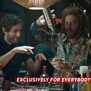
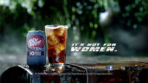
3. How well does your current branding represent your company? 

A) Very well: There’s meaning behind our design, and it communicates the message and feel that we want it to

B) Pretty well: Our design is thoughtful and reflects most of what we want it to, but some elements are slightly off or absent

C) Not well: Our design either doesn’t say much about who we are as an organization or sends the wrong message

We’ve discussed the importance of intentionality when it comes to design on our blog before, but it bears repeating. A good brand identity doesn’t just look cool — it says something about who your organization is and what you stand for. A company that wants to be known for its innovation, for example, would probably want to embrace a modern look rather than a retro one. You might even want to incorporate references and details specific to your company. So if your organization is a medical company on a mission to help customers navigate their health, you could embrace a compass motif. This kind of customization will not only help you send the right message to your target audience — it will also help you stand out from your competitors.

4. How thorough is your brand book?

9913526ea52be92f6391a9e14450a5d7.jpg

A) Very thorough: It defines our unifying brand theme, logo, color palette, typography, photography style, illustration style, icon sets, and guidelines for all other expressions of the brand

B) Pretty thorough: It has most of the elements listed above, but it’s missing a few of the more recent assets your brand team has developed

C) Not thorough: It has some of the elements listed above, but it’s missing several important components

Brand identities, which often come in the form of brand books, can contain any number of different aspects and will differ from organization to organization depending on their unique needs. However, there are a few components that every brand identity should have. A thorough brand book will play a key role in maintaining consistency and providing direction over time. 

5. How would you describe your brand strategy?

A) Great: We know who our target audience is and how we want to make them feel, and we’ve clearly defined our brand identity, brand narrative, positioning, and messaging in order to accomplish that

B) Good: We understand who our target audience is and how we want to make them feel fairly well, and our brand identity, brand narrative, positioning, and messaging mostly support that. However, we would probably benefit from a deeper dive into our audience and/or updating our strategies for reaching them

C) Poor/non-existent: We don’t have a clear understanding of our target audience. We’re not in agreement on how we want to be perceived, and the different elements of our brand are not aligned

Having an eye-catching, authentic-feeling brand identity is only part of the equation — you’ll also need to think about how leveraging your branding will help you achieve your goals, whatever they may be. This starts with a thorough understanding of your target audience: who they are, how they sound, where they spend their time. Then, you’ll need to come up with a coordinated strategy defining your brand narrative, positioning, and messaging, as well as detailing how they will work together to help you emphasize your unique strengths and differentiate yourself in the market.

6. How consistent is your brand across different channels and assets?

A) Very consistent: Your brand feels cohesive no matter where it appears, and you have enough templates and guidelines to make creating new assets a snap

B) Fairly consistent: Your brand is largely consistent across different channels and assets, but there are a few places where it seems a bit off-kilter. You have most of the templates you need and pretty clear guidelines, but you do occasionally find yourself using outdated assets or having to pull together new ones at the last minute

C) Inconsistent: Your brand looks very different depending on where it appears. Many of your templates and guidelines are either outdated or non-existent, making it a struggle to keep up with all of the ad-hoc design requests you receive

While it’s normal for there to be some slight variations in your brand from place to place — your brand on Instagram, for example, may appear to be a little bit more lighthearted and fun than your brand in a whitepaper — it should still be cohesive across the board. To do this, you’ll need a thorough brand book and brand strategy with clear usage guidelines and templates for nearly every use case you have. Otherwise, pulling together assets will be a time-consuming and chaotic process, resulting in erratic branding.

7. What do customers and employees think of your branding?

A) They love it

B) They like it

C) They dislike it/I’m not sure 

The best way to figure out whether or not your brand is hitting the right note is by getting feedback from the people around you — not just your existing and potential customers, but also your internal team members. You can think that your branding is spot-on all you want, but if your audience disagrees, it doesn’t mean much at all. Consider holding an audit or doing interviews to see what people think of your brand, how they would describe it, how it makes them feel, and what message it sends to them. Ideally, you’ll hear consistent, on-message responses no matter who you ask.

Results

Discover & share this Slanted Studios GIF with everyone you know. GIPHY is how you search, share, discover, and create GIFs.

Mostly A’s: You’re probably good for now

If you answered mostly A’s, your branding is probably fairly recent. It should be modern, reflective of who you are, consistent, and appreciated both internally and externally, while your brand book and brand strategy should be comprehensive and thoughtful. In this case, your branding isn’t just “good enough for now” — it’s a true strategic asset. While you’ll still want to check in and evaluate your brand from time to time, odds are that you won’t need to make significant changes for a few more years still.

Mostly B’s: Gather more information

If you answered mostly B’s, your branding is probably hovering between adequate and good. To figure out whether or not you should actually look into a brand refresh, you’ll need to evaluate your situation more carefully. You may want to conduct a brand audit to understand where your brand is at currently and contrast that with where you want it to be. If the cracks in your current branding are beginning to show and it’s holding your business back as a result, learn more about how a brand refresh could work, how much time and money it would take, and whether it’s practical given the state of your business. However, if your branding still holds up fairly well and continues to help drive the business forward, you can probably stick with it for now — just make sure to keep tabs on it over time.

Mostly C’s: It’s time for a brand refresh

If you answered mostly C’s, it has likely been a few years since you last touched up your brand, resulting in a look and feel that’s outdated, inconsistent, and unrepresentative of who you currently are. Your brand book and strategy might be incomplete, obsolete, or nonexistent, creating a design process that’s difficult and time-consuming. As a result of all of these factors, your relationship with your existing customers may be on the rocks, and you will likely struggle to attract new ones. At this point, a brand refresh is well overdue, and you should make it a top priority.

Wondering where to start once you decide it’s time for a brand refresh? We’ll discuss this topic more in our next piece.

Anastasia Salazar Ltd. is an independent design studio for tailored branding and digital designs. Reach out to learn how we can help you fuel growth and maximize your brand’s impact.