
In the world of visual design, few things trigger a stronger gut reaction than color. Colors can recall emotions, like a warm, sunny yellow inspiring feelings of positivity. They might bring to mind societal norms, like blue being associated with masculinity and pink being associated with femininity (although interestingly, it used to be the exact opposite). Colors can even affect your performance — a study from the University of British Columbia found that red stimulated attention to detail, while blue fostered creativity. Given how much color shapes our mood and behavior, it’s well worth taking the time to learn how to choose a color palette for your brand.
Branding is all about evoking a feeling in your audience, and color, often the first thing consumers notice about your brand, plays an outsized role in determining what that feeling will be. But choosing the right color scheme isn’t as simple as picking a few shades that you think look nice together. Your brand identity color palette should be designed with intentionality, and reflective of the attributes you most want to highlight.
Wondering how to choose a color palette for your brand? Check out the tips, examples, and sources of inspiration below to help you find one that perfectly complements your business.
Brand Identity Color Palette Dos & Don’ts
With something as subjective as color preferences, there’s no one right answer about what your palette should or shouldn’t include — but keeping the following tips in mind can help guide your decisions along the way.
Dos
Keep medium in mind: Where your brand typically appears should be weighed heavily when choosing your brand colors. If your brand is mostly seen in physical spaces, for example, you may not want to use a shade of electric blue since it won’t be quite as vibrant in print. That being said, there are always exceptions to the rule. I’m seeing a trend of more brand collateral in digital spaces using a CMYK color model rather than RGB.
Stay on top of trends: You don’t always have to base your brand identity color palette on whatever’s in style at the moment, but having a general awareness of what’s in and out can prevent you from choosing anything too passé. In 2013-2019, neutral palettes were everywhere, but today’s brands are playing with contrast by mixing in bright, vibrant colors.
Think about which colors you won’t include: What you don’t include in your color scheme is often just as important as what you do include. Consider Apple’s brand identity — in a time when computer hardware companies were all choosing black, they made a strong statement by opting for a palette that was almost exclusively white and gray.
Don’ts:
Don’t just choose your favorite colors: One mistake I see all the time in branding is people basing their brand colors around their own personal preferences without considering their actual brand attributes or the competitive landscape. Doing so can result in a palette that sends the wrong message or fails to stand out from the rest of the pack. In tech, for example, you see a lot of blues and cooler colors, so a great way to stand out is using a warmer palette (as long as it still authentically reflects your brand).
Don’t forget to do a gut check: If there’s one thing we can learn from the whole white-and-gold vs. black-and-blue dress debate, it’s that everyone perceives colors differently — that’s why you won’t want to go all-in on a palette without testing it first. Getting outside feedback allows you to verify that your brand identity color palette is actually communicating what you want it to.
Brands Doing Color Right
There are tons of great color palettes out there, but here are a few in particular that have caught my eye.
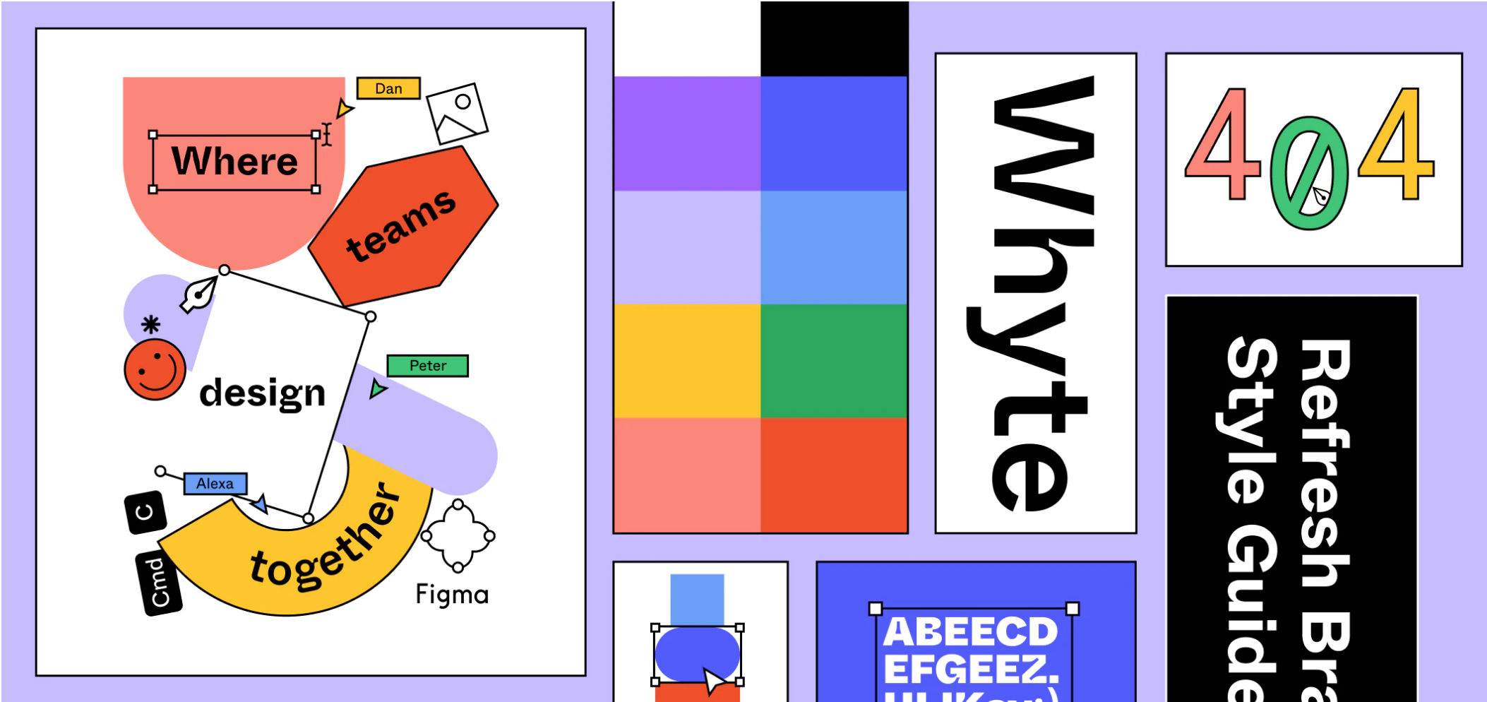
Image credit: Figma
Figma
Figma, a company that makes collaborative design software, is a prime example of a tech company whose color palette stands out from others in their space. They combine primary colors (not the jewel tones you usually see in tech) with simple shapes in a way that feels almost elementary, but used in a harmonious way. The first time I saw their ads, I immediately wanted to learn more about the company — their branding feels so playful and curious.

Image credit: Dezeen
Burger King
Burger King, who just launched their rebrand last month, is another example of a company bucking industry design conventions. Rather than the bright, in-your-face colors of companies like McDonald’s and Taco Bell, Burger King embraced a warm, nostalgic, and comforting color palette.
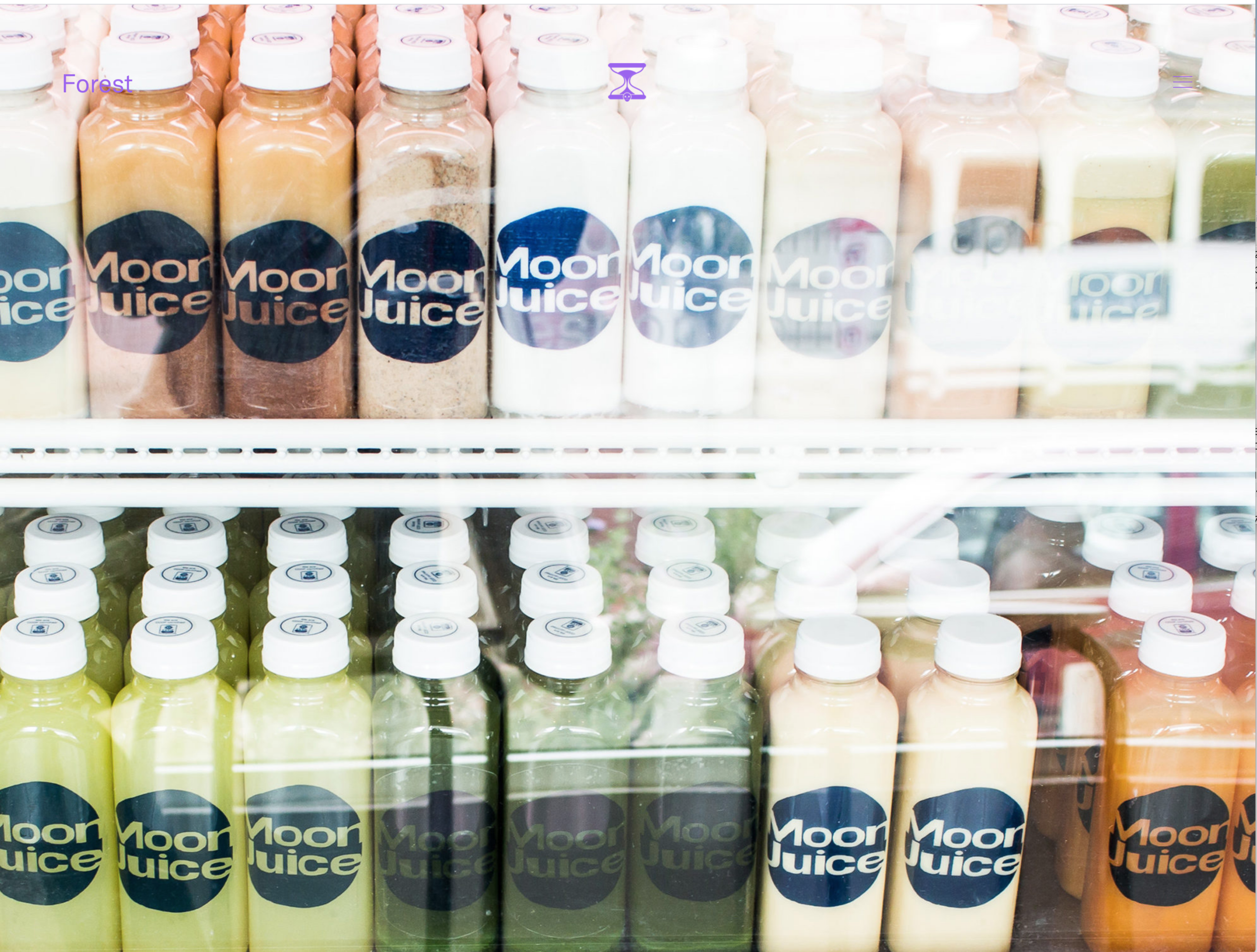
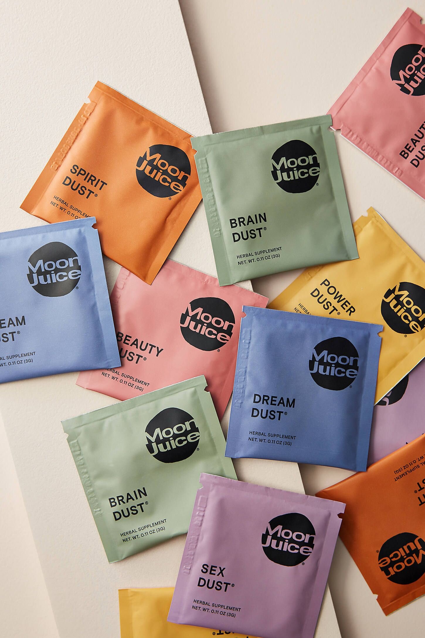
Moon Juice
Moon Juice, an LA-based juice and supplement company, draws their brand identity color palette from the fruits and veggies that go into their products. The rich shades they use give off a lush, organic, and natural vibe.
Finding Inspiration for Color Palettes
If you want to learn more about color theory or just get some ideas for colors you could use in your palette, check out the following resources.
Books:
The Secret Lives of Color by Kassia St. Clair: This is a super interesting book that recounts the origins and history of colors. While it looks at color through a scholarly lens, it doesn’t feel too academic — the way St. Clair talks about colors as if they were old friends makes the topic fun and approachable.
Interaction of Color by Josef Albers: This is the classic that everybody in art school is assigned. In this book, Albers presents a number of different color plates and studies to show how colors work together. It really gives you a sense of how color can be deceiving, and how certain combinations of colors can look like totally different ones.
A Dictionary of Color Combinations by Sanzo Wada: This book is a good pick for anyone who wants to expand their horizons when it comes to color. Wada showcases nearly 350 different color combinations that work well together, which serves as great fodder for artists and designers.
Resources:
Pantone Color Bridge Set: You can’t talk about modern color theory without talking about Pantone. Pantone’s color-coding system is used all around the world in graphic design, fashion, manufacturing, and more. Their color bridge is a set of swatches of thousands of different colors, and it’s largely considered the bible for designers looking for color inspiration.
Color Palette Cinema: This Instagram account shows stills from different movies and the color palette used within them which might help you recognize the colors you see in film and understand the emotional impact they have — romantic scenes, for example, are often shot through a soft yellow filter. After spending some time going through their posts, you’ll be better equipped to pay attention to and analyze the colors you come across on a daily basis.
The effect color has on our lives is hard to overstate. When color can do everything from making hearts race to changing the flavor of food, it’s safe to say that studying up on how to choose a color palette for your brand is well worth the effort. And if reading about color theory, identifying trends, researching the competitive landscape, hunting down the perfect colors, and testing them on your audience seems like overkill, don’t worry — it will almost certainly be worth it in the end. Find the perfect combination of colors to express your brand, and you just might capture your audience’s attention and earn their affinity.
Anastasia Salazar Ltd. is an independent design studio for tailored branding and digital designs. Reach out to learn how we can help you fuel growth and maximize your brand’s impact.