
In the design world, it’s easy to get intimidated by the big guys. Companies like Nike and Apple are just a couple of iconic brand identity examples that are recognizable worldwide, with sharp, consistent looks across every medium. “How am I supposed to compete with that,” you might think. Often, this kind of mindset results in a creative block.
But at times like these, one of the best ways to move forward is by stepping back. When it comes to looking at other brands, choose to be inspired instead of envious — with so many companies, agencies, and individuals designing incredible work, you’re doing yourself a disservice if you don’t seek it out. Of course, you don't want your brand to look like the clone of another, but surveying the landscape can play a key role in informing your own brand identity and strategy.
There’s no shortage of impressive brand identities out there, but for this post, I compiled a few favorites across a range of styles and industries so you can sample a little bit of everything. Look through them below, making sure to take note of what you like, what you dislike, and how those takeaways can be applied to your own brand identity design.
Top Brand Identity Examples
NASA
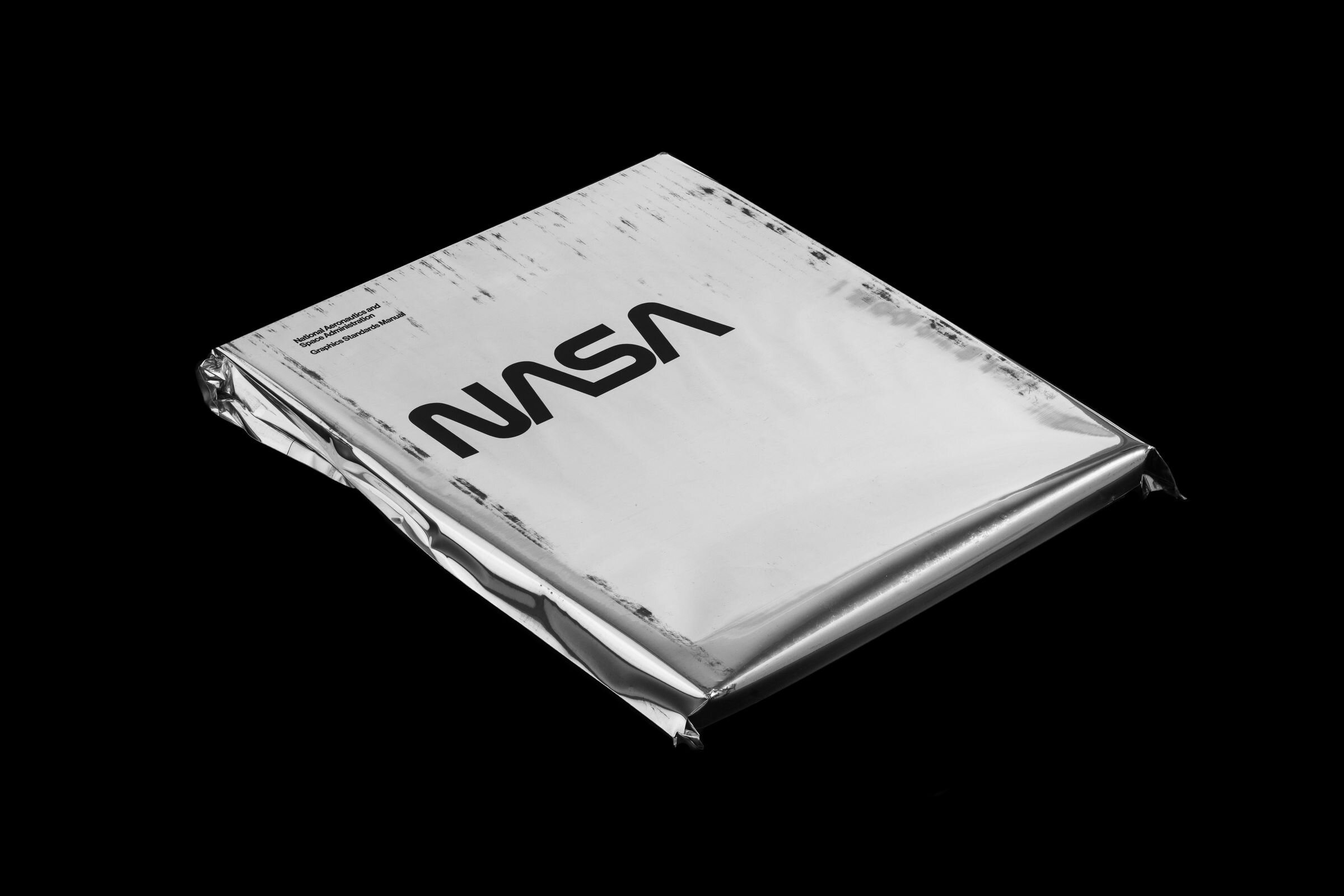
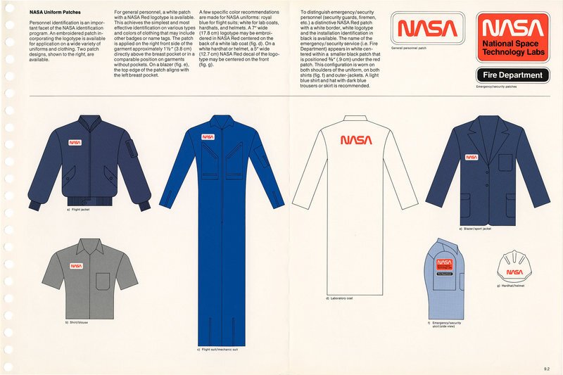
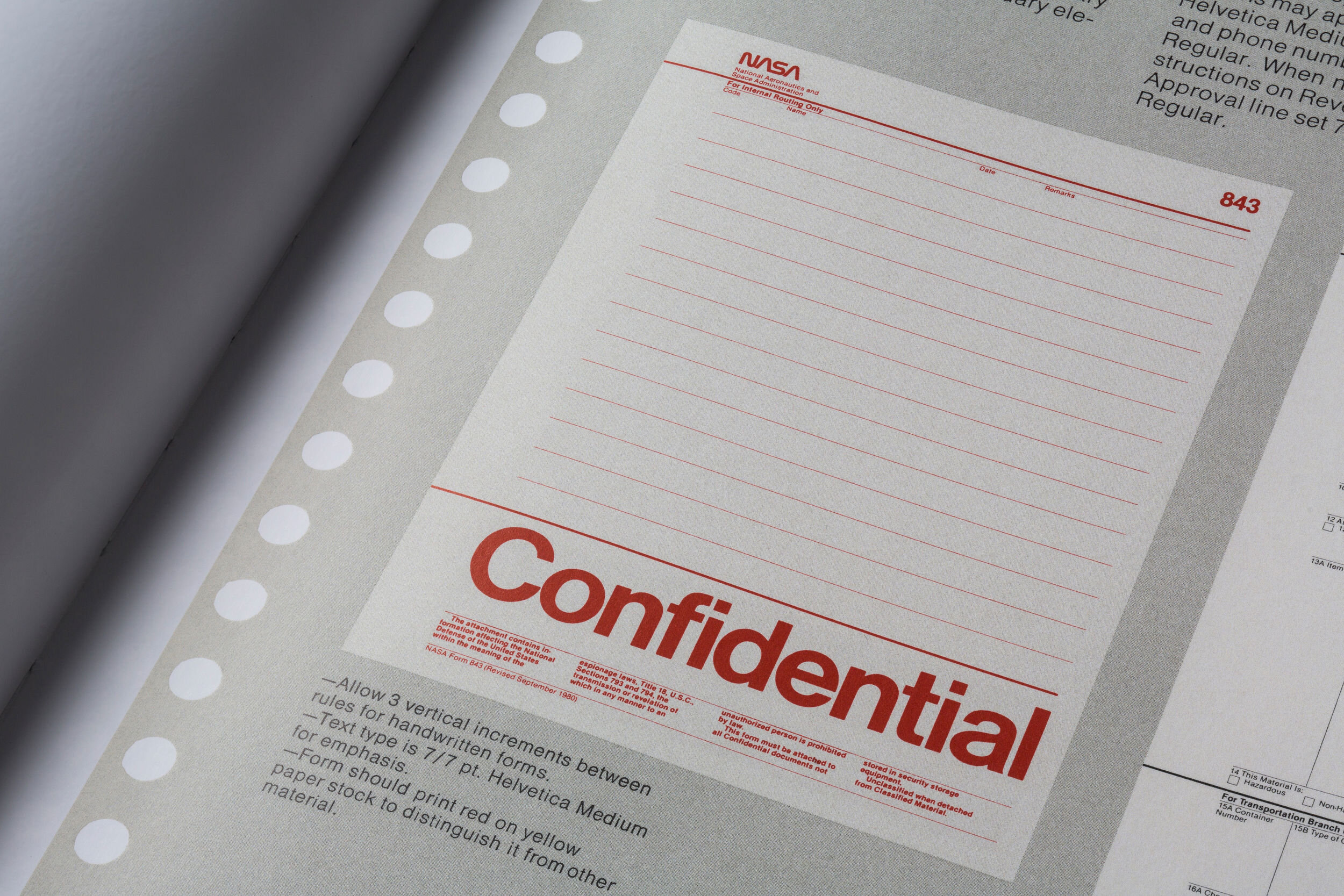
While NASA’s brand book, pictured above, was created in 1975, designers Richard Danne and Bruce Blackburn managed to create an enduring look that still holds up well today. Even the packaging of the book is amazing. I love the space-age metallic pouch it comes in, and the black texture on it that gives off a cool, retro, Xeroxed feel. Their logo, meanwhile, is a real testament to timeless design — while it did change in the 90s, NASA recently announced that they’re going to revive the old logo for use on a space shuttle called Falcon 9.
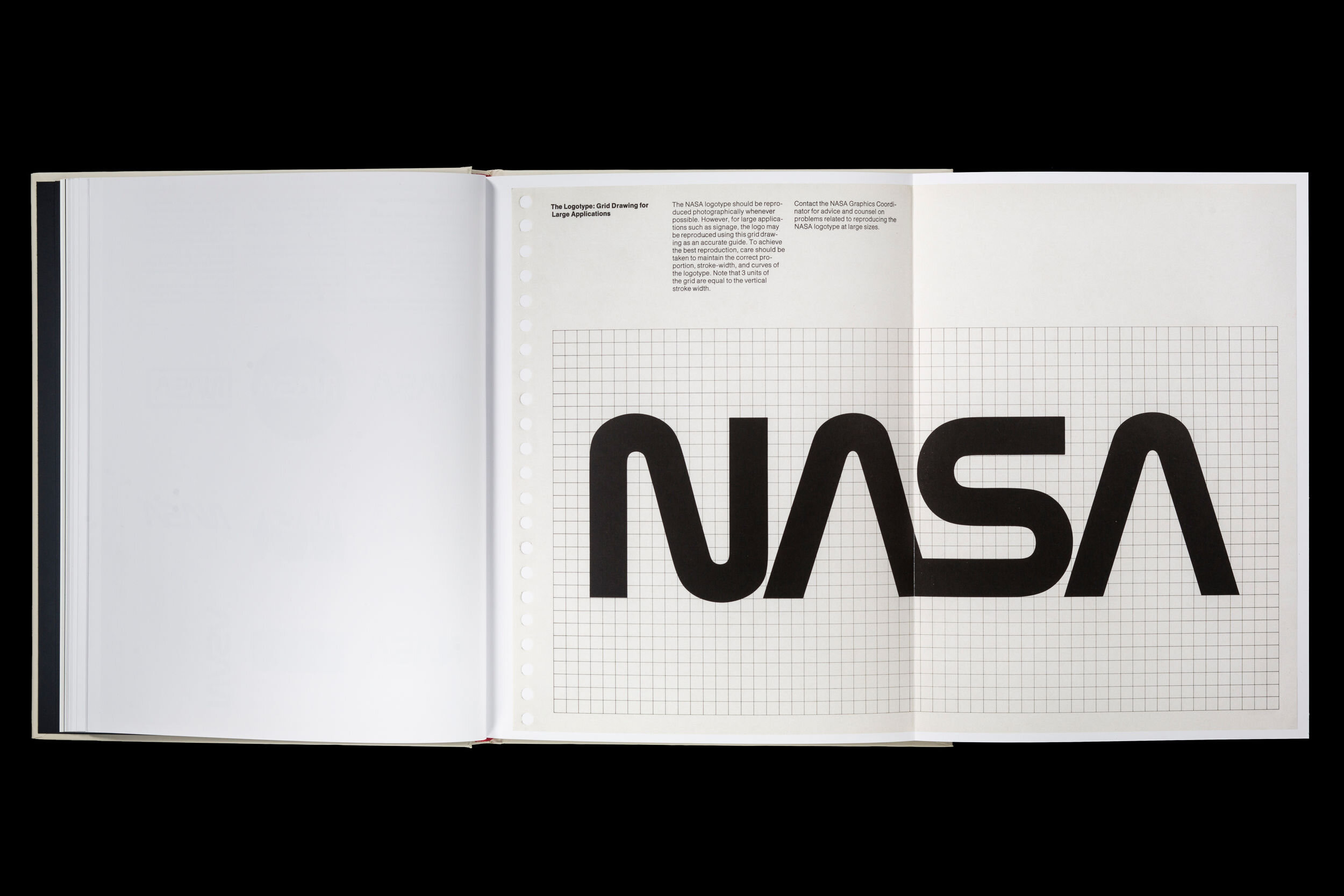
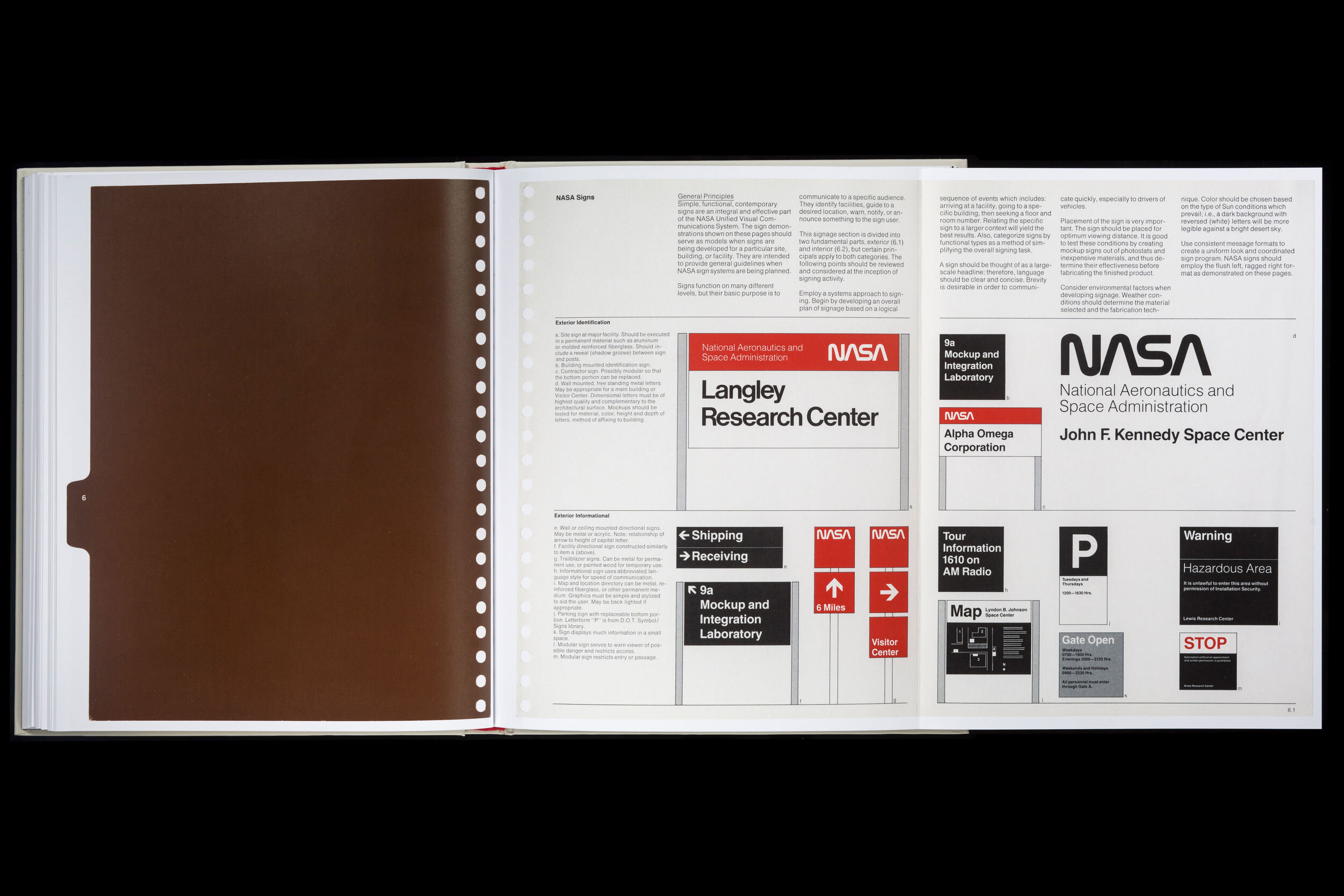
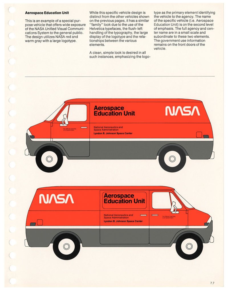
The content of the book itself is just as solid as the logo. I love how their brand identity reads almost like a textbook — it does a great job conveying NASA’s scientific, intellectual vibe, which helps to emphasize their credibility and expertise. The print medium sets it apart as well, with so many other companies today opting for digital brand books. It’s so thorough, too. Every use case down to the “confidential” stamp is included. (On a side note, how badly do you want their clothing? I would totally buy their flight jacket!)
Overall, I consider it the standard to which all other brand books should be held.
Fort Point Beer Company
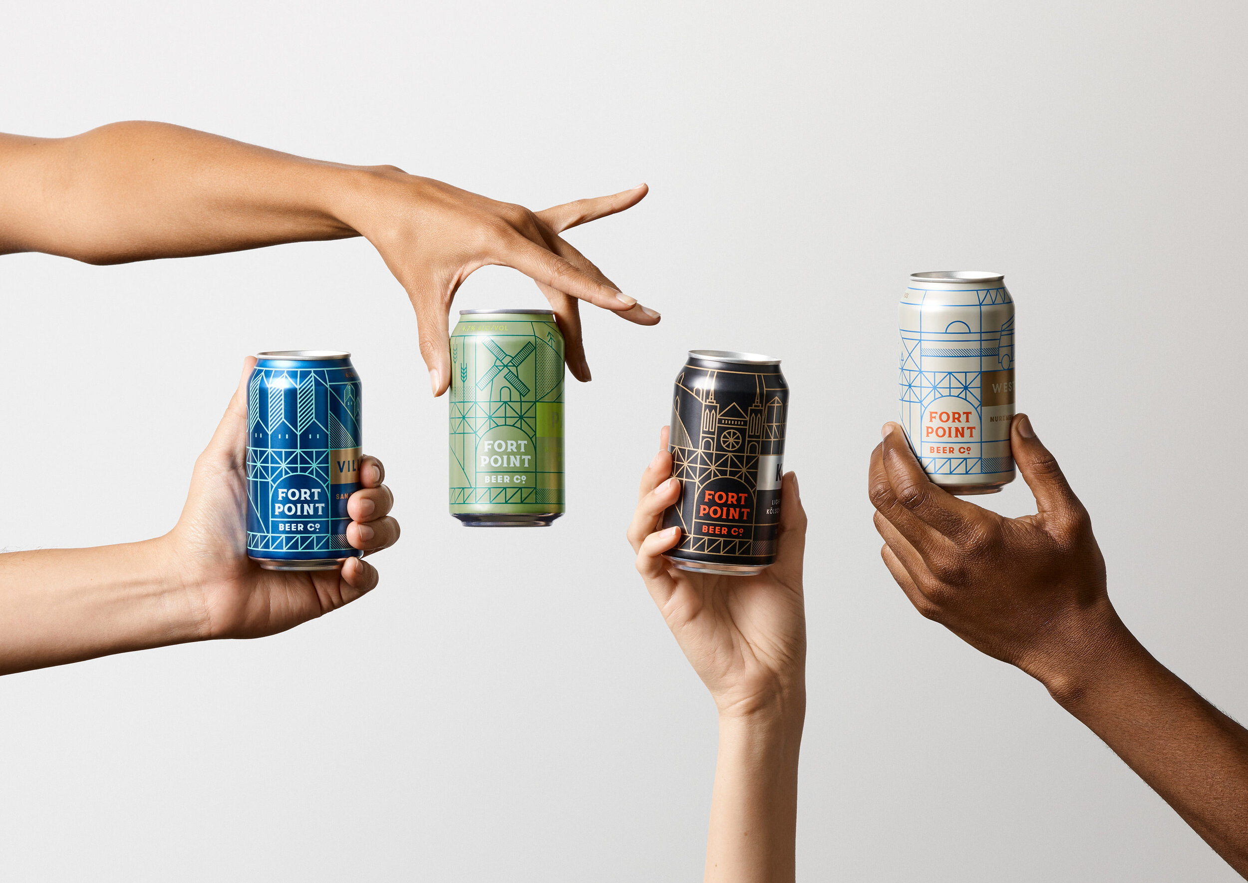
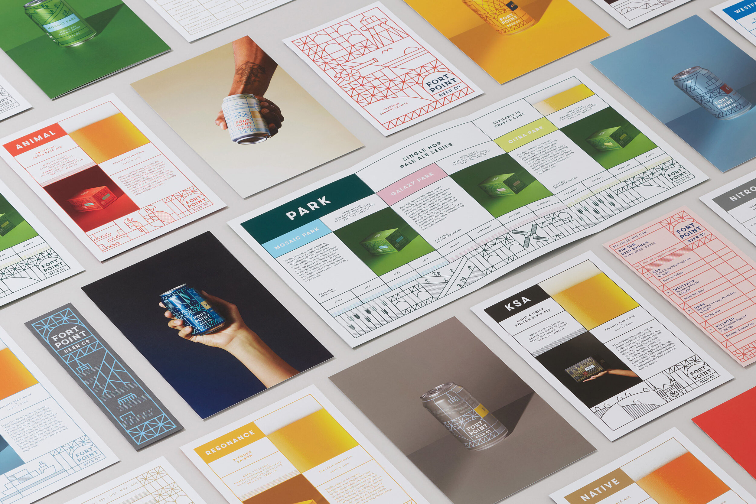
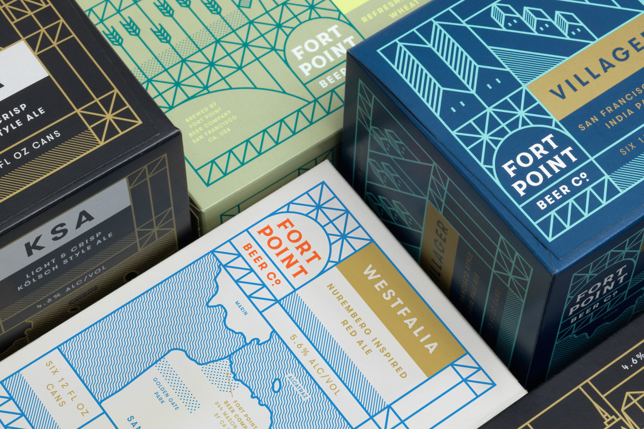
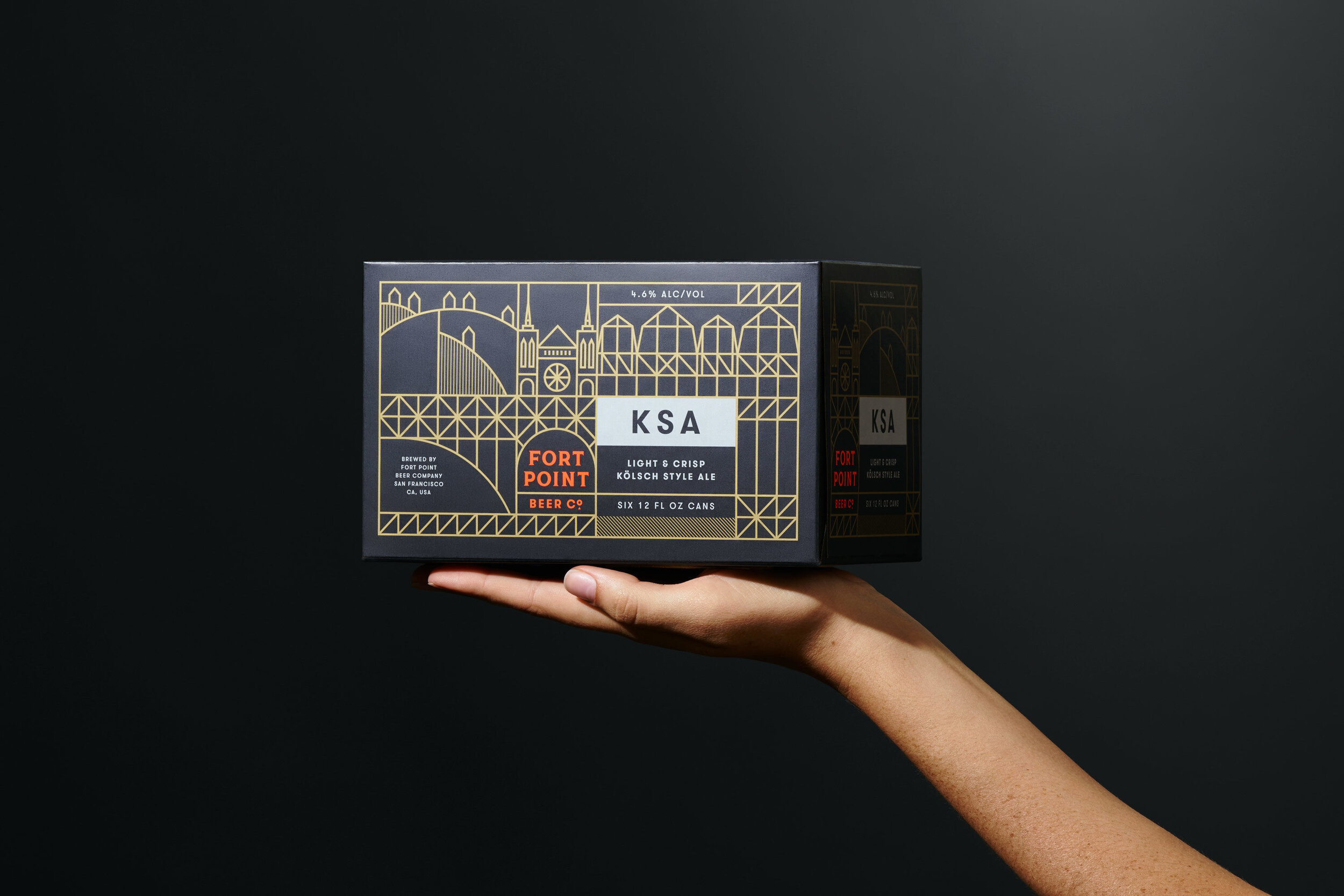
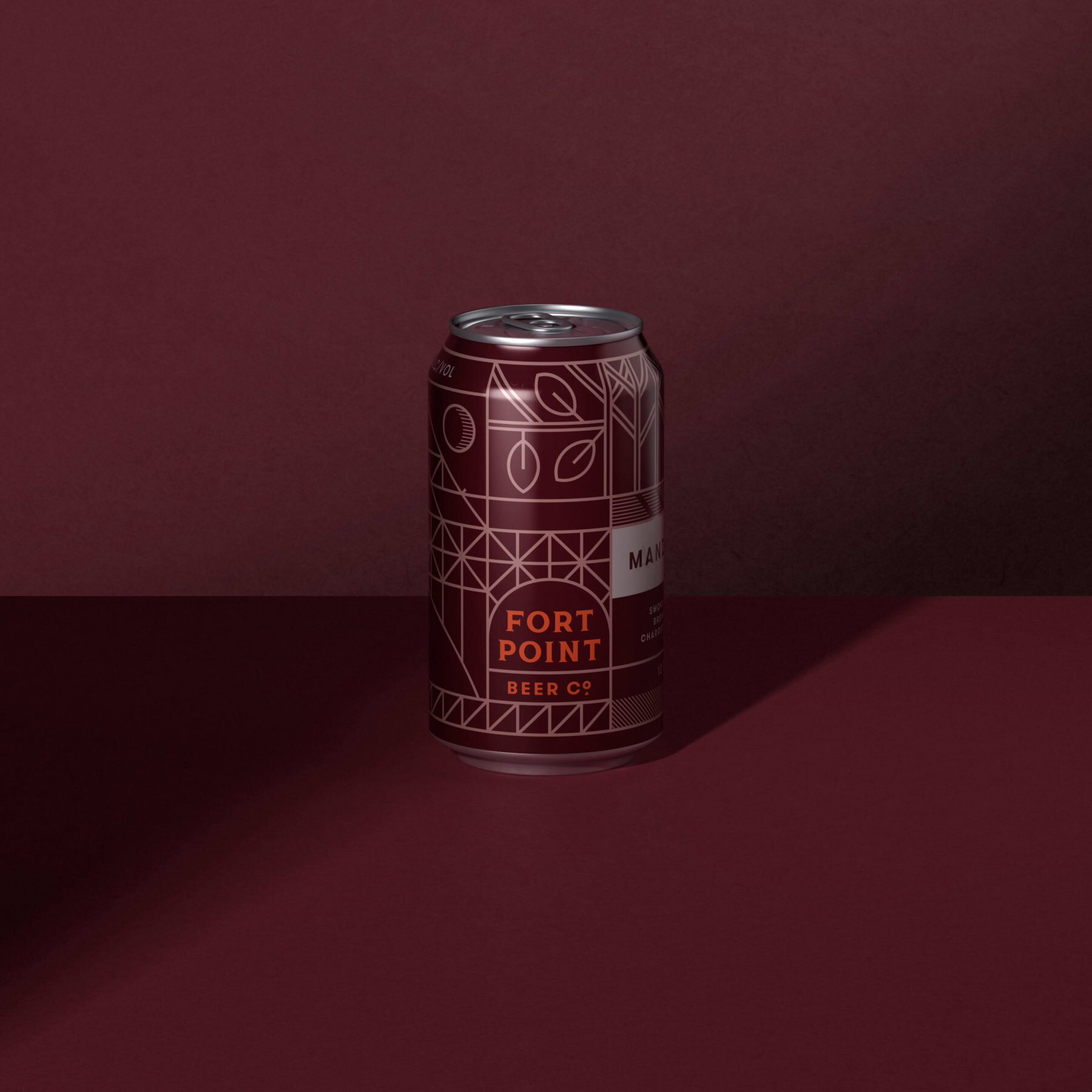
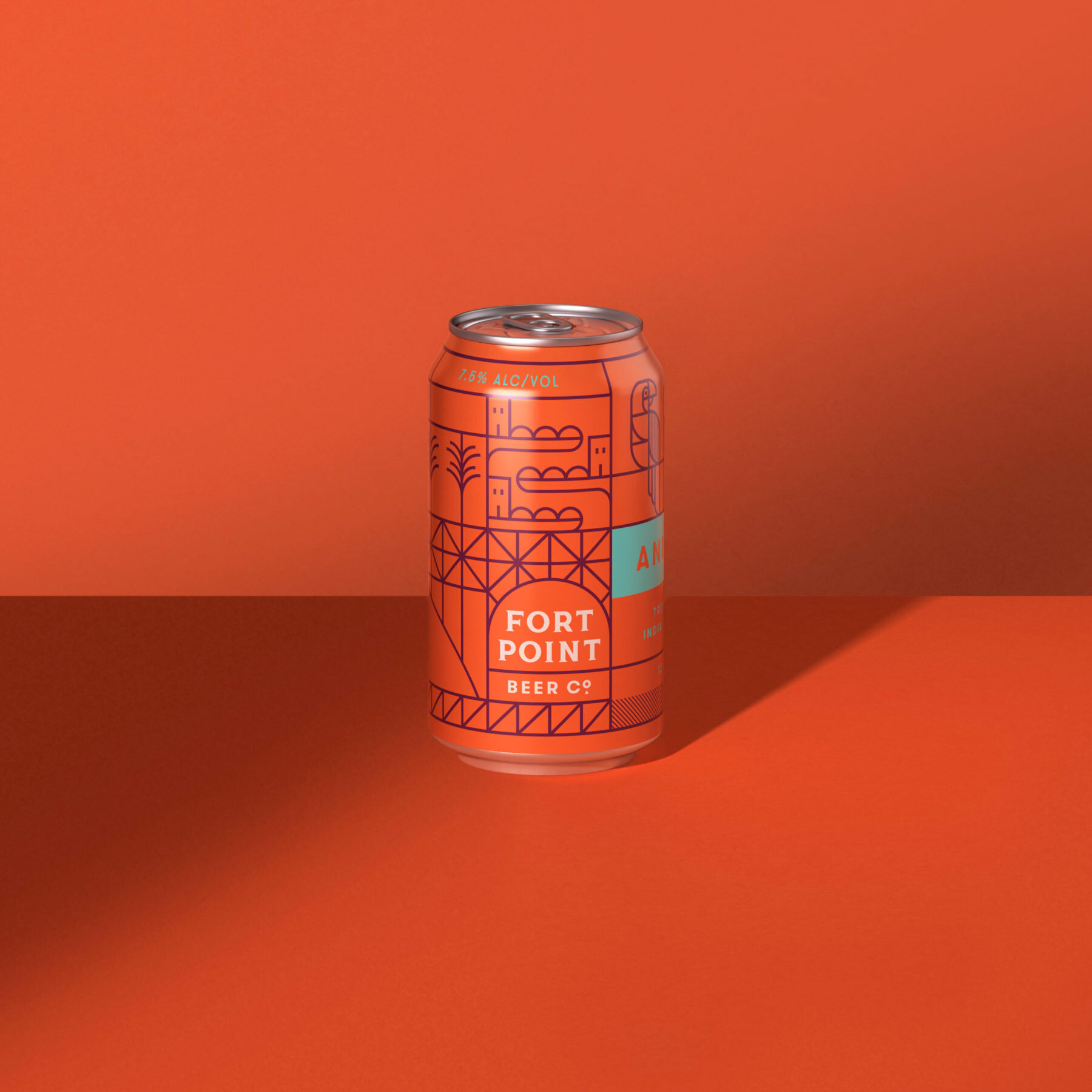
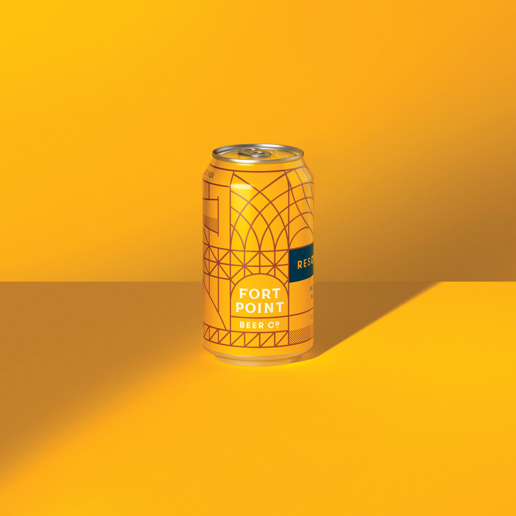
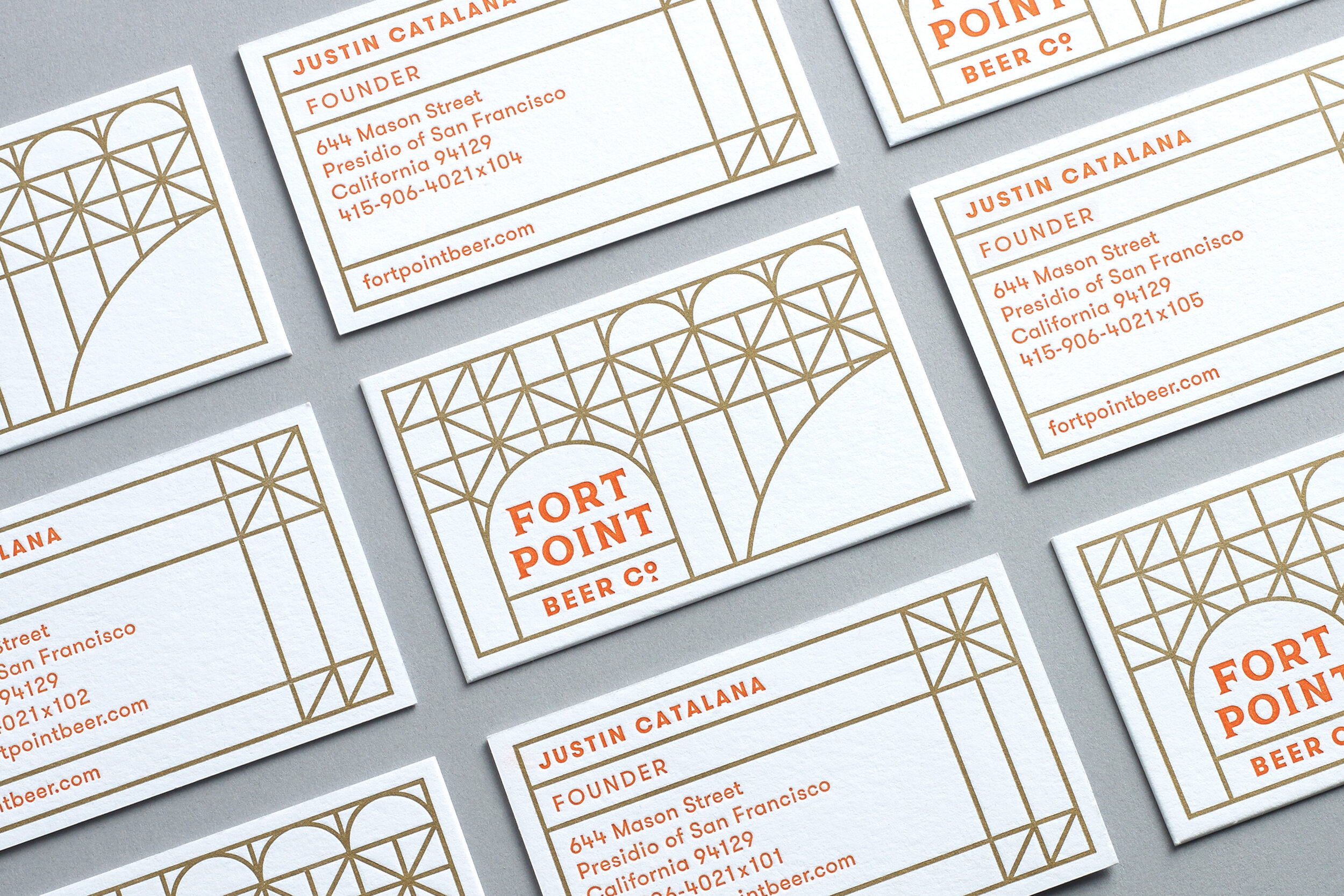


Shoutout to SF-based agency Manual — this group does super cool work, including the brand identity design for Fort Point Beer. As an SF native, I often cringe when companies try to capitalize on San Francisco-related imagery in an attempt to look “authentic,” but Fort Point succeeded in creating a tribute to the city rather than just trying to profit off of it. Anyone can slap an icon of the Golden Gate Bridge on their product, but many of the landmarks that appear on Fort Point’s products — like the Dutch windmill in Golden Gate Park, or the Bay’s ever-present cargo ships — are references that only locals can recognize.
Speaking of which, the geometric, single-weight illustrations really work for Fort Point. Although it’s a very trendy aesthetic right now, Manual was able to put a unique spin on it that Fort Point could own. The monochrome photos look great, too. Each of the different elements present complement one another to create a cohesive visual system that's contemporary, authentic, and meaningful.
Allbirds
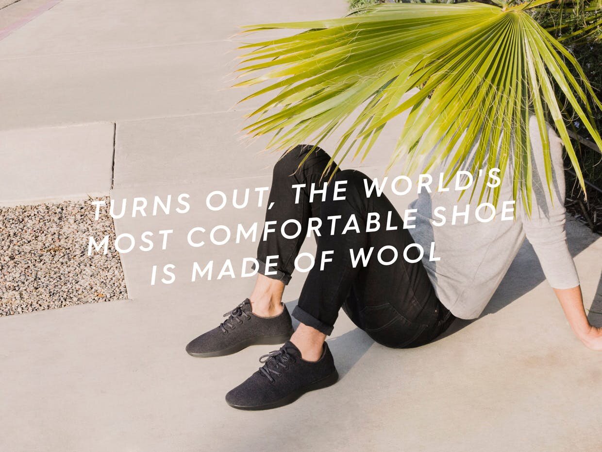
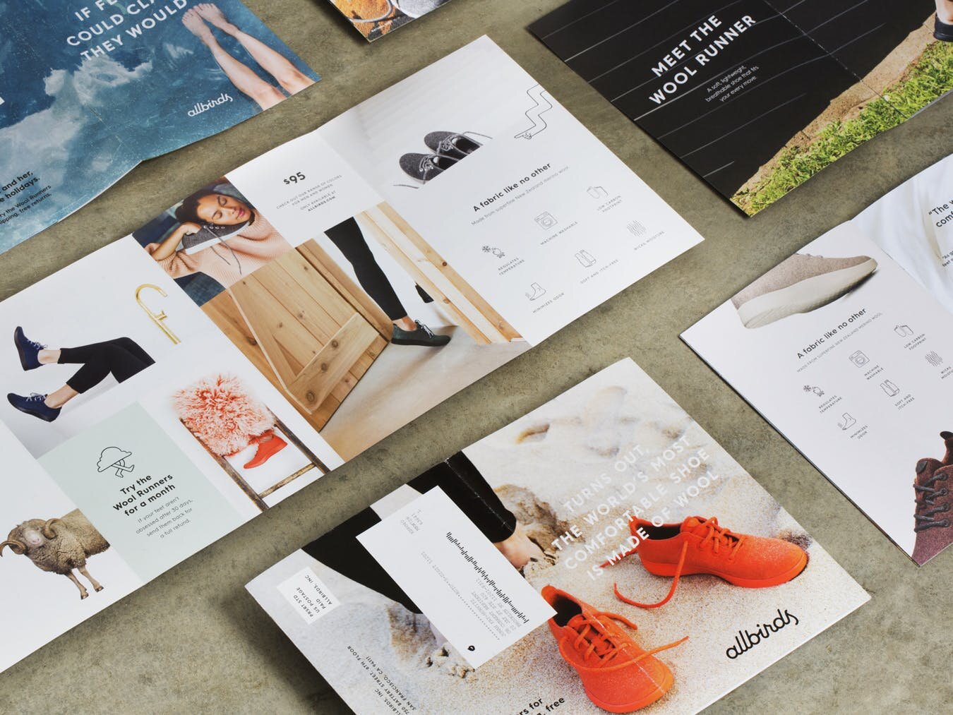

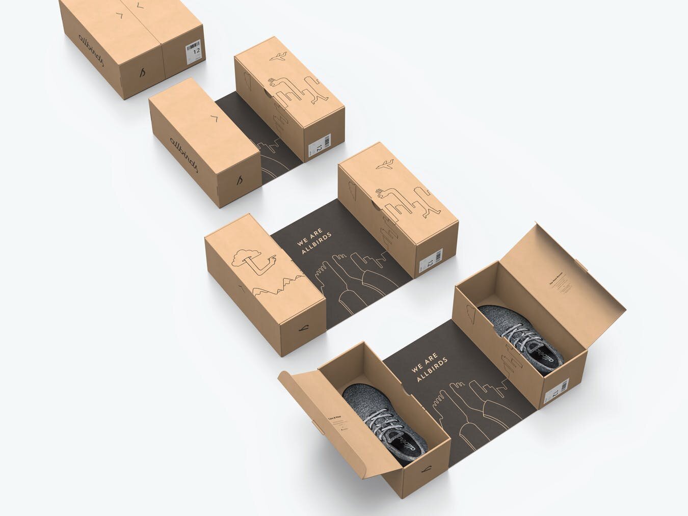
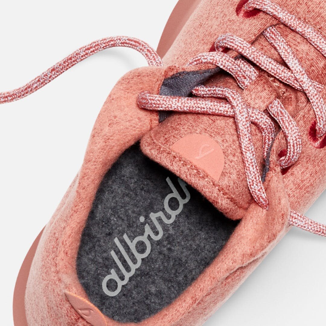
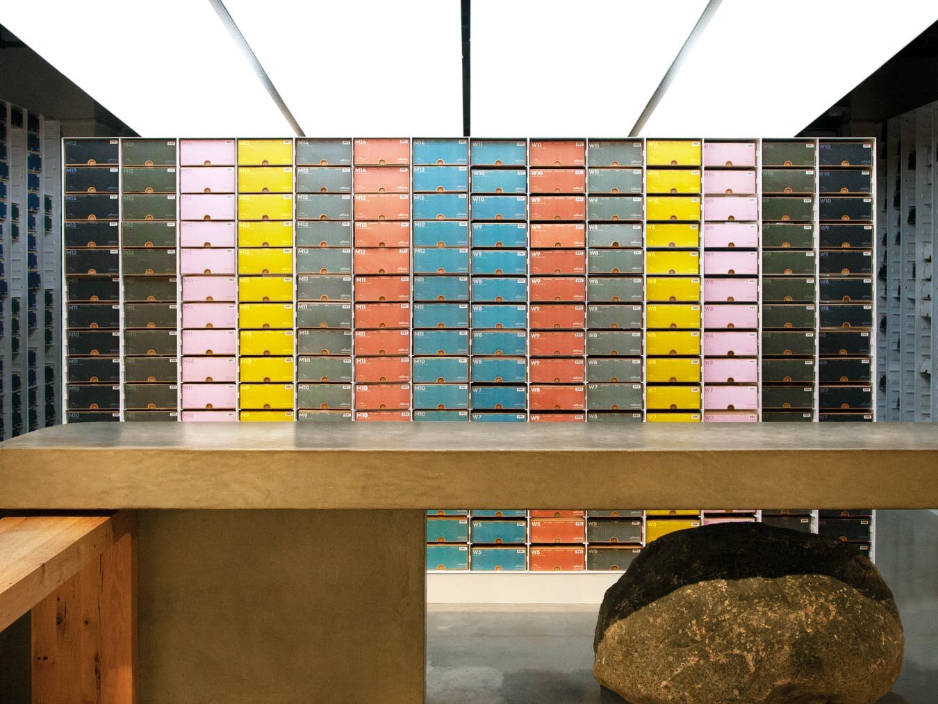
With the Allbirds brand identity, design and marketing agency Red Antler completely nailed the look that most of today’s direct-to-consumer brands are going for: clean and bright minimalist photography, playful illustrations, and geometric color blocking. In fact, in the 4+ years since the brand identity launched, it’s become so popular that many other brands have tried to pull it off themselves — although no one has ever quite been able to measure up to the original, in my opinion.
One of the best things about Allbirds’ original design is that it left room for branding evolution and growth. Now that Allbirds is a well-established, widely-recognized brand, they’ve begun to take some more creative risks. Increasingly, the photography featured on Allbirds’ site is expanding beyond its original immaculate, highly-manicured format to show unexpected details and textures, like the dirt sprinkled on the background of a recent homepage header (see below). The company has also begun to embrace more natural colors instead of the strictly pastel palette they started out with. Throughout all of the change, though, Allbirds has always been able to remain true to their brand.

Seed


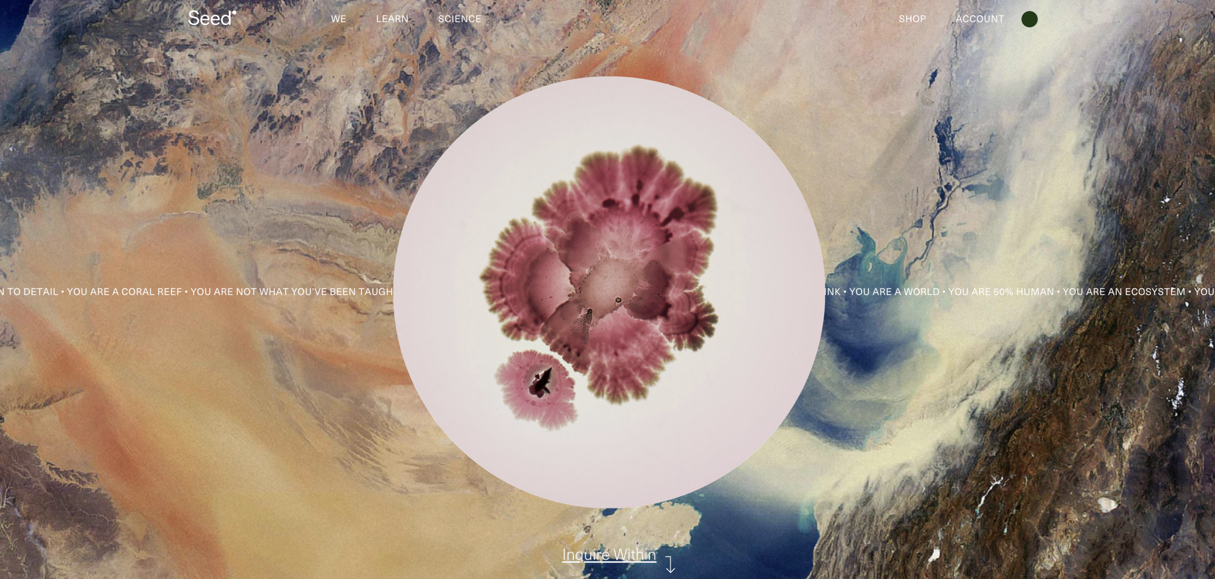


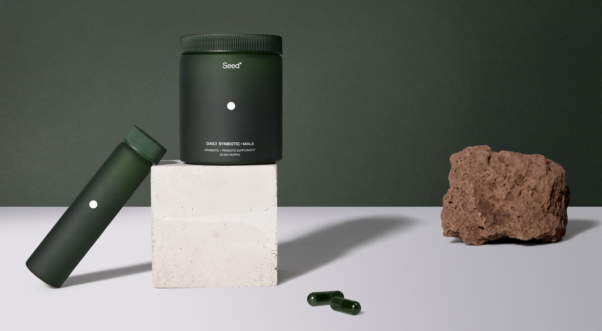
I’m calling it right now: Seed, a woman-run microbiome product company, is going to be a branding trendsetter. Designer Jam Sayne has created a brand identity design that really leans into the company’s grounding in science and research. The visual style strikes a perfect balance between a cutting-edge look and an organic, natural feel. The clean, straightforward sans-serif text of the website is complemented by artful, almost floral, images of bacteria blooming in petri dishes. Even the UI is inspired, with your icon serving as a magnifying glass as you hover over text and images.
Usually, design agencies specialize in either digital or print, but the team behind Seed’s brand excelled at both here. The packaging is simple to the point where it’s almost anti-design, but the dead-on execution of the fine details — color, font, icon — make it masterful.
Madre Mezcal
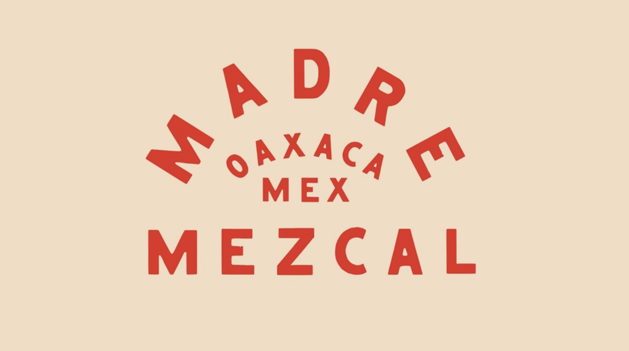
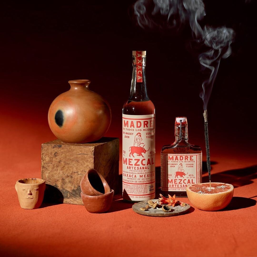

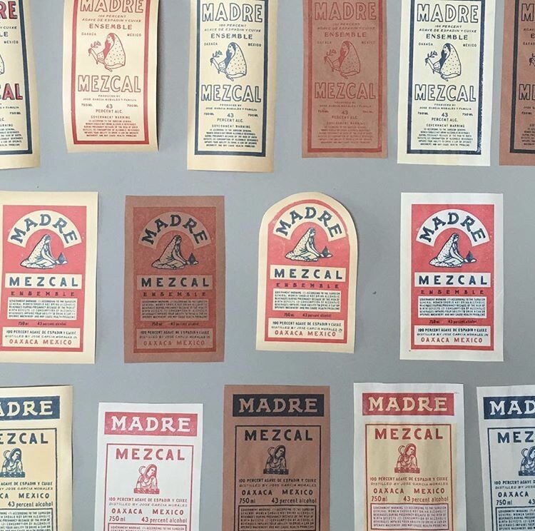

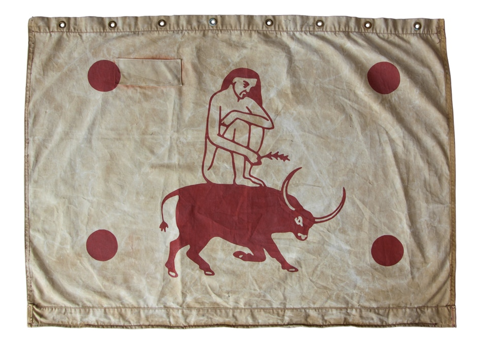
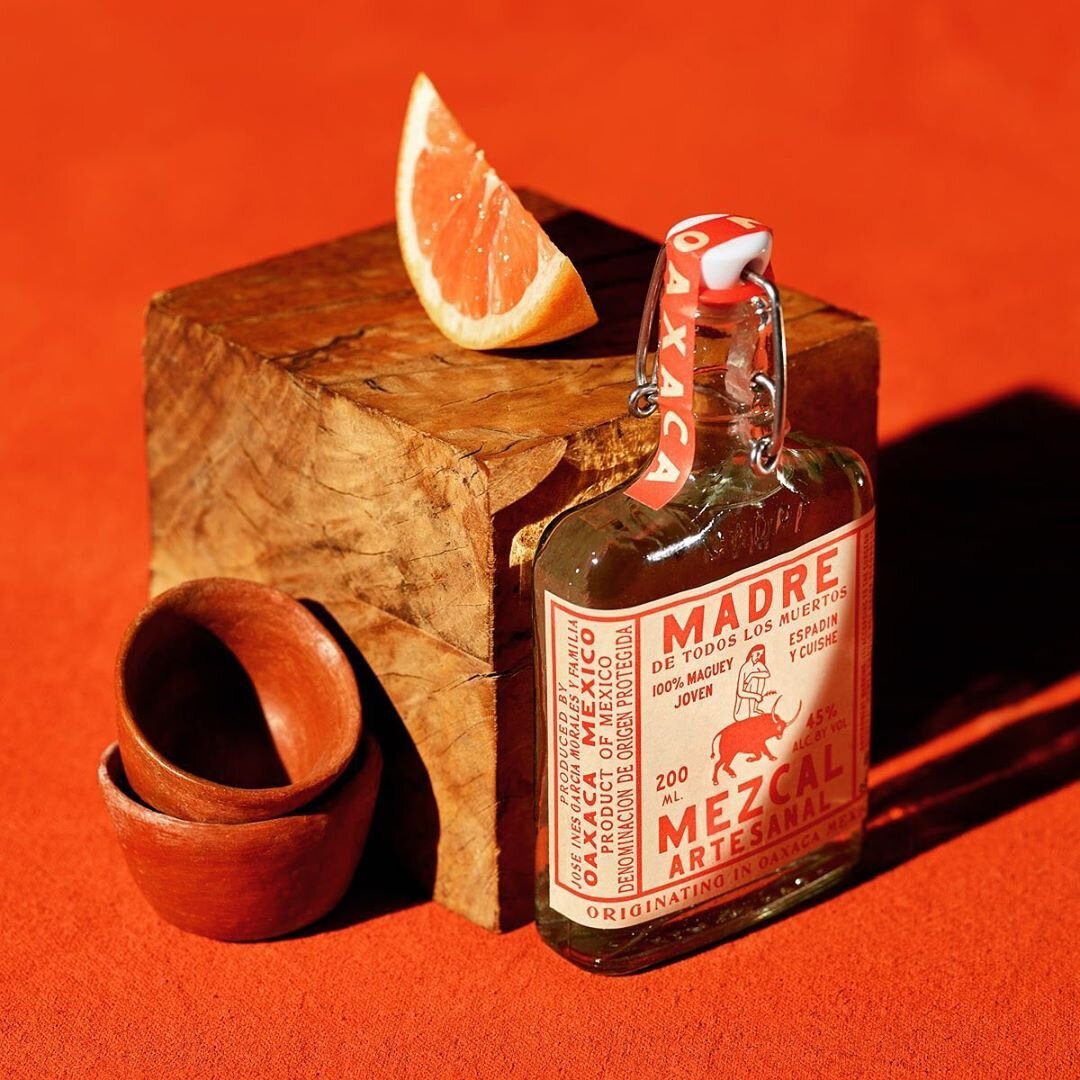
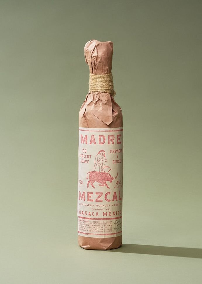
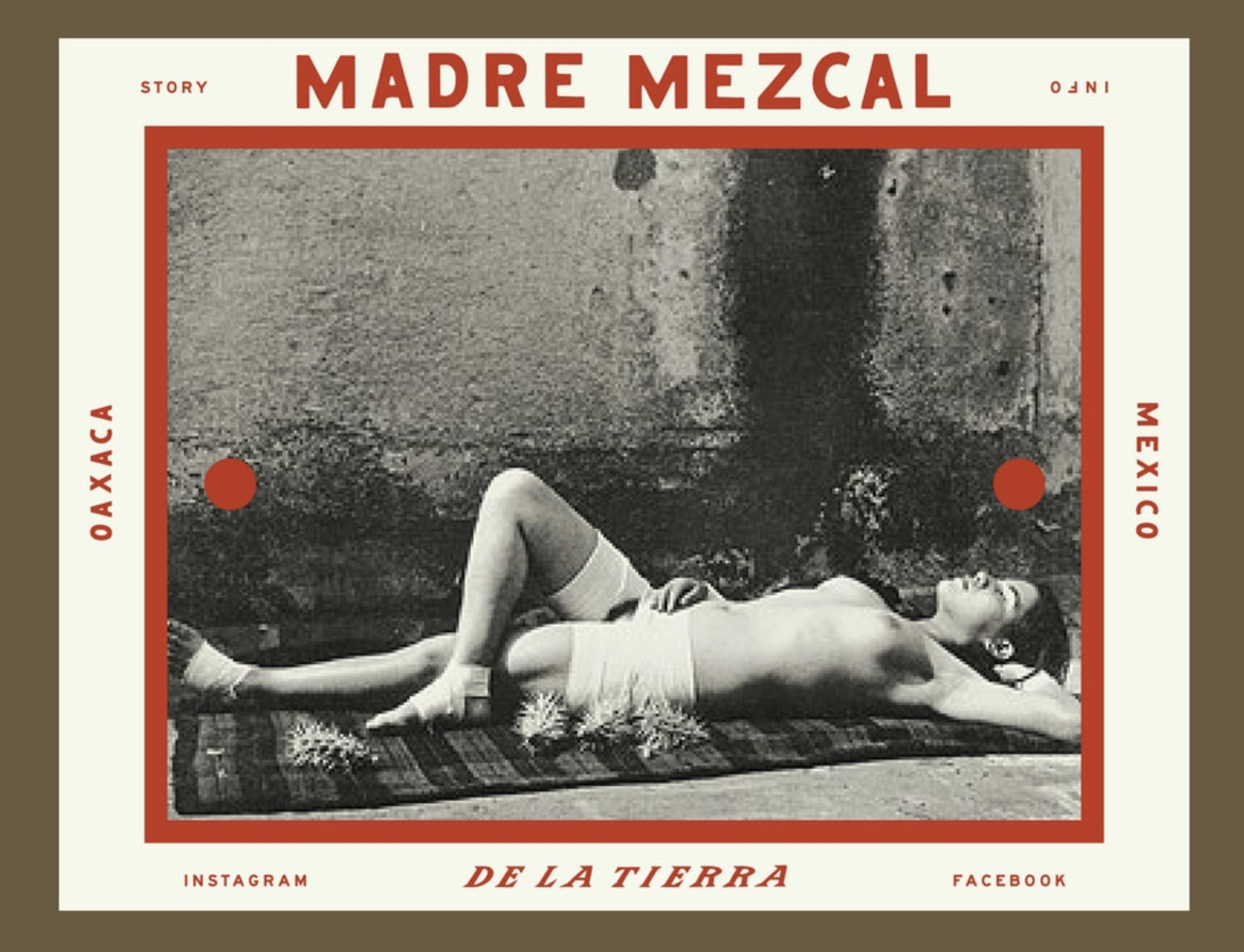
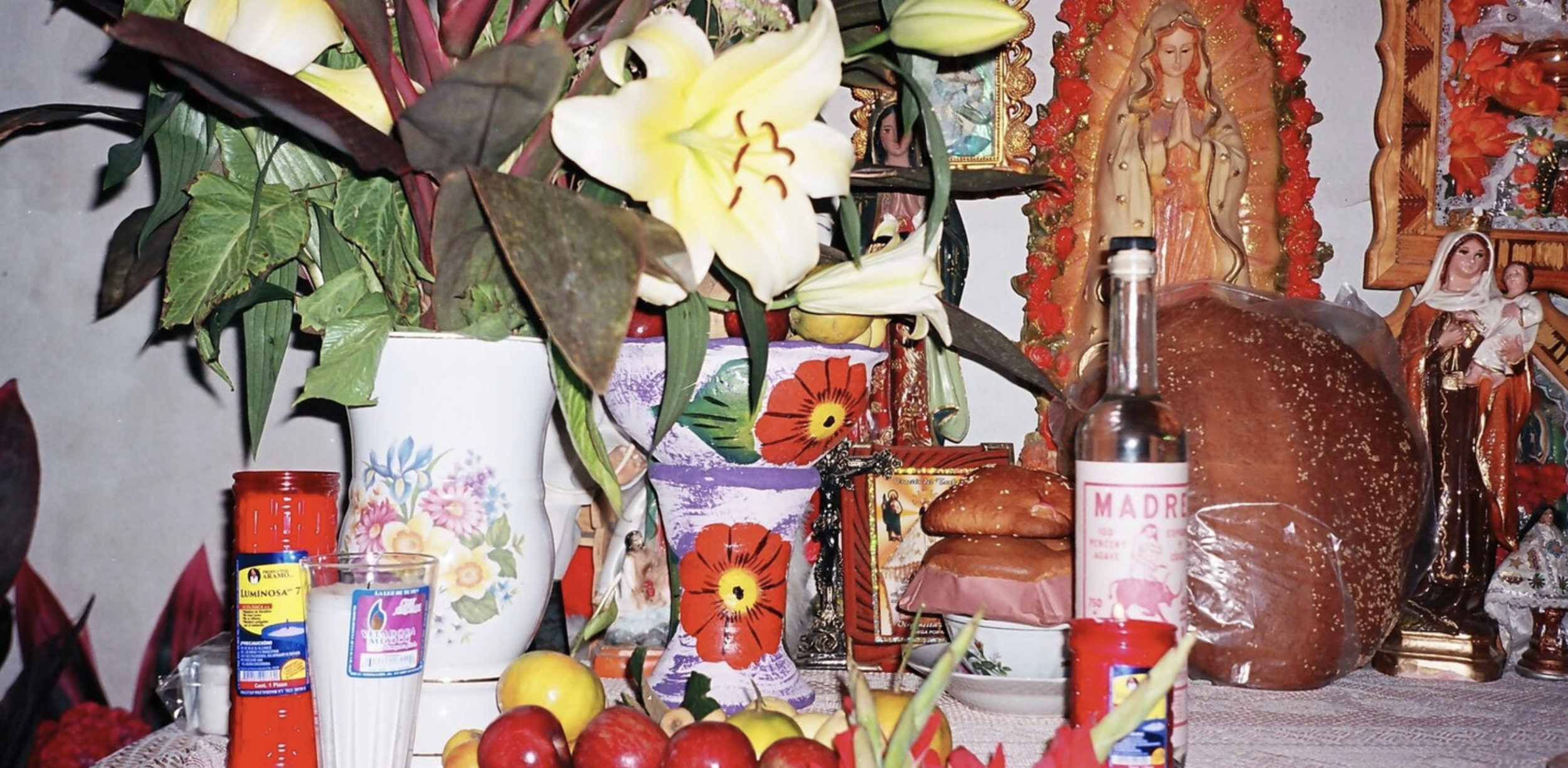
Madre Mezcal is one company that has put art and tradition at the front and center of their brand identity. Initially, I wasn’t sure how I felt about an agency run by two white guys using a traditional Oaxacan aesthetic, but I have to hand it to them — they really paid their dues to understand the craft of mezcal making.
On the website for the agency, Land, the Madre Mezcal case study shows the lengths they went to in order to honor the culture. Photos — both in color and black and white — of agave plants, workers, and daily life in Mexico drive home the rugged authenticity of this family-owned company operating out of Oaxaca, while vintage packaging details like the image of a woman riding a bull, faded print, and paper and twine wrapping bring to mind the rich history of traditional mezcal making.
It goes to show that companies don’t need to jump on the bandwagon of computer-forward design, sans serif fonts, and vector illustrations — embracing your roots can be even more powerful. The end result isn’t just pretty graphics, but rather, a brand identity that pushes the boundaries of how we define contemporary design.
While the five brand identity examples above are among my recent favorites, the amount of incredible design being produced today is nearly endless — so keep researching until you find a style that speaks to you!
Anastasia Salazar Ltd. is an independent design studio for tailored branding and digital designs. Reach out to learn how we can help you fuel growth and maximize your brand’s impact.