
A methodical and well-thought-out rebrand can do a lot for your business. It can help you appeal to new customers and markets, showcase your values, and stand out from your competitors.
However, a bad rebrand can do more harm than good.
The good news? You can learn from these branding fails to make sure your own rebranding efforts get the results you want.
We’ve put together three branding failure examples, looking at what went wrong and how to avoid making the same mistakes.
Branding fail #1: Jaguar


Prestigious British-based car manufacturer Jaguar unveiled Project Roar in November 2024 to a baffled audience.
The aim of the rebrand was to launch Jaguar’s new line of electric vehicles to a young and wealthy target audience. With a revised logo, an “exuberant” color palette, and an ad campaign featuring a diverse range of stunning models, the rebrand aimed to showcase Jaguar as a young, creative, and modern company.
As you might expect, the reaction was not good. A UK motoring journalist referred to the launch as like a “hallucinogenic sci-fi movie,” while comedian Stephen Colbert said it looked “like a luxury condom brand in an eastern European dance club.”
The rebrand is retro, but not in a good way. It doesn’t pay homage to the brand’s legacy and ultimately came across as inauthentic and dare we say, a little bit cheap.
The lesson learned:
The Jaguar rebrand failed so spectacularly because Jaguar forgot its core values. The brand wanted to appeal to a younger, more tech-savvy audience and as a result, threw away the prestige and admiration it had built up over the past century.
As the Jaguar rebrand was geared towards electric vehicles, a savvy move could have been to create a sub-brand. That way it could run the traditional branding and newer branding alongside each other, appealing to two different audiences while not compromising its identity.
For an example of this in action, take the Spanish clothing brand Inditex, which operates luxurious designer brand Massimo Dutti alongside the more affordable high-street brand Zara. Two different brands, two different target audiences.
Branding fail #2: The Gap
One of the most memorable branding failures is The Gap.
In 2010, The Gap hired Laird and Partners to redesign its logo. The new logo was launched on 4th October 2010 and was hailed as more contemporary and “sexy” than the original.
However it was met with a barrage of public vitriol across social media. People said it looked tacky, boring and soulless, some even dared to say it looked like a PowerPoint template.
The hatred of the new logo was so intense that it was scrapped on the 11th October 2010—less than a week after it launched. The executive who oversaw the change ended up resigning a few months later.
The lesson learned:
Where to start with this one?
One of the key reasons why rebrands fail is that there isn’t a good enough reason to rebrand. Gap wanted to modernize, but making something modern doesn’t always mean it will be well-received.
“Brand fatigue” is never a good enough reason to rebrand.
Another reason the Gap rebrand failure happened was because the new logo was too radical a departure from the old one. While the new logo did include a tiny nod to the old blue box, it wasn’t enough to keep loyal customers invested.
Compare and contrast with Pepsi. While the soft-drink brand has evolved a lot over the years, the bottle cap design and red, white, and blue color scheme have always been a constant.
If you already have a strong brand identity, it’s best to build on what you have rather than trying something completely different.
Finally, and this is something we’ll touch upon in more detail in the next section of this article, Gap pushed the rebrand through very quickly, without consultation. There was no buildup or notification that a rebrand was taking place, frustrating and confusing customers.
Branding fail #3: X


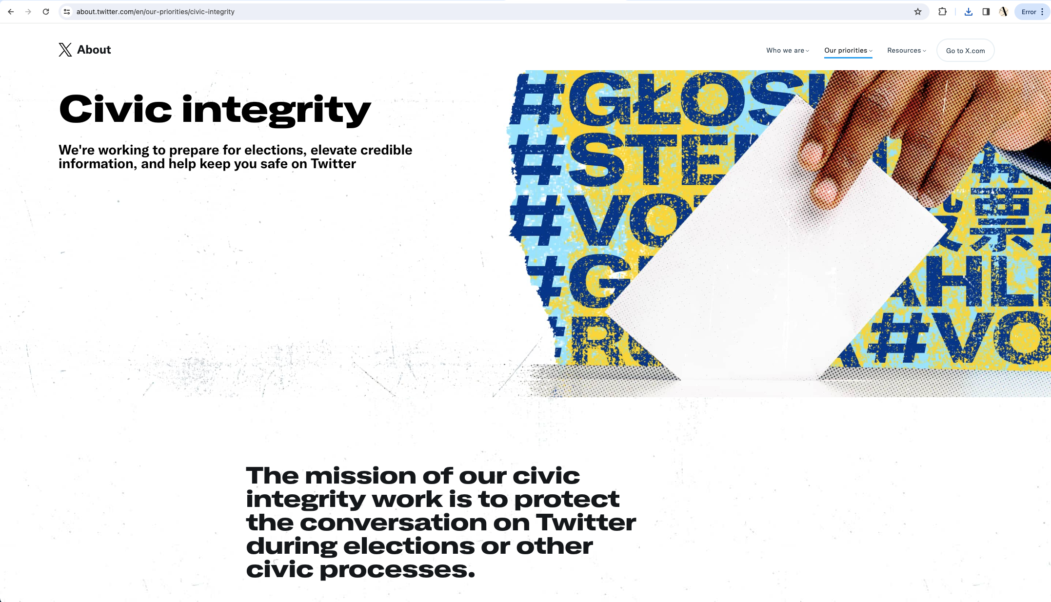
In July 2023, Twitter rebranded to X following a handful of tweets from Elon Musk. The iconic blue bird was replaced with a minimalist black and white “X” design and the domain was eventually changed to x.com, which Musk owned from his PayPal days.
The logic behind the rebrand was that Twitter was to become a platform that encompassed various functions beyond microblogging. Plus, Musk had a personal affinity for the letter X, as seen in SpaceX and X Holdings.
As you might expect, the decision did not go down well with users, with some referring to it as “the worst rebrand in tech history.”
We have a personal connection to old Twitter, having created the iconic anniversary graphics, so this particular rebrand hit us hard. To us, this rebrand marked a drastic change in Twitter from a fun place to catch up with friends to something a lot more shadowy and sinister.
The lesson learned:
Changing your logo, tagline, or brand colors is hard but achievable.
However, changing your name is a whole other story, especially when your original name is so entrenched in the lexicon of modern internet users.
The X rebrand hasn’t just annoyed and disenfranchised users but has led to a significant drop in brand equity, with the social network losing over $5 billion since the change.
A rebrand should always lead to an increase in profits, never a loss.
One of the reasons the X brand was so poorly received was that it felt rushed, with no communication about what was going to happen. As Orlando Baeza said: “Their brand identity went from feeling warm and welcoming to dark and members-only. And to top it off, this all happened overnight. Literally.”
When rebranding, it’s essential to plan ahead. Clear communication is vital—you need to explain why you’re rebranding and reassure customers that your values will stay the same. Dunkin’ Donuts did this when it rebranded to Dunkin’, testing the new branding at selected locations and introducing the new logo several months beforehand.
You need a buildup when you rebrand, whether that’s through social media, blogging, or a few well-placed spokespeople.
How to avoid your own branding failure
While there are bad rebrands out there, rebranding can be great for your business if you do it right.
For example, we recently talked about Mozilla refreshing its brand identity successfully, and we loved Hugo Boss’s bold and contemporary rebrand back in 2023.
We’ve looked at some ways you can avoid a branding fail of your own in this article but let us leave you with one final thought.
It pays to gather a range of perspectives before moving ahead with a rebrand, both from inside and outside your business. This can help you understand the impact of your rebrand and whether it’s the right approach.
Talk to customers, employees, and industry experts. Designers (like us!) are a great source of information too—they’ve been around and can tell you if your rebrand is a sensible idea.
Still not sure if your brand is due a refresh? Take this seven-question quiz!