
2020 was, to put it lightly, a wild ride. In some ways, it seemed like the world began to move a little slower — no more rushing to the office in the mornings or cramming our schedules full of social engagements. In other ways, things moved at a breakneck pace. People and businesses alike had to adapt overnight to constantly-changing regulations and market shifts. And the world of branding certainly wasn’t exempt from this rapid change. The natural fluctuation in preferences that happens over time combined with the extraordinary events of the past year led to some seriously innovative and cool branding trends in 2020.
We’ve highlighted a few of the most notable ones below, as well as insight into how they might evolve over the year to come — read on to get some inspiration for your own brand.
2020 Branding Trends
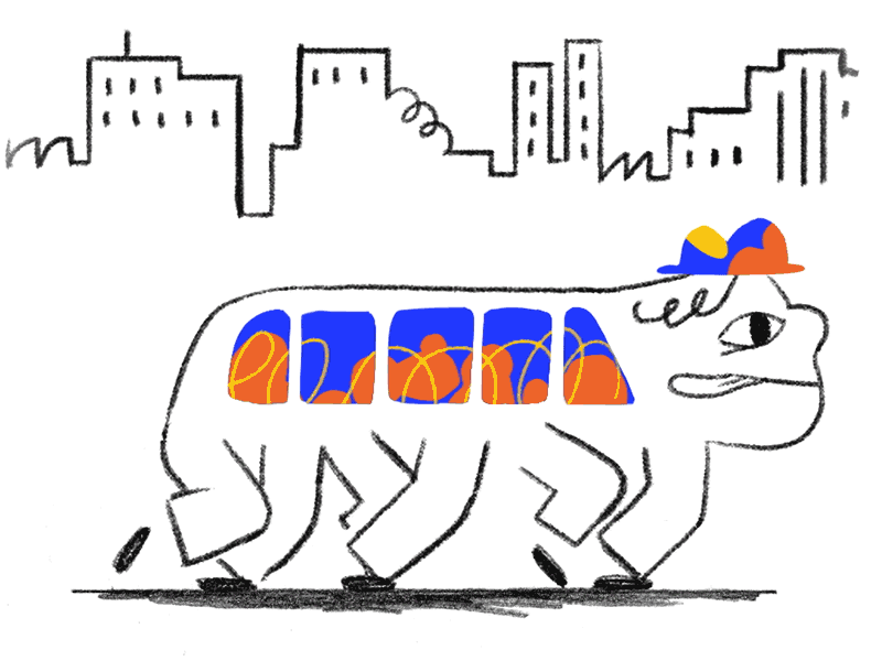
Making Flat Designs Pop
In the past few years, many brands have favored flat designs without any dimension, shadows, or perspective. While it’s still possible to see strong examples, it’s becoming harder to keep the no-depth look fresh. Brands are starting to play with this trend more, though, as they incorporate new elements to add an additional level of complexity to their 2D design.
One example I’ve been seeing a lot of is 2D images with moving elements, like this Instagram post from artist and photographer Brooke DiDonato. It can be tough to get right, though. Brittany Spears’ “Swimming in the Stars” visualizer, for example, falls flat due to how busy it feels.
Another trend in adding depth to 2D design is mixing geometric patterns with textured and perspective design so that it feels more dynamic. Here’s an example from Dropbox.
Mixed Typefaces
In 2013, branding was awash with sans-serif typefaces, many of which were all-caps with a very condensed letterform (Bebas Neue seemed like it was everywhere). In later years, brands moved onto rounder sans-serif typefaces, like the new Google logo. Today, fonts like those are still popular, but brands are now mixing them with serif typefaces as well, especially in brand identities.
One brand that does a great job exemplifying this trend is Hims, a direct-to-consumer men’s health company. Their logo is a serif typeface, but all of their digital typeface is sans-serif — a good choice, since serifs can be hard to read in small print. That being said, I think their all-neutral palette could use some updating. Let’s get some color pops in there!

To take serif fonts a step further, a lot of brands are using very thin stems and embellishments – something that will likely continue in the new year.

Non-Design
In the age of digital media, content can be created and published instantly, and brands are taking advantage of that. With so many companies creating content, however, it’s no longer a differentiator. To stand out from their competitors, brands have to publish more and more content at an ever-increasing rate. Because of this, designers must work within a constantly shrinking timeframe, which can put a lot of constraints on the creative process. Paradoxically, though, these creative constraints can often result in innovation.
Many brands are now taking a low-effort design approach, where they leverage tools like emojis, gifs, Instagram Creator Studio, and templates to create quick and easy designs. Frequently, these designs are composed of simple shapes, limited colors, and just a few typefaces.
Cove, a biodegradable water bottle company, is one example of a brand doing this look well. It’s super simple, but every element fits in and complements the others.

Retro Futurism
The design world always seems to be in love with the aesthetic from two decades before. Now that we’re in the 2020s, people have really begun to embrace the look of the 2000s — with a bit of a twist. Creatives are obsessed with nostalgia, but still dreaming of the future, which results in a unique retro-futuristic look that’s surreal and euphoric with lots of sparkle effects and glass type. This is especially present in digital media, like the example below from Fisk Projects.

Some brands are kicking it back even further, like Kin Euphorics, which combines a 70s feel with a modern flair.

The Natural Look
One silver lining of the COVID-19 pandemic is that it got people outside and helped inspire a renewed sense of appreciation for nature. A lot of brands seem to be acknowledging this with design that incorporates the outdoors and a more natural vibe. I’ve noticed this with a few recent commercials, such as this 90-second spot from Gucci or the More Nature campaign from Jeep.
I’m seeing more and more use of fuzzy and blurred imagery as well, which feels similarly organic.

Source: Mary Herbert
Today’s brands are very aware of the world we’re all living in, and acknowledging it — and even finding some beauty in it — allows them to connect with their audiences on a more personal level. Although a vaccine is on the horizon, it will probably be a while before we return to normal, so I don’t see this trend ending anytime soon.
Experiential Design
In a year where indoor gatherings are off-limits, a lot of companies found creative ways to reenact experiences in a digital format. And this wasn’t just limited to event-based businesses. Hulu came out with an awesome haunted house simulator called the Screamlands around Halloween (or, as they called it, Huluween).

Another experiential area more brands are leveraging is virtual reality (VR) and augmented reality (AR). Even the fashion world is adopting these technologies, with luxury brand Balenciaga recently announcing that their fall 2021 collection will debut in VR using avatars as models. AR is also taking off in popularity thanks to platforms like Spark AR studio for Instagram that make it more accessible. It’s bringing a lot of fun weirdness back to branding — check out this AR crossword puzzle filter The New York Times recently released.
As audiences become more comfortable with interactive experiences on websites and social media, my prediction is that brands will begin carrying it over to their native apps soon as well.
Playfulness
If there’s one thing we could use more of right now, it’s levity. Thankfully, companies all across the board have been stepping up to the plate. Brands seem to have loosened up a little bit on their guidelines, giving them the flexibility they need to succeed on more casual channels like social media. As a designer, this is exciting, because it allows you to play with a brand in all its different forms and craft a slightly tailored visual language for each.
In addition to brand design, this is also happening in brand messaging. Companies are embracing a more down-to-earth tone of voice, sometimes successfully (Dollar Shave Club does a great job of being casual, clear, and often entertaining) and sometimes not (Cosmopolitan tries a little too hard with all the slang and abbreviations).
This playfulness has even extended to data visualizations. Companies are going beyond bar graphs in brand colors to display data in interesting and unique ways, like this piece from creative studio Datalands.

Of course, these branding trends may not all be right for you — it’s much more important to embrace authenticity than whatever’s in the zeitgeist. But if you can figure out how to incorporate one or more in a way that feels true to your brand, you’ll be ahead of the curve in 2021.
Anastasia Salazar Ltd. is an independent design studio for tailored branding and digital designs. Reach out to learn how we can help you fuel growth and maximize your brand’s impact.