brand design

How to Choose Typography for Your Brand by Anastasia Salazar

ASL-Design-Blog-2021-Typography-for-branding_v1_Website.png

When people think of visual branding, the first things that come to mind are usually logos or colors. Typefaces, on the other hand, may come in at a distant third or lower. But even though they don’t always receive the same recognition that logos or colors do, typefaces play no less of an important role in branding — which is why it’s so important to learn how to choose typography for your brand.

Along with color and shapes, typefaces are one of the main building blocks of design. After all, nearly any application of your branding — your website, digital ads, packaging — will include copy. And if the typeface of that copy doesn’t complement the other elements of your visual brand identity, it can come off as amateur — like you haven’t put much thought into your design. Your audience may even struggle to get a feel for who you really are.

Choosing the right typeface isn’t just as simple as downloading the first free font you find, though — or at least it shouldn’t be. Below are a few things worth keeping in mind while you hunt for the perfect typeface.

First Things First

The key to selecting the right typeface is finding a match between the style of the lettering and the context in which it will be seen. Looking into a typeface’s history is a good place to start. A modern, high-performance athletic footwear company, for example, probably won’t want to use a typeface designed in the 17th century on their boxes. The connotation of the typeface is important as well — think about how traditional text in Times New Roman feels, or how juvenile Comic Sans looks. And don’t forget to consider the formal qualities of a typeface as well, like consistency and spacing. If you’re not a typography expert, this is where having a designer's help comes in handy!

Serif & Sans-Serif Typefaces

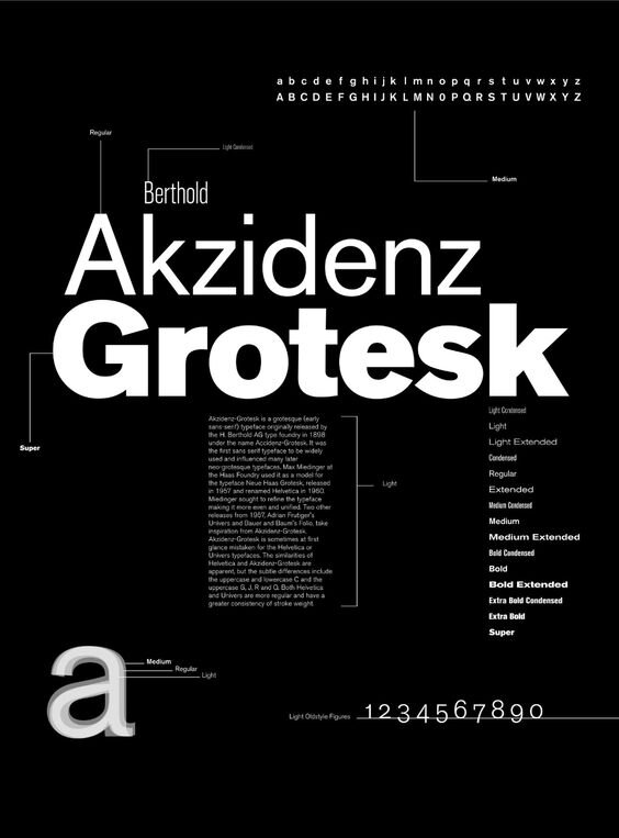
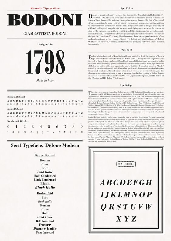
The two main categories that commercial typefaces fall into are serif and sans-serif. Serif typefaces are marked by small flourishes at the end of their strokes, while sans-serif typefaces don’t have them. Times New Roman is one of the most well-known serif typefaces, while Helvetica is a common sans-serif typeface.

Generally, serifs have more details and decorative embellishments, which can make them difficult to read at smaller sizes — so they’re usually not the best fit for body copy. You’re better off choosing a sans-serif typeface for that, and saving serif typefaces for larger text.

How Many Typefaces Should a Brand Have?

If you’re wondering how to choose typography for your brand, you might not be sure about how many different typefaces you’ll need. As a general rule, most brands choose two typefaces — one for titles and headers, and one for body copy. If you go this route, try to choose two that contrast one another so it’s easy to a) distinguish between them and b) understand the distinct roles they play. Choose two typefaces that are too similar, on the other hand, and they’ll clash and lose their purpose.

It’s possible to use only one typeface, though, as long as it’s flexible enough to be used in different applications. Try choosing a font with a few different weights to add a little more variety.

I rarely see brands with more than two typefaces. When you have a lot of different people touching your brand, it’s best to keep it simple to avoid confusion. I think you’d need a deep familiarity with typefaces and design to pull it off, but if you can, more power to you!

Where to Download Fonts

When thinking about how to choose typography for your brand, you'll almost certainly have to consider digital applications — there’s hardly a company out there anymore that doesn’t have some kind of internet presence. Then, you’ll have to decide whether you want to choose a cheaper (and sometimes even free) publicly-available font, or a bespoke one.

It wasn’t so long ago that people only used a handful of web fonts — remember when you would see Papyrus and Comic Sans everywhere? The past 10 years or so, though, have been somewhat of a typeface renaissance. Now, you can find a lot of high-quality fonts from Google and Adobe. But if you can afford it, I always prefer going with a custom-made font from a type foundry.

Custom-made fonts are so much more ownable, whereas if you use a publicly-available font, you run the risk of blending in with the hundreds or thousands of other businesses that have chosen the same one. Good type foundries put so much knowledge and detail into their work, which really allows you to stand out from the crowd.

5 Awesome Type Foundries Worth Checking Out

There are a lot of great type foundries out there, but a few of my favorites are:

1. Monkey Type

Design-blog-typography-1

Monkey Type is a cool, quirky type foundry with a strong portfolio of custom sans-serif fonts. I’m particularly fond of Banana Grotesk, a really flexible typeface that I could totally see being used for decades to come. Its minimalist style gives it a timeless look, and its readability makes it work well for either header or body copy.

2. Dinamo

Design-blog-typography-2

Dinamo is a Swiss type foundry that’s innovative in just about every sense of the word. They have a super fun, off-the-wall website, a really interesting licensing model, and of course, tons of cool typefaces. My favorite of theirs is Whyte — it has the most delicious cuts and a wide array of weights for all sorts of different use cases.

3. Acute Studio

Design-blog-typography-3

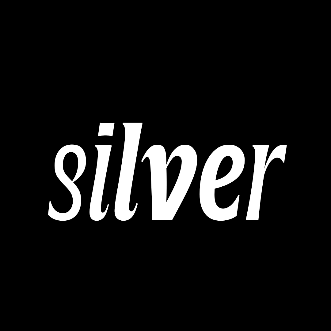
Acute Studio is a Netherlands-based type foundry founded by Diana Ovezea. I love how refined her typefaces feel — one of my favorites is Silverknife, a funky-but-elegant take on Copperplate Gothic. 

4. Sharp Type

Design-blog-typography-4

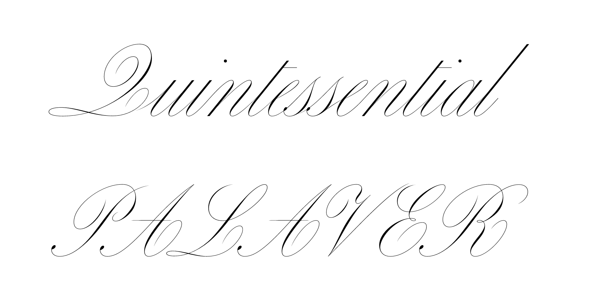
Sharp Type is a critically-acclaimed studio founded by Chantra Malee and Lucas Sharp. There's so much variety in their typefaces that it's hard to pick just one stand-out, but Carta Nueva is pretty dreamy — it’s almost enough to make me want to get it as a tattoo! There’s a great backstory behind it, too. The designer, My-Lan Thuong, shared that it’s “a digital re-imagination of a pointed-nib calligraphy model from 1851 in Barcelona, Spain” found at an antique fair in Madrid. How cool is that?

5. Jung-Lee Type Foundry

Design-blog-typography-5

You can tell that this Amsterdam-based foundry is one-of-a-kind from the minute you see their website. It has this surreal, retro, anti-design vibe that’s bizarre in the best way. You can even play around with the color, size, and weight of different typefaces with the type simulator on their homepage — I’m partial to Orbis, especially the italic weight with the beautiful ascenders.

Type foundries can be pretty male-dominated, so I love finding and supporting amazing women-owned studios. I’ve found a few different ones on Femmetype, an organization that celebrates women in type, and @womenintypography, an Instagram account that features womxn in type design.

Although they may not get the credit they deserve, typefaces are undoubtedly the dark horse of brand design. The right one can pull your entire brand identity together, while the wrong one can stick out like a sore thumb. And although it may still take some time before you find the perfect fit, you’re in a great position right now — learning how to choose typography for your brand is often the hardest part.

Anastasia Salazar Ltd. is an independent design studio for tailored branding and digital designs. Reach out to learn how we can help you fuel growth and maximize your brand’s impact.

4 Environmentally Conscious Brands to Celebrate This Earth Day by Anastasia Salazar

ASL-Design-Blog-2021-enviornmentally-conscious-brands_v1_Website.png

Even in the wake of a pandemic that has shaken the economy, sustainability is still at the top of consumers’ minds — a global survey from BCG found that 70% of respondents are more aware of the threat climate change poses now than before the pandemic, and 40% of respondents plan to integrate more sustainable behaviors in the future. On top of that, some studies have shown that sustainable companies are actually more profitable. Going green can be a big competitive advantage, and an increasing number of environmentally conscious brands are embracing it to the fullest.

But there are a lot of cliché, tired tropes when it comes to brand design for eco-friendly companies (think: green color palette, recycling symbols everywhere, brown paper packaging). That’s not to say you shouldn’t use any of those things, but if you use all or most without adding a twist, you can’t expect your brand to stand out. Do your eco-friendly branding well, on the other hand, and you can drive affinity for your company and benefit the planet, its people, and your profits.

Below are a few companies that are doing a particularly good job of highlighting their eco-friendly bona fides in a unique, creative, and appealing way — check them out to find some inspiration for your own brand.

Environmentally Conscious Brands to Watch

1. Prose

Prose, a Brooklyn-based company that offers personalized hair care, has an apothecary-like look that really stands out in their space. Their academic font and ingredient index feels intellectual and scientific, but not overwhelmingly so. They manage to balance their textbook vibe with a touch of warmth from their color palette and authentic portraits. The packaging looks almost like a prescription, but it’s still eye-catching enough to make you want to buy their products. They also do a great job of highlighting their environmental efforts without it being heavy-handed — as you scroll throughout the site, you can see the B Corp logo and find details on their earth-friendly ingredients and packaging.


2. Mutha

Skincare product company Mutha takes a much different approach, with a look that’s bold and brash. Their all-caps font, contrast-heavy photography, and metallic purple packaging make their branding hard to ignore — and it’s definitely not the kind you typically see with clean beauty products. In fact, it’s pretty hard to spot their eco-friendly shoutouts at all. They mention that their products are clean a few times throughout the site, but it’s really only on their FAQ and ingredients pages that you get details on their natural, (mostly) vegan, and often organic ingredients. With so many similar companies going all-in on an earthy visual style, Mutha really challenges the idea of what environmentally conscious brands can look like.


3. Buffy

Buffy, a bedding company that uses sustainable materials, has a really cool retro feel to their brand. And you can see it the second you open their website, thanks to their prominent chunky 70s-inspired typeface. Their lettering is so big and fluffy it looks like you could sleep on it. They feature the natural materials they use prominently on their site, and share their sustainability practices on their mission page. There, Buffy highlights not only their responsible materials but also their carbon offset program, donated returns policy, and even a detailed timeline on how they’re working to close the loop in the next 10 years — proving that their eco-friendly branding is more than just talk.


4. Girlfriend Collective

Girlfriend Collective first debuted with leggings made out of recycled plastic, but they have since started manufacturing clothing and accessories of all kinds: dresses, windbreakers, bras, scrunchies… they even make laundry bags and washing machine filters to catch microfibers from their recycled plastic before it ends up in the ocean. They have a super soothing neutral color palette, a big trend in the direct-to-consumer space, but they manage to make it their own by pairing it with a 70s-inspired serif typeface that has a bit of gothic flair. I love how much diversity they have in their models, too. You see bodies of every shape and size and disabled folks as well — one of their models was a Special Olympics gymnast with Down syndrome. They’re really transparent about their processes, too, from why their products are made in Vietnam instead of the U.S. to instructions for recycling them. From top to bottom, Girlfriend Collective makes you feel good about supporting them.

Walking the Walk

While there are lots of great environmentally conscious brands today, there are also a number of companies that try and capitalize on green trends without doing the necessary work to back it up — a practice referred to as greenwashing. One time, for example, I found out that a company using brown paper in their packaging — which usually indicates natural, unrefined paper — was actually standard white treated paper that had been dyed brown. While it may seem like a quick win at the time, your audience will probably discover that you’re not practicing what you preach at one point or another — and that kind of scandal can pose an existential threat to your company. So if you are going to brand yourself as eco-friendly, make sure it’s not just hot air.  

There are a ton of different ways you can embrace green practices at your company that will help make sure your environmental footprint lines up with your branding. Here are just a few ideas:

  • Use sustainable materials in your products. You may even want to go the extra mile and detail how you source and process them. Transparency builds trust!

  • Use eco-friendly packaging and shipping materials, like cardboard, unrefined paper, cornstarch packing peanuts, aluminum containers instead of plastic, etc.

  • Look into becoming a B Corporation, a certification given only to companies that meet high environmental and social good standards.

  • Support small, local vendors whenever possible. Shorter distance traveled means fewer CO2 emissions.

  • Offer a recycling or repair program. The more you reuse and recycle, the fewer virgin materials have to be created.

It’s great to highlight green practices like these if you employ them, but make sure it doesn’t sound too much like you’re patting yourself on the back. No brand is perfect, after all, but you should always be striving to improve. 

With climate change and environmental damage already impacting the world, it’s important for companies to act fast. The good news is once you do, it can have a ripple effect, inspiring other organizations to follow suit and individuals to be more sustainable in their everyday lives. While environmentally conscious brands may not be able to save the planet alone, green business practices and branding helps amplify the climate conversation we need to effect change.

Anastasia Salazar Ltd. is an independent design studio for tailored branding and digital designs. Reach out to learn how we can help you fuel growth and maximize your brand’s impact.

The Top Branding Trends of 2020 — & What to Expect in 2021 by Anastasia Salazar

2020 was, to put it lightly, a wild ride. In some ways, it seemed like the world began to move a little slower — no more rushing to the office in the mornings or cramming our schedules full of social engagements. In other ways, things moved at a breakneck pace. People and businesses alike had to adapt overnight to constantly-changing regulations and market shifts. And the world of branding certainly wasn’t exempt from this rapid change. The natural fluctuation in preferences that happens over time combined with the extraordinary events of the past year led to some seriously innovative and cool branding trends in 2020.

We’ve highlighted a few of the most notable ones below, as well as insight into how they might evolve over the year to come — read on to get some inspiration for your own brand.

2020 Branding Trends

Making Flat Designs Pop

In the past few years, many brands have favored flat designs without any dimension, shadows, or perspective. While it’s still possible to see strong examples, it’s becoming harder to keep the no-depth look fresh. Brands are starting to play with this trend more, though, as they incorporate new elements to add an additional level of complexity to their 2D design.

One example I’ve been seeing a lot of is 2D images with moving elements, like this Instagram post from artist and photographer Brooke DiDonato. It can be tough to get right, though. Brittany Spears’ “Swimming in the Stars” visualizer, for example, falls flat due to how busy it feels.

Another trend in adding depth to 2D design is mixing geometric patterns with textured and perspective design so that it feels more dynamic. Here’s an example from Dropbox.

dropbox-illustration-texture-geometric-patterns

Mixed Typefaces

In 2013, branding was awash with sans-serif typefaces, many of which were all-caps with a very condensed letterform (Bebas Neue seemed like it was everywhere). In later years, brands moved onto rounder sans-serif typefaces, like the new Google logo. Today, fonts like those are still popular, but brands are now mixing them with serif typefaces as well, especially in brand identities.

One brand that does a great job exemplifying this trend is Hims, a direct-to-consumer men’s health company. Their logo is a serif typeface, but all of their digital typeface is sans-serif — a good choice, since serifs can be hard to read in small print. That being said, I think their all-neutral palette could use some updating. Let’s get some color pops in there!

hims-website.png

To take serif fonts a step further, a lot of brands are using very thin stems and embellishments – something that will likely continue in the new year.

crane-serif-typeface-rebrand.png

Non-Design

In the age of digital media, content can be created and published instantly, and brands are taking advantage of that. With so many companies creating content, however, it’s no longer a differentiator. To stand out from their competitors, brands have to publish more and more content at an ever-increasing rate. Because of this, designers must work within a constantly shrinking timeframe, which can put a lot of constraints on the creative process. Paradoxically, though, these creative constraints can often result in innovation.

Many brands are now taking a low-effort design approach, where they leverage tools like emojis, gifs, Instagram Creator Studio, and templates to create quick and easy designs. Frequently, these designs are composed of simple shapes, limited colors, and just a few typefaces. 

Cove, a biodegradable water bottle company, is one example of a brand doing this look well. It’s super simple, but every element fits in and complements the others.

nondesign-cove.png

Retro Futurism

The design world always seems to be in love with the aesthetic from two decades before. Now that we’re in the 2020s, people have really begun to embrace the look of the 2000s — with a bit of a twist. Creatives are obsessed with nostalgia, but still dreaming of the future, which results in a unique retro-futuristic look that’s surreal and euphoric with lots of sparkle effects and glass type. This is especially present in digital media, like the example below from Fisk Projects.

2020-design-trends-evolution-branding-aluna-george

Some brands are kicking it back even further, like Kin Euphorics, which combines a 70s feel with a modern flair.

retrofuturism-2.png

The Natural Look

One silver lining of the COVID-19 pandemic is that it got people outside and helped inspire a renewed sense of appreciation for nature. A lot of brands seem to be acknowledging this with design that incorporates the outdoors and a more natural vibe. I’ve noticed this with a few recent commercials, such as this 90-second spot from Gucci or the More Nature campaign from Jeep.

I’m seeing more and more use of fuzzy and blurred imagery as well, which feels similarly organic.

the natural look.png

Source: Mary Herbert

Today’s brands are very aware of the world we’re all living in, and acknowledging it — and even finding some beauty in it — allows them to connect with their audiences on a more personal level. Although a vaccine is on the horizon, it will probably be a while before we return to normal, so I don’t see this trend ending anytime soon. 

Experiential Design

In a year where indoor gatherings are off-limits, a lot of companies found creative ways to reenact experiences in a digital format. And this wasn’t just limited to event-based businesses. Hulu came out with an awesome haunted house simulator called the Screamlands around Halloween (or, as they called it, Huluween).

experiential-design.png

Another experiential area more brands are leveraging is virtual reality (VR) and augmented reality (AR). Even the fashion world is adopting these technologies, with luxury brand Balenciaga recently announcing that their fall 2021 collection will debut in VR using avatars as models. AR is also taking off in popularity thanks to platforms like Spark AR studio for Instagram that make it more accessible. It’s bringing a lot of fun weirdness back to branding — check out this AR crossword puzzle filter The New York Times recently released.

As audiences become more comfortable with interactive experiences on websites and social media, my prediction is that brands will begin carrying it over to their native apps soon as well. 

Playfulness

If there’s one thing we could use more of right now, it’s levity. Thankfully, companies all across the board have been stepping up to the plate. Brands seem to have loosened up a little bit on their guidelines, giving them the flexibility they need to succeed on more casual channels like social media. As a designer, this is exciting, because it allows you to play with a brand in all its different forms and craft a slightly tailored visual language for each.

In addition to brand design, this is also happening in brand messaging. Companies are embracing a more down-to-earth tone of voice, sometimes successfully (Dollar Shave Club does a great job of being casual, clear, and often entertaining) and sometimes not (Cosmopolitan tries a little too hard with all the slang and abbreviations).

This playfulness has even extended to data visualizations. Companies are going beyond bar graphs in brand colors to display data in interesting and unique ways, like this piece from creative studio Datalands.

datalands-playfulness.png

Of course, these branding trends may not all be right for you — it’s much more important to embrace authenticity than whatever’s in the zeitgeist. But if you can figure out how to incorporate one or more in a way that feels true to your brand, you’ll be ahead of the curve in 2021.

Anastasia Salazar Ltd. is an independent design studio for tailored branding and digital designs. Reach out to learn how we can help you fuel growth and maximize your brand’s impact.