

Sandy is a freelance management platform designed to help companies find, manage, and pay teams of expert freelancers all in one place. They reached out to us to help design the talent side of their SaaS platform and go to launch. We first worked on a UI style guide to help define their digital aesthetic and create a system that would allow the platform to be quickly made and easily scale.
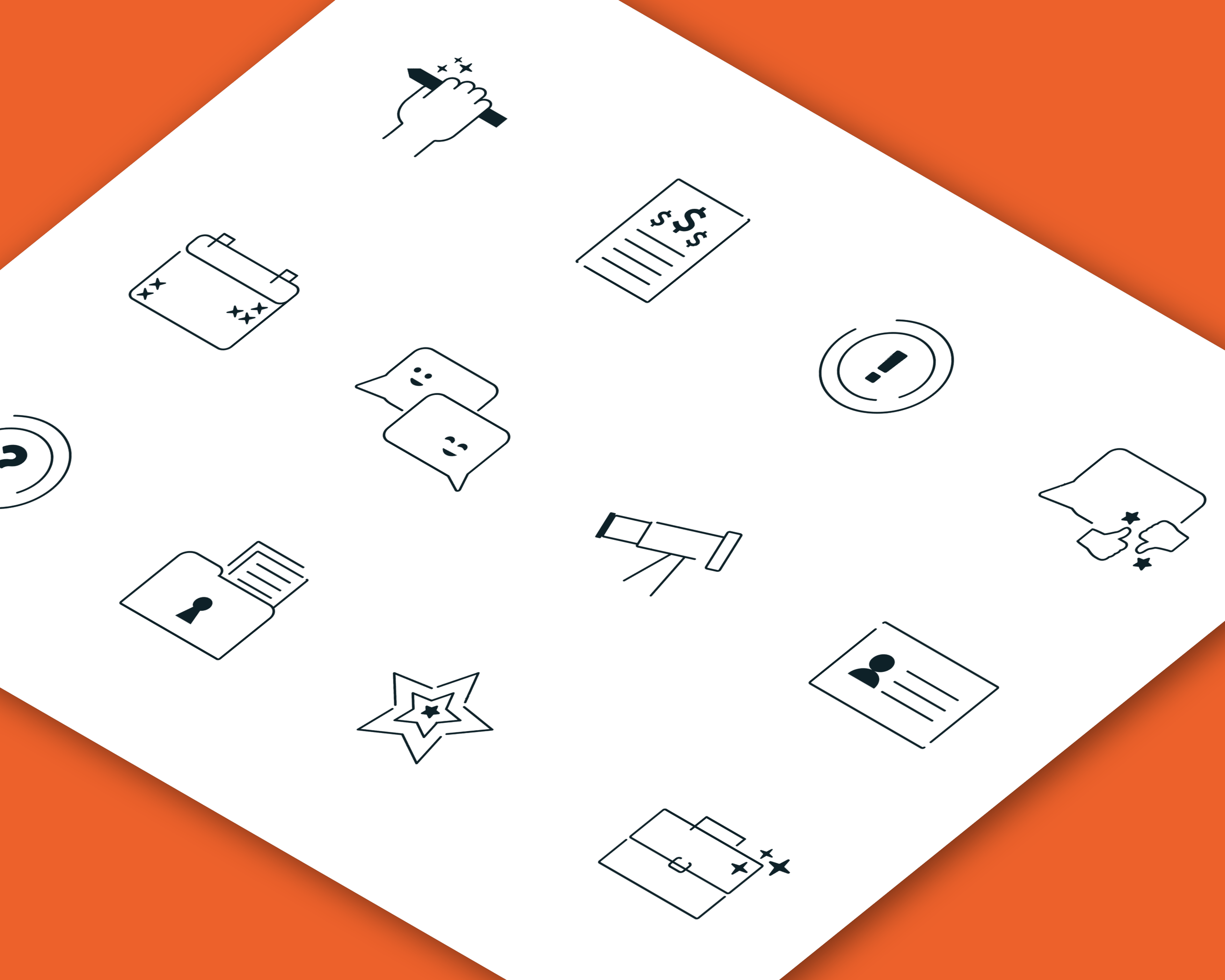
For their look and feel, we wanted to match their messaging which was edgy, quippy and a modern tone of voice and felt authentic to their team. However, their past visuals had a very safe, corporate feel that felt disjointed. To make the visuals more cohesive, we expanded their color palette to include a bright variety of tones and introduced a photography style that focused on the users but in as style that gave a nod to Sandy’s ad agency side of the business— with flash photography and bold compositions. We also wanted to show a mix of personal/human in contrast with a digital look since Sandy’s product is part freelance community and part state of the art team building technology. One way we showed this was through the mix of typefaces, one being more expressive and quirky and the other being more uniform and common for websites (in digital places). Another way we showed this was through a custom icon set that had playful faces, and decorative embellishments included while still being instantly legible.
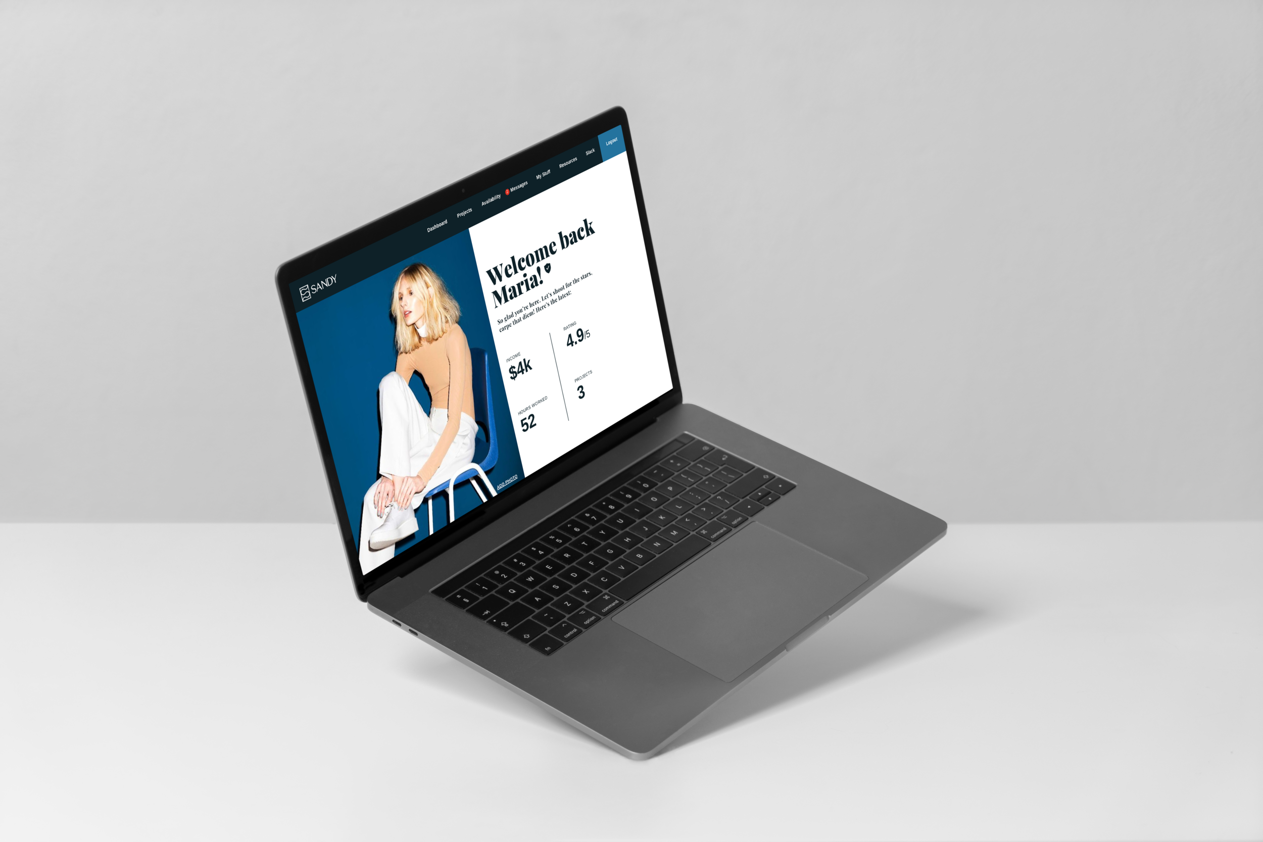
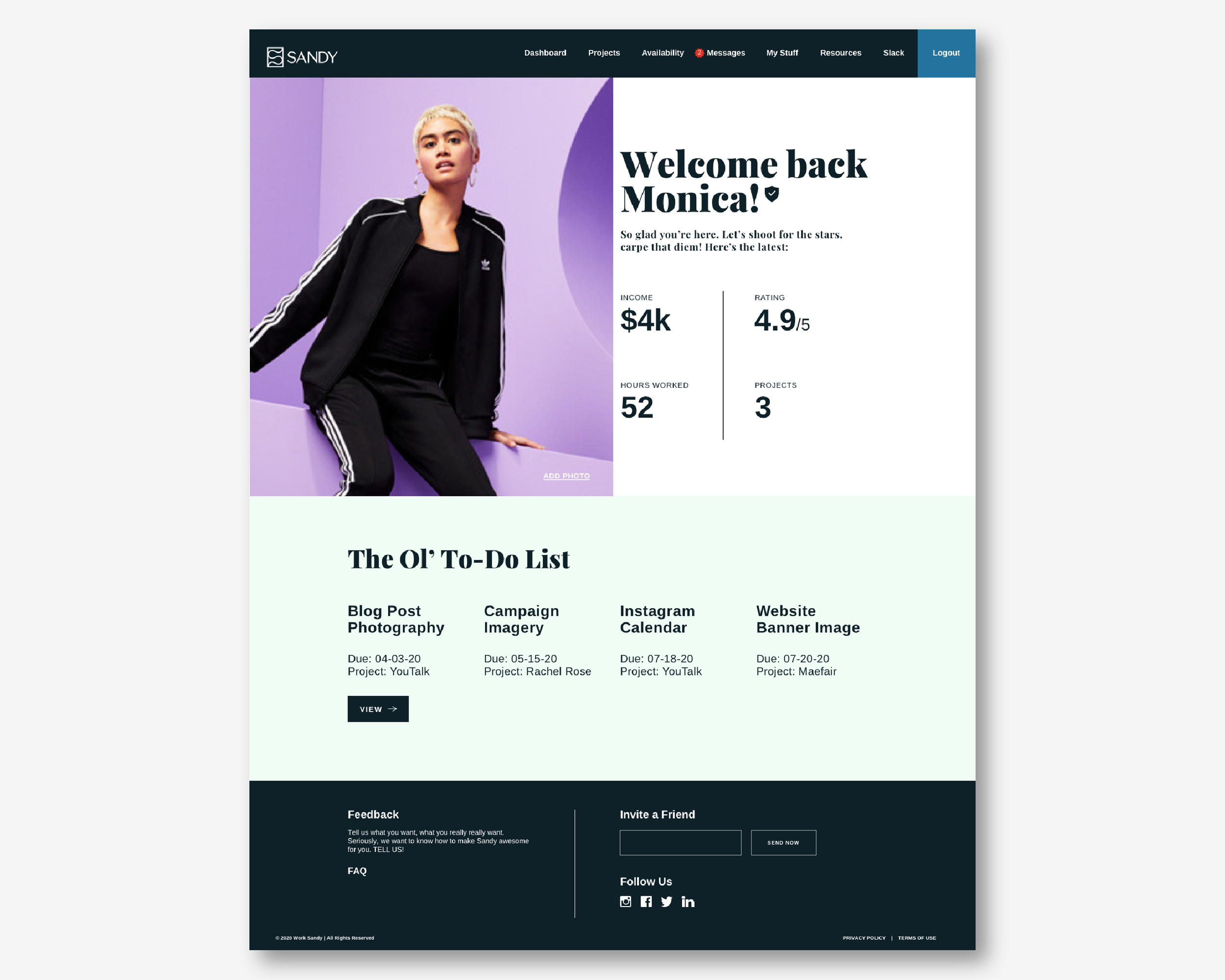
Once their UI style guide was done, we moved onto the platform design. Sandy was on a tight budget and timeline and was looking for a truncated UI design process to meet the realistic circumstances. We took their written content outlines and created templates based on grouped information before applying the templates across all talent user pages. Above are a few examples of some of the page designs. The main goals as a talent user was to be able to create a profile, check on project statuses and get paid. Our design allowed these functions to be as easily accessible as possible with a simple and minimal layout, while adding some moments of delight through messaging and visuals.
The end result was an agile and modern platform that worked for Sandy’s limitations and future plans of expanding while still highlighting their people based approach and high-tech software.
May 2020
