
A rebrand is serious business. You must do the hard work of starting with an audit and planning your next moves carefully with the right partner by your side.
RELATED: How to Kick Off a Rebrand or Brand Refresh
It requires thoughtful consideration of the desired brand identity, messaging, positioning and how it’s all executed. If this sounds like a lot, the good news is that when done correctly, you can push the refresh button on your brand in just the way you wanted. If you’re wondering what the end results might look like once the work is done, we’ve got a few company rebranding examples to paint the picture. Here are some rebrands to learn from.
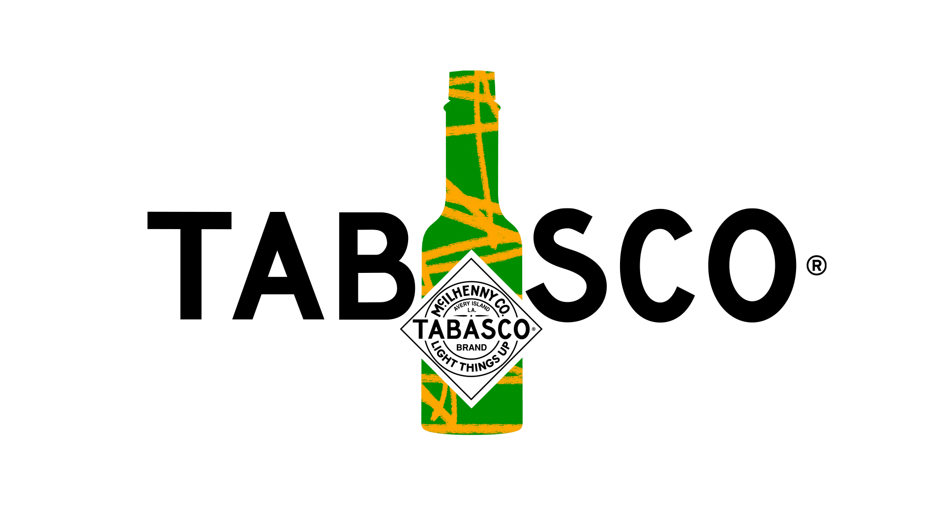
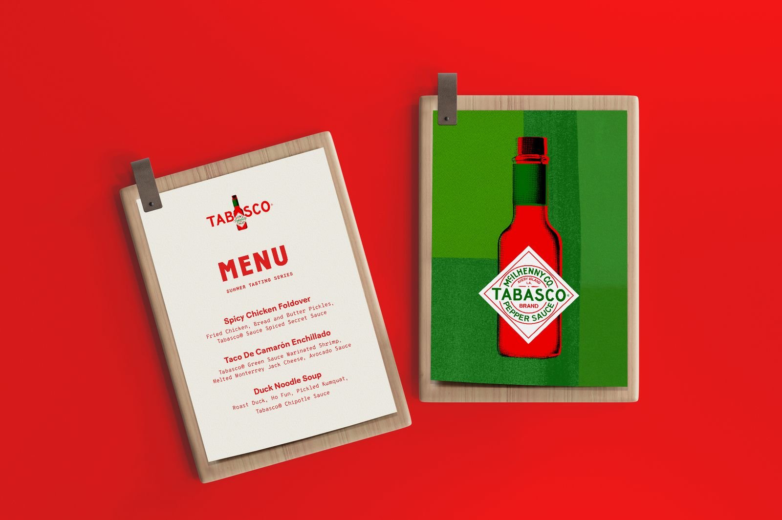
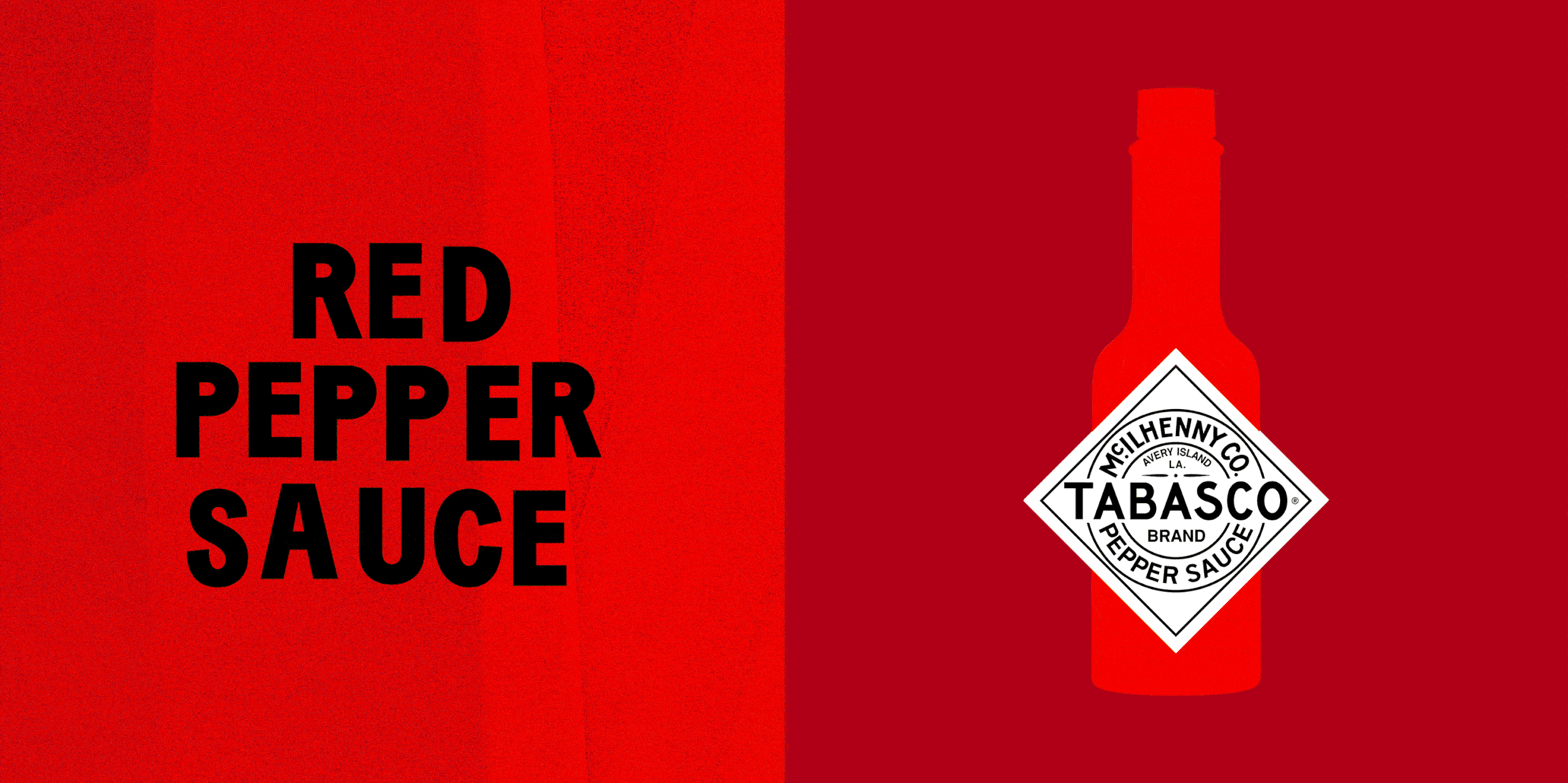
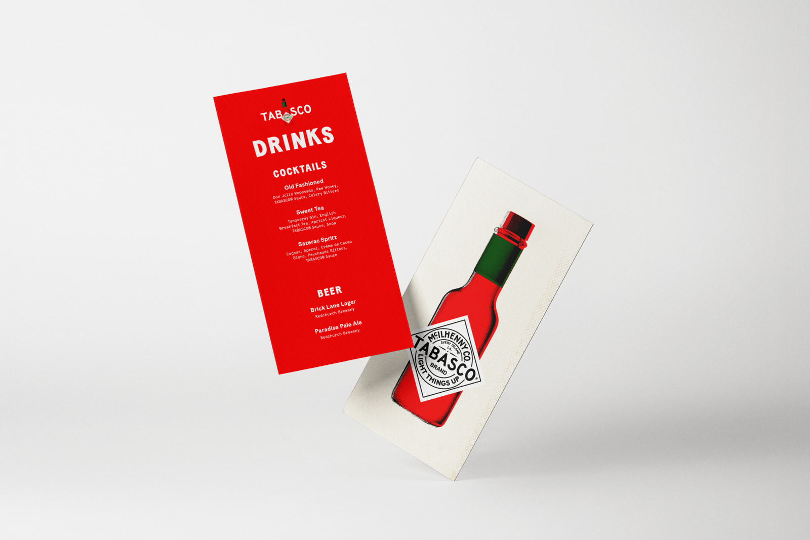
Tabasco
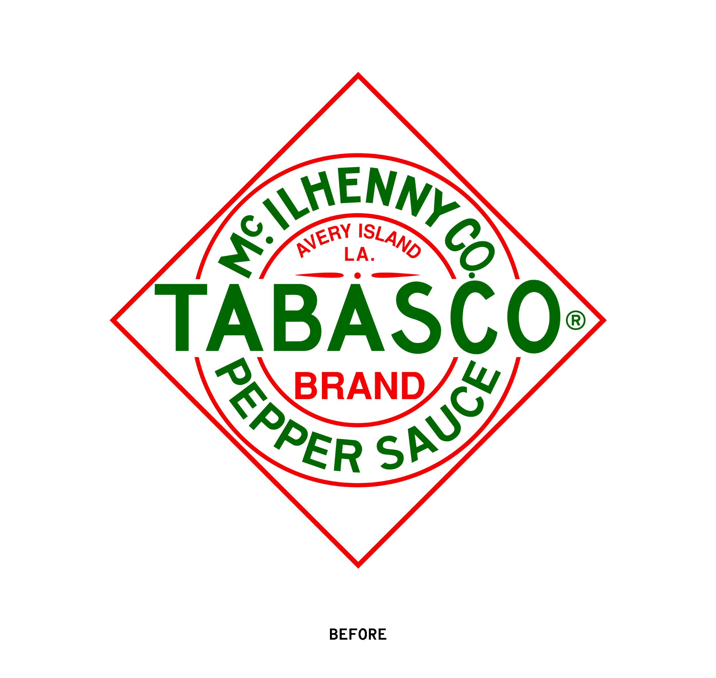
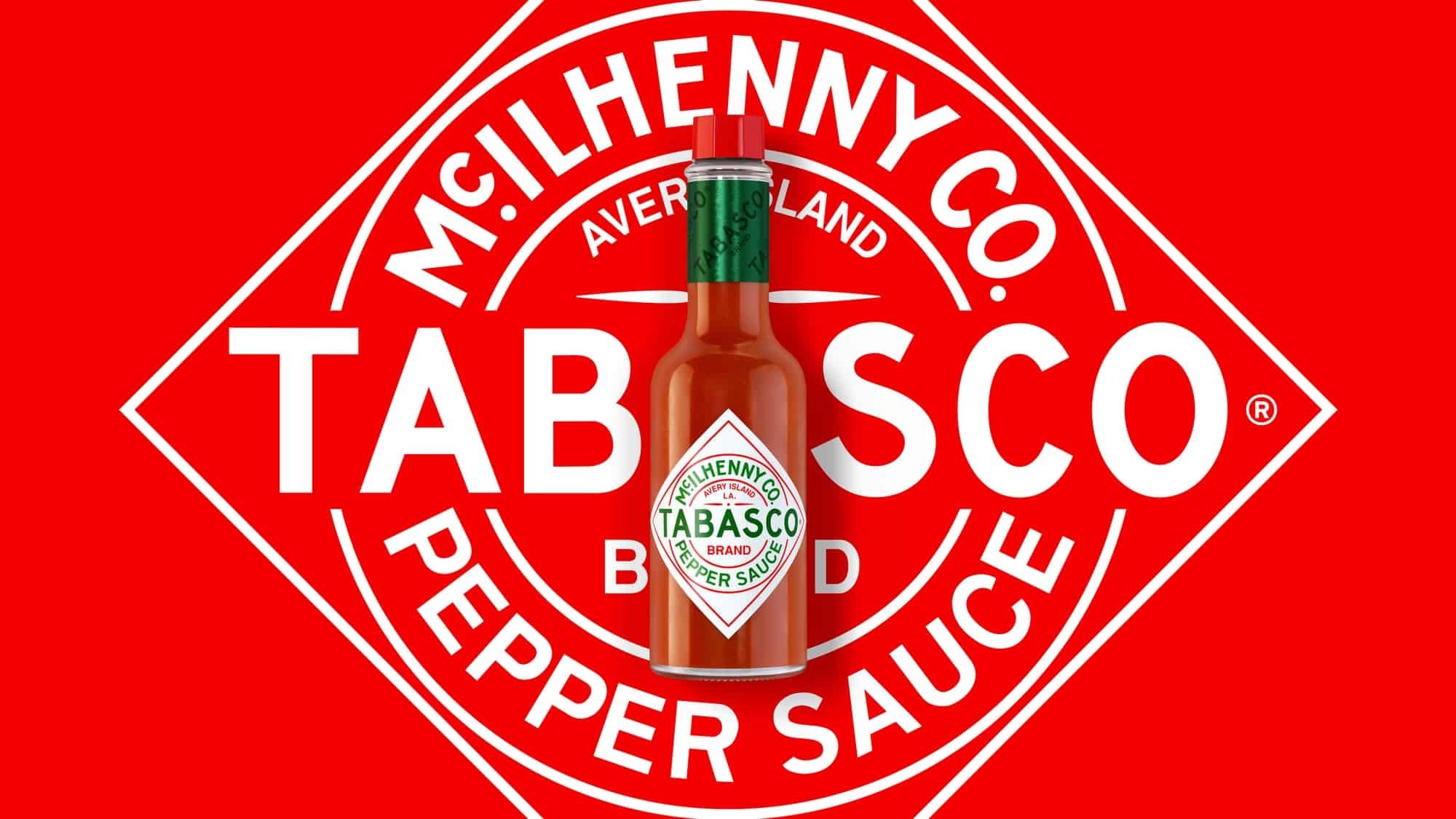
When you consider the iconic status of The Hot Sauce, Tabasco presents a challenge that is entirely unique among our company rebranding examples. The packaging of Tabasco is an immediately recognizable one, having remained constant since 1927. With its classic diamond label and red tops, the bottle has a look that is well-loved and famously recognized.
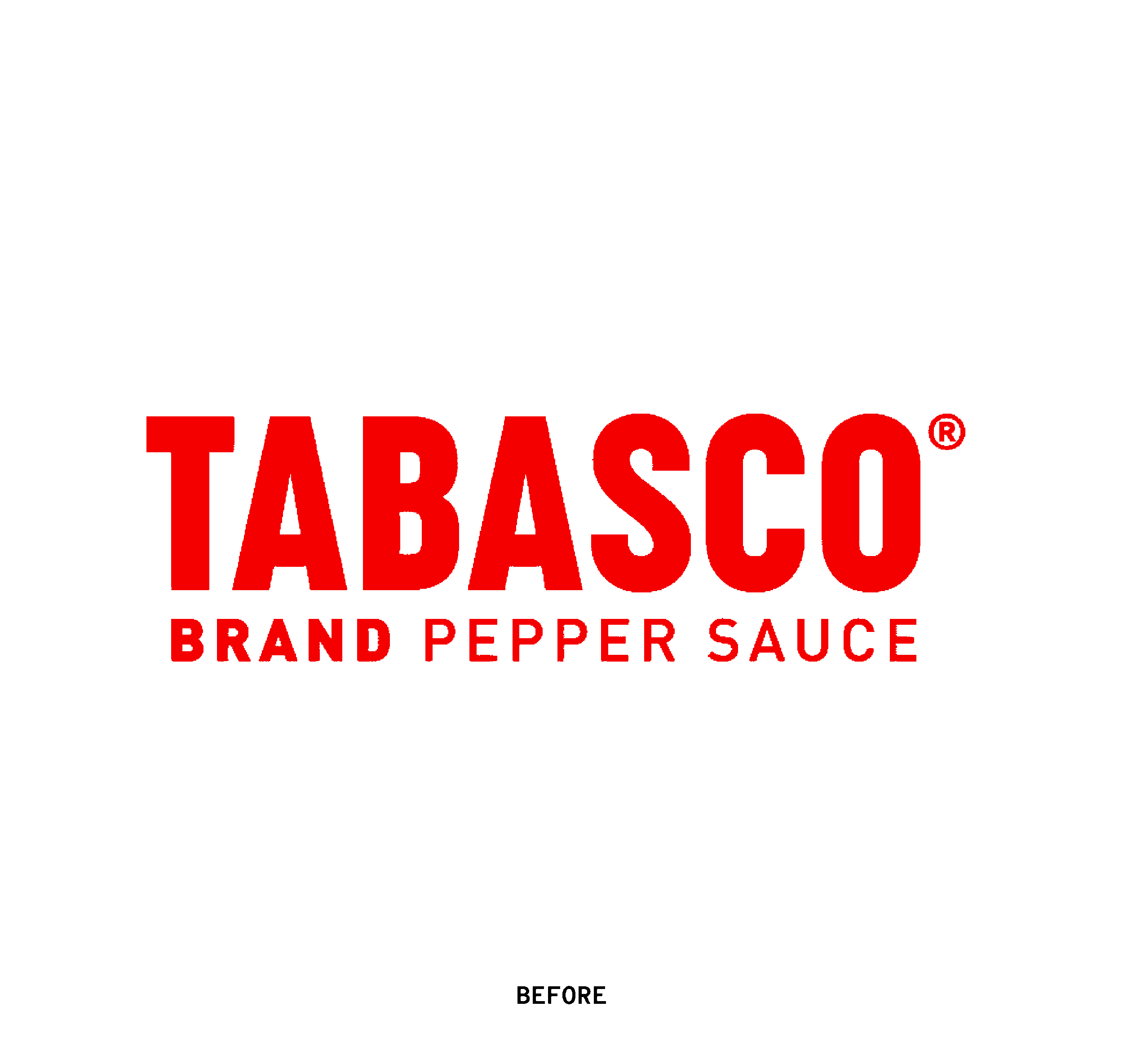
Breathing fresh air into the design while keeping the recognizable brand intact, Mrs&Mr struck the balance of striking design and tradition. Rather than reinventing a beautiful logo, the color palette and typography were given a subtle bright and modern revamp, bringing a vibrance that spoke to their tagline of “light things up.”
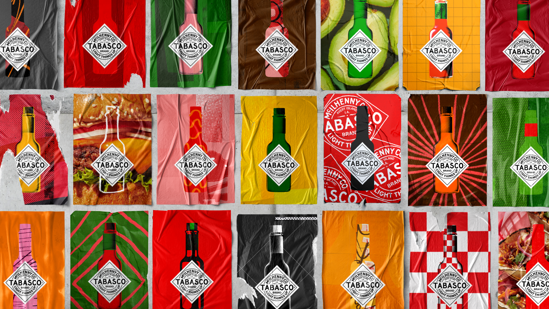
The rebrand came with a flexible visual system of the bottle in and against various hand-drawn illustrations, high-contrast photos, and bold backgrounds, all bringing excitement akin to the exciting flavors of Tabasco. With such vibrant visual features, you could practically taste the synergy of Tabasco with a variety of foods. Key in all of this was that Tabasco remained mindful of its identity as a food company. All the improvements maintained an appetizing and clean aesthetic, even with some of the modern, and at times, grungier backgrounds.
Meta
Introducing a merging of apps and the rise of the metaverse, Meta came to be in 2021. Bringing Facebook, Instagram, Whatsapp, Oculus, and more under one metaverse-led roof, the new brand was meant to connect online experiences to the physical world. Moving beyond Facebook into realms of VR (virtual reality) with Oculus among other acquisitions, the rebrand was strategically necessary.
With the modern consumer being concerned with data privacy and invasiveness of technology, however, the introduction of Meta was a touchy task. In a video that did little to soften and reassure consumers of the positive aspects of the metaverse, Zuckerberg presented stiff and awkward. Beyond dragging on for more than an hour, the video was not successful in finding the middle ground between cutting-edge and approachable. Ultimately, the storytelling fell short of Meta’s ambitious goals.
While the video storytelling overall felt a bit impersonal, some of the benefits of Meta were called out in the video, such as bringing intimacy between parents and children calling from afar, and the feeling of being in the room with your colleagues during virtual meetings.
Meta is among the company rebranding examples that teaches us some of the things to avoid in a rebrand. Ultimately, its visual identity fell a bit flat in comparison to its desired positioning at the forefront of the “next chapter for the internet.” With the underwhelming flat logo, and blue gradients and geometric shapes used in the branding of many tech companies, it was less than exciting for the trailblazing vision it hoped to convey.
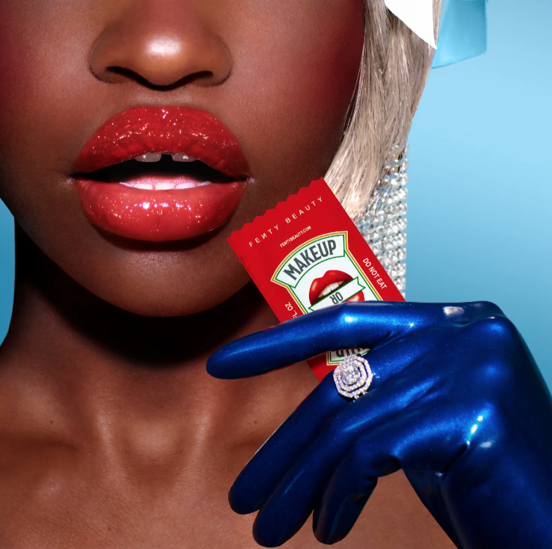
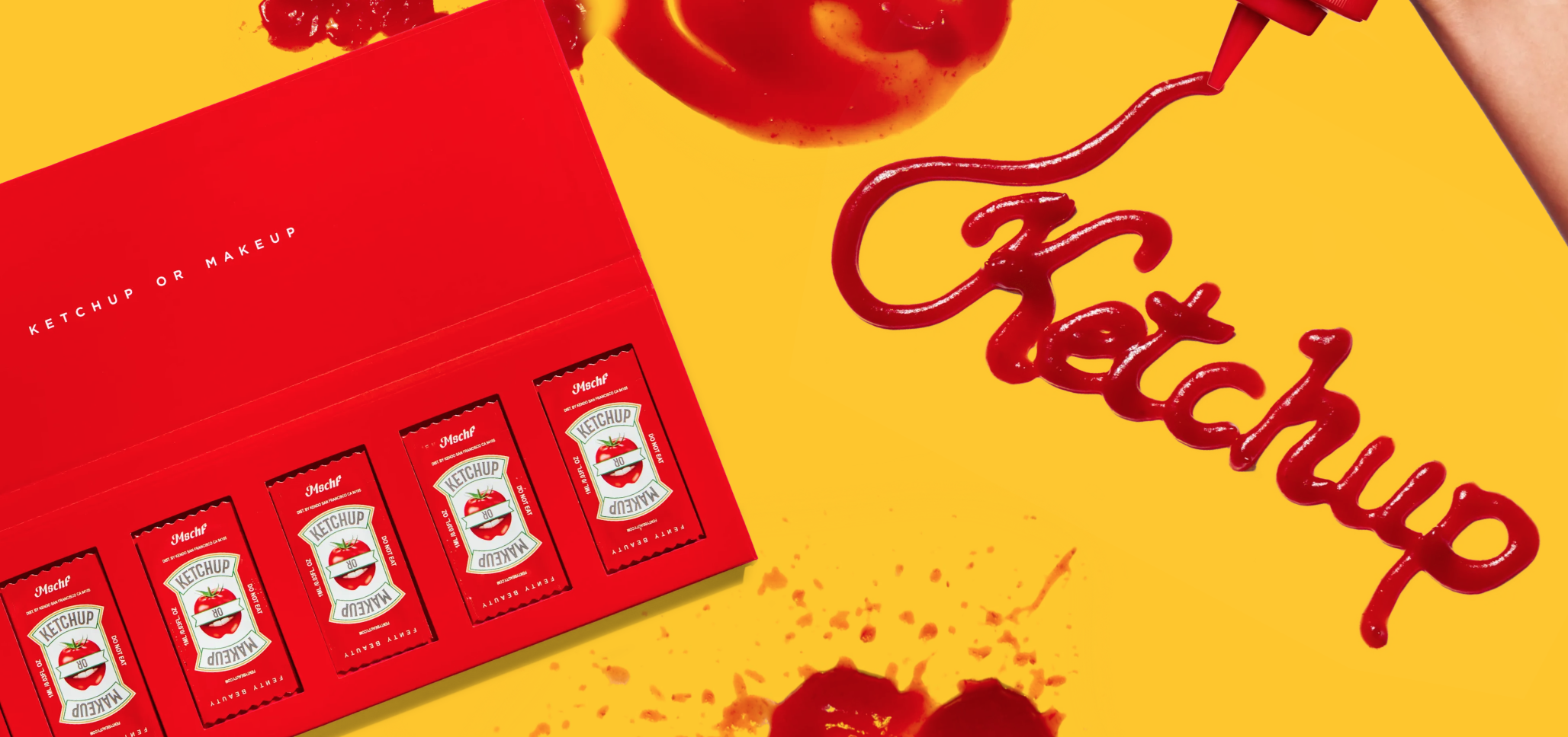
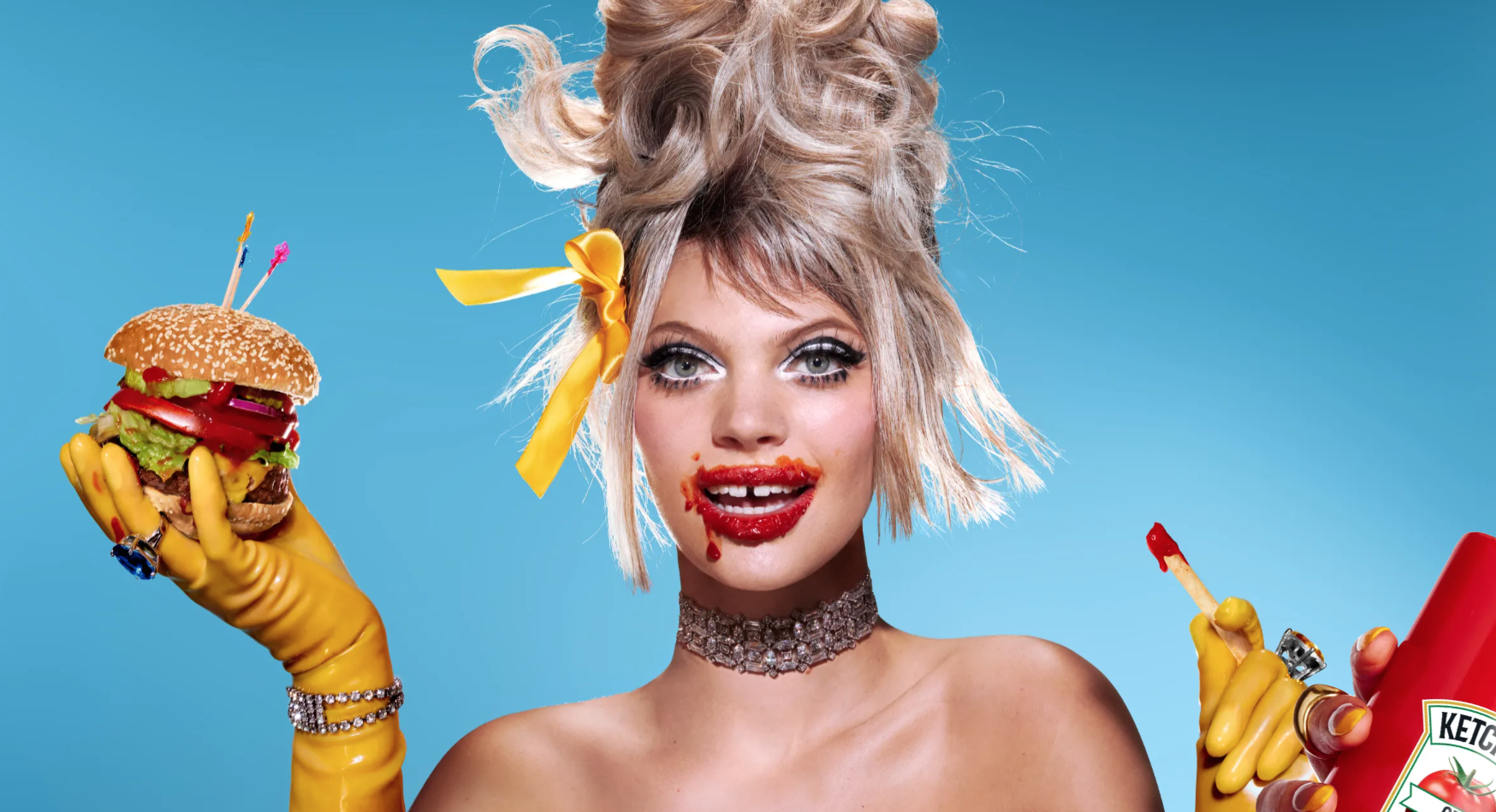
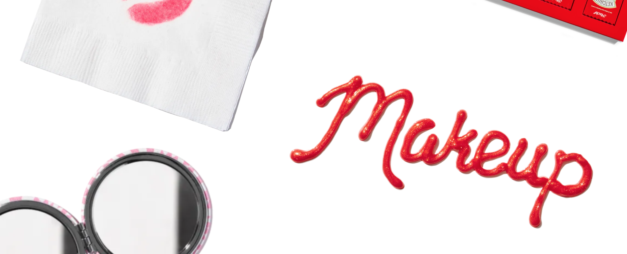

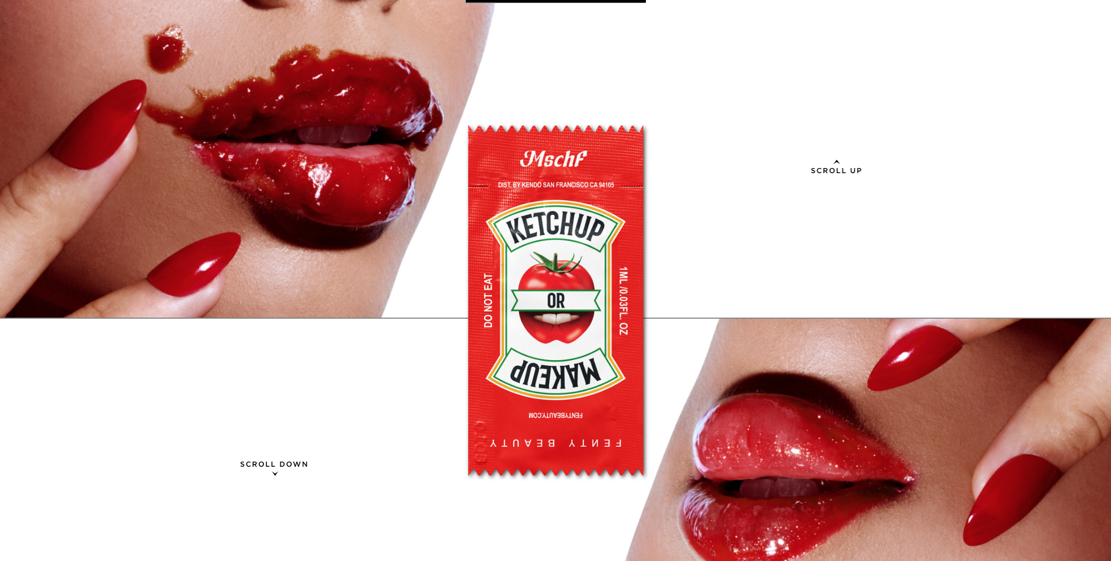
Ketchup or Makeup
Mschf, an art collective that sells ideas more than the products themselves, teamed up with Rihanna’s Fenty Beauty to create a campaign called Ketchup or Makeup. With both Rihanna and Mschf fostering a love for, well, mischief, the collaboration boosted the spirit of the two entities in an entirely avant garde way. Although this isn’t a rebranding per se, this co-branding between Fenty and Heinz demonstrated the exponential power of two companies with similar vision.
The Ketchup or Makeup product was succinctly named, as consumers were meant to buy a mystery box of 6 packets containing ketchup or Fenty Beauty’s Gloss Bomb. With a playful twist on the classic Heinz ketchup packets, the consumer was made to think about two entirely different products in a simultaneously connected and separate way. Immediately from the landing page, the consumer was faced with the push and pull of the two entities in the split screen and sleek design. By turning the ideas of ketchup and lip gloss on their heads, the resulting concept dug deeper than sales.
Even though the product was more of an artful experience than the sum of its parts, the website clearly explained what you got with a purchase (an action that was also clearly displayed with a “buy” button), showing the box, the packets, and its contents. The result was an entirely unique experience/product with endless potential for starting conversations and growing into a social experience among friends.
The Takeaway
Exciting as a rebrand may be, it’s a hefty task pivoting the direction of your company. It goes beyond finding the right typography or logo, and into the business of conveying that big shining idea that brought you here in the first place. Here are some lessons from this rebrand roundup:
Tabasco: When you’ve got good bones, work with them. No need to start from zero just because you’re rebranding.
Meta: Playing it too safe can be counterproductive to your big, bold ideas!
Ketchup or Makeup: Explore those creative, playful, and unconventional concepts. They can pay off big time.
With the right rebranding inspiration from real company rebranding examples, you’re well on your way to get that special idea of yours across.
Anastasia Salazar Ltd. is an independent design studio for tailored branding and digital designs. Reach out to learn how we can help you fuel growth and maximize your brand’s impact.