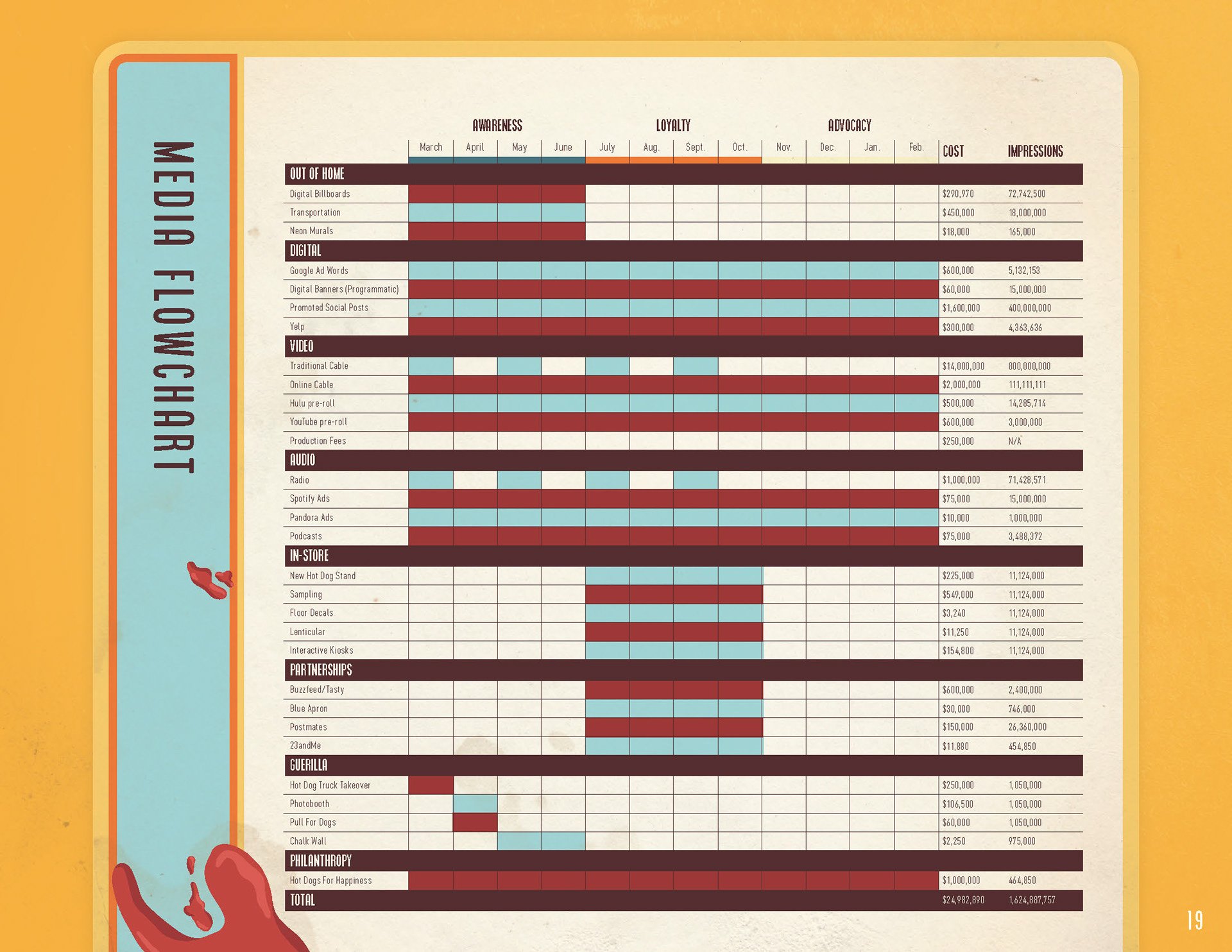
If you can immediately associate McDonald’s with its classic yellow and red, or Tiffany & Co.’s exact shade of robin’s egg blue, you’ve already experienced the heady impact of color on branding firsthand. But these effective branding color palettes don’t often occur by sheer strokes of luck. Color palette methodology can help you pick the colors that not only look good together, but also support your branding goals.
What is Color Palette Methodology?
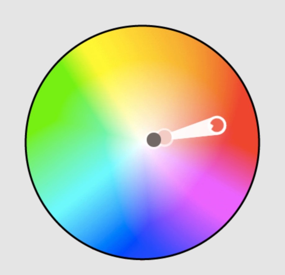
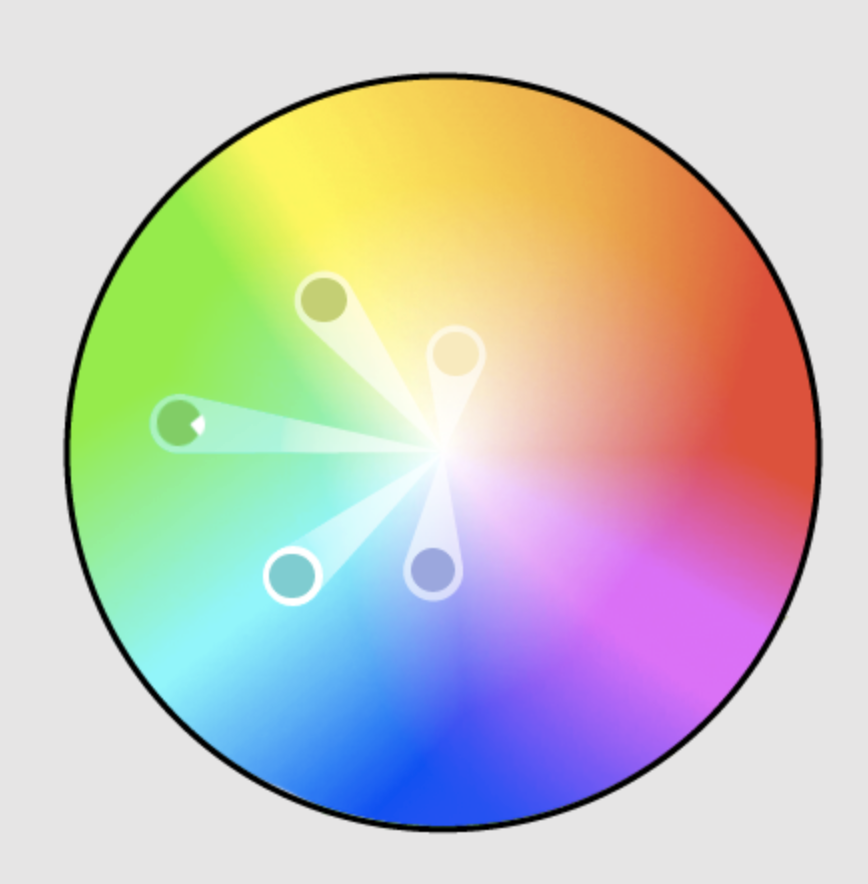
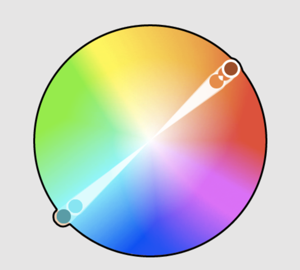
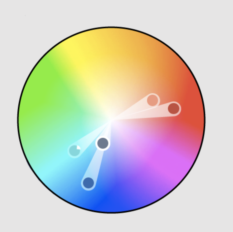
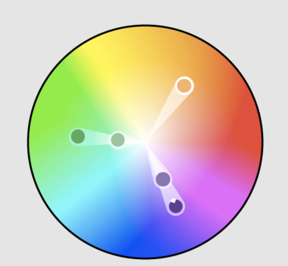
Color palette methodology uses the color wheel (a 1666 invention by Isaac Newton), to guide the choosing of colors for a harmonious palette. There are 7 major types of color palette methods, which are most effectively shown using a color wheel due to its visual ability to show the relationships between colors. While rules can always be broken of course, these methods are guiding principles behind colors that will most likely work best together.
How Does it Affect Branding and Design?
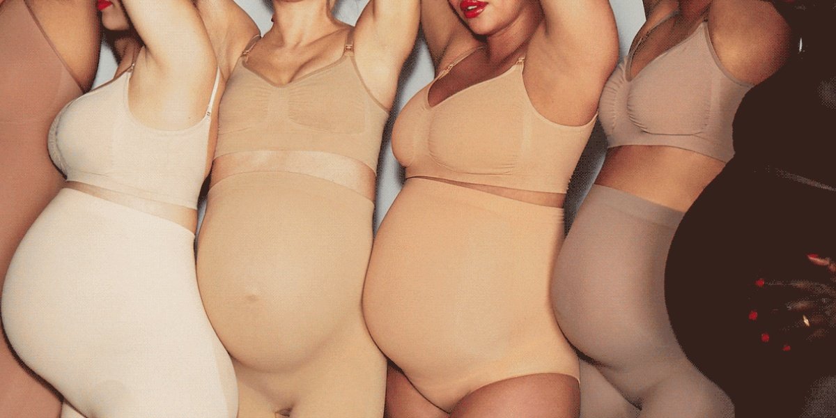
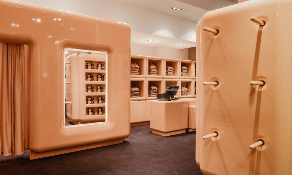
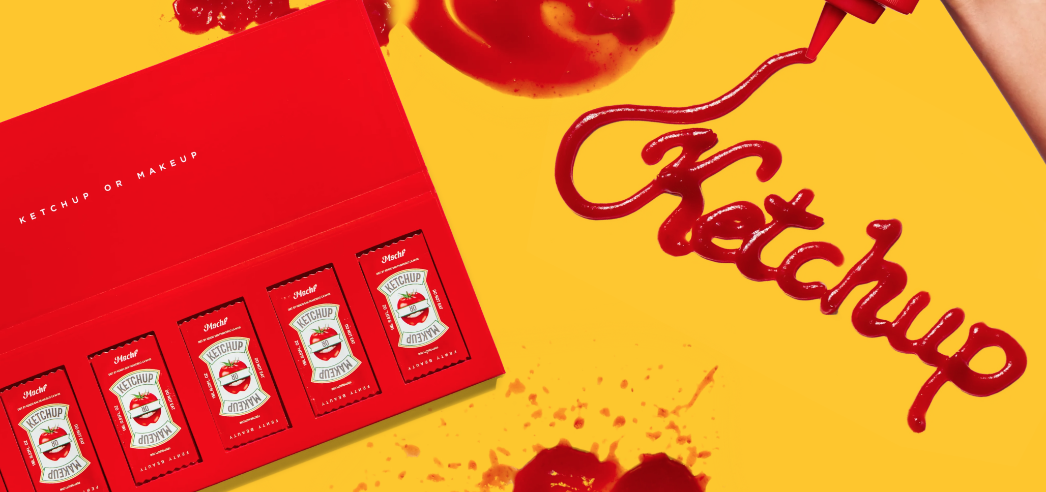
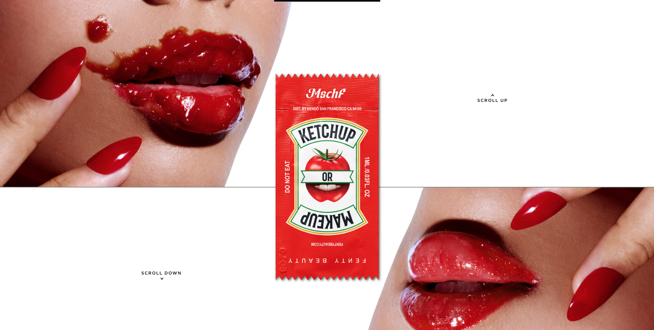
Color is a powerful element of branding and design due to its ability to draw emotional reactions from consumers. While some reactions to color are more culturally determined (such as red being associated with luck or aggression, depending on where in the world you are), there are many widely experienced reactions to color that are immediate and intense. It’s no wonder then that color is arguably one of the most powerful tools of branding; consumers’ recognition of a brand was shown to increase by a surprising 80% through the use of color. A whopping 90% of people make up their thoughts about a product based solely on color.
Getting Started
Now that you know that color is a powerful tool in branding and design, let’s talk about the actual process of using it. Here are the steps you need to consider when building branding color palettes.
1. Consider Color Psychology: Start off by considering colors and their effects on your target audience. What are the moods, thoughts, or feelings you want to affect when people first interact with your brand? Maybe yellow is the way to go if optimism and energy are a key part of your branding. Black might be your choice if boldness and confidence are at the forefront of your branding. This crucial consideration will help determine your dominant colors.
Pro Tip: When in doubt, test it out. If you want to double check that your colors are communicating your brand values, you can test them out with a group and check out the reactions they have to the colors you have selected.
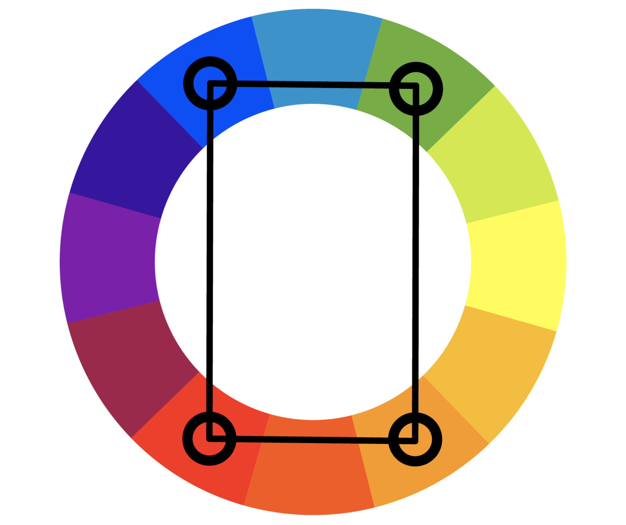
2. Start With Color Theory Basics: The primary colors are red, yellow, and blue. These are the basic colors that can be combined to create the secondary colors: orange, purple, and green. Tertiary colors combine primary and secondary colors to create a whole new range of colors.
In order to go from here to the complexity of the color wheel, we add white and black to the hue, or the pure color. The tint refers to the hue, combined with white. The tone refers to the hue, combined with white and black. The shade refers to the hue, combined with black.
Pro Tip: There are 2 common color standardization systems in design: CMYK and RGB. CMYK is a subtractive model that assumes you subtract colors to get white, whereas RGB is an additive model that assumes you add colors to get white. CMYK is used for print purposes whereas RGB is used for electronic displays.
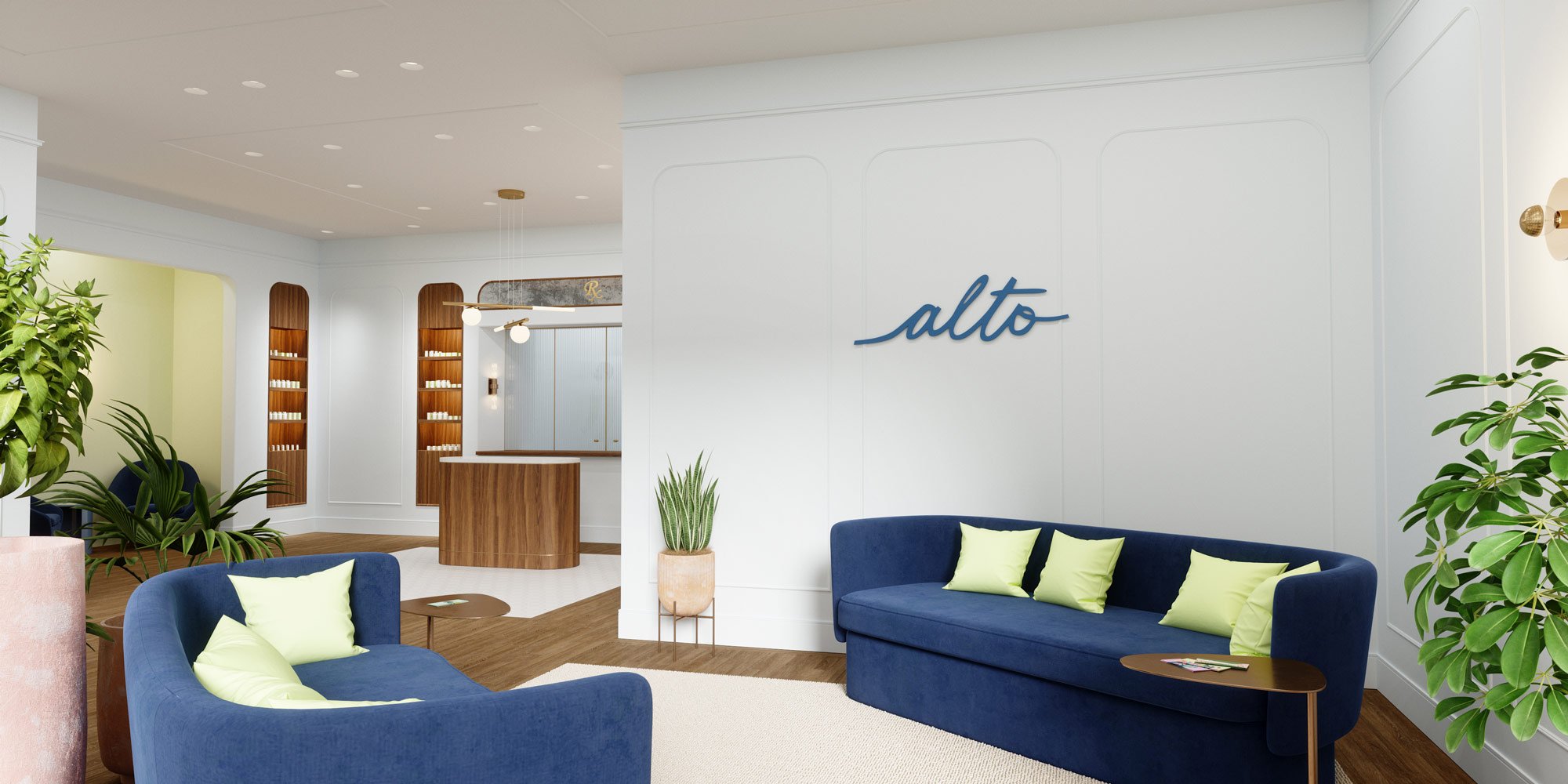
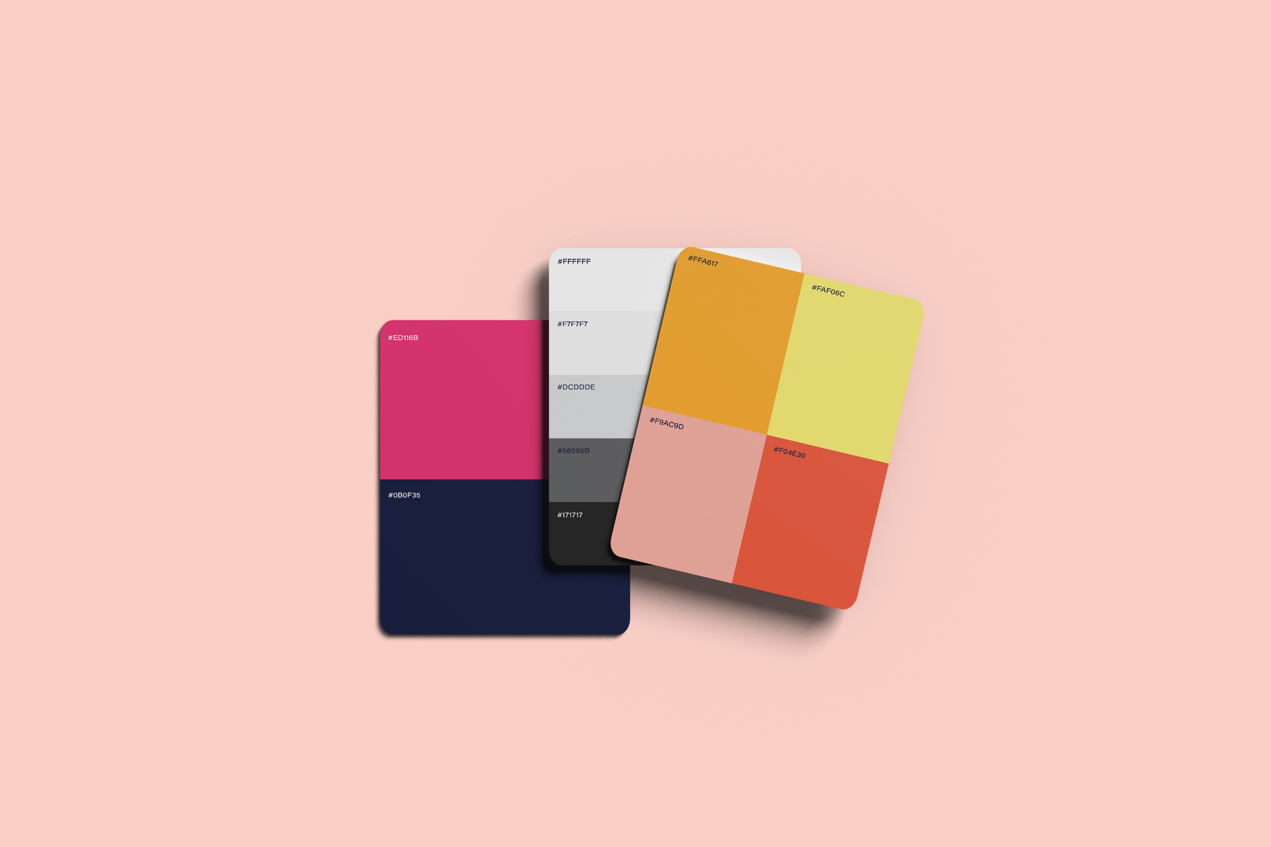
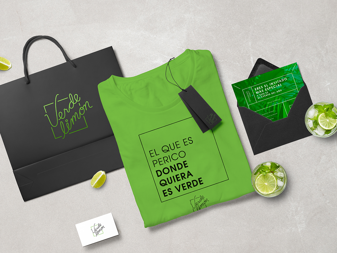
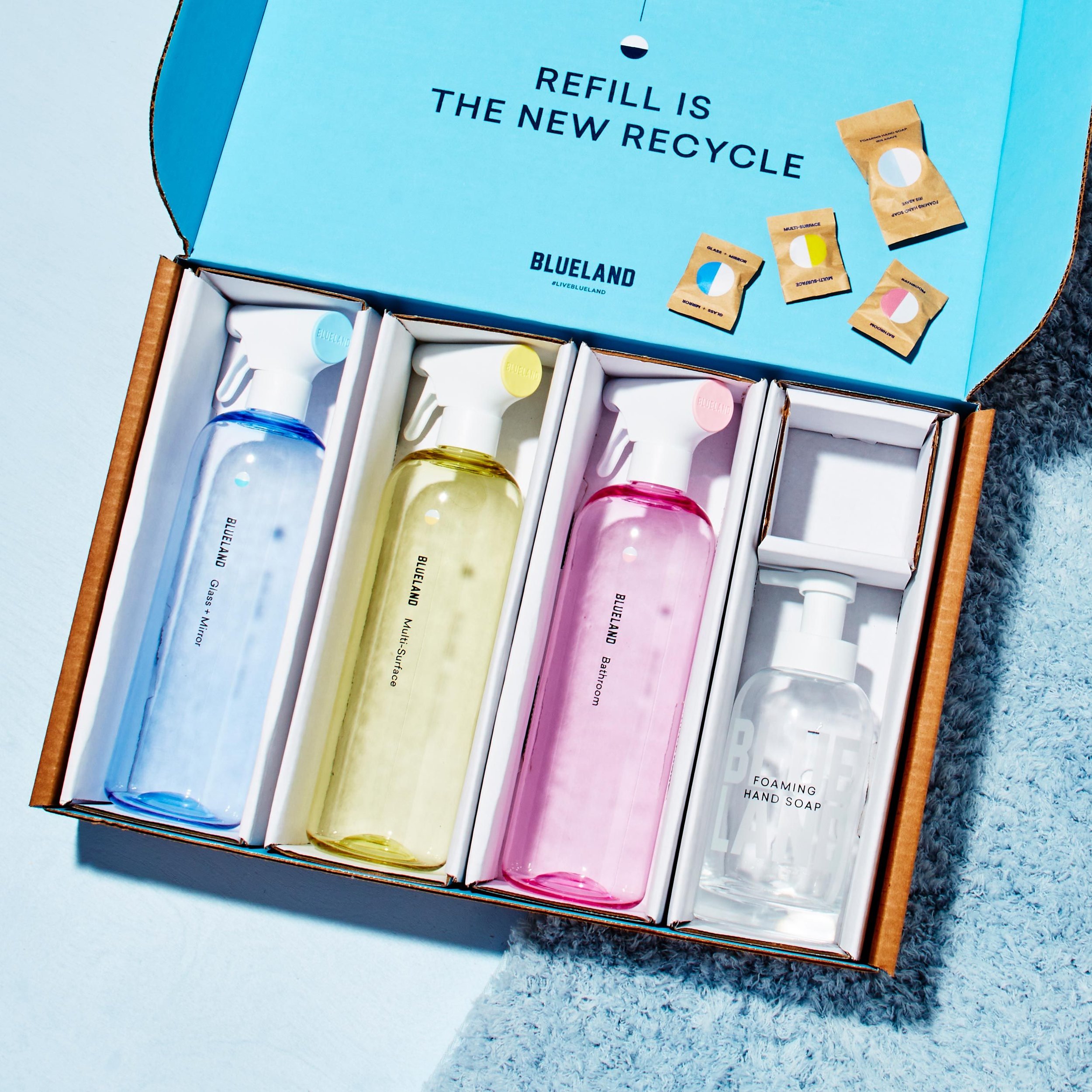
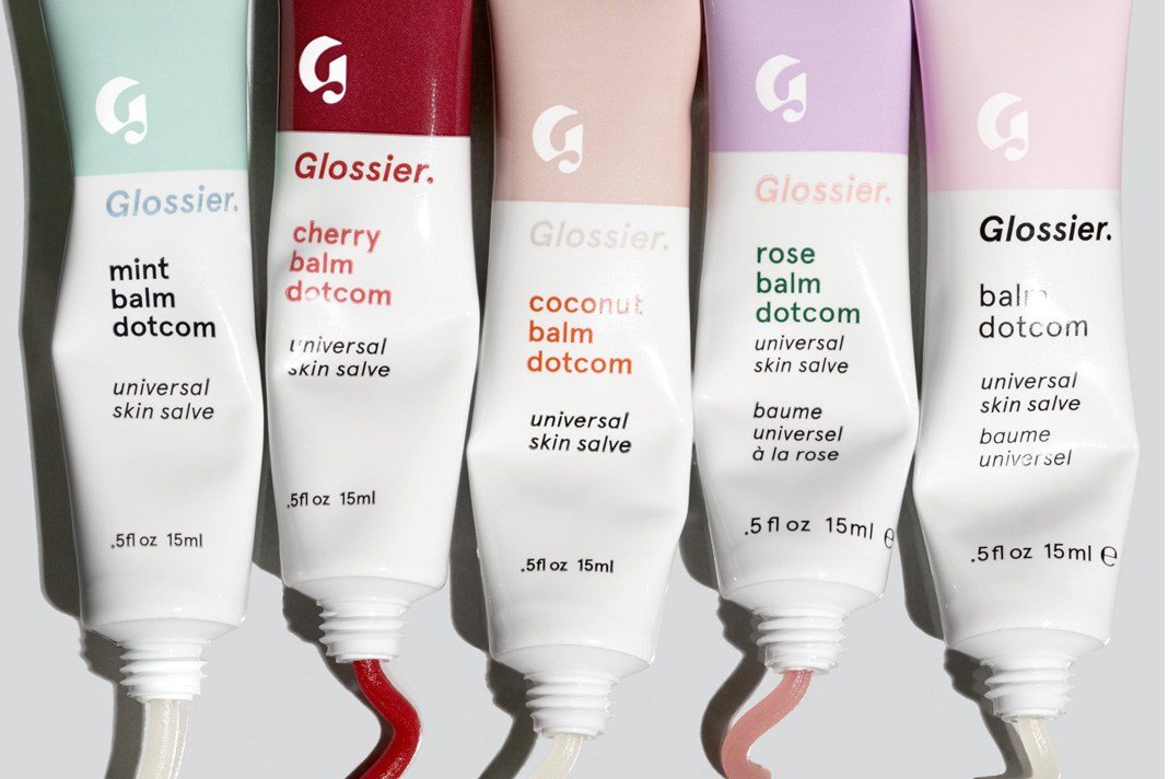
3. Choose Your Dominant Colors: You will then select 1 or 2 dominant colors, and make sure to note the exact hex codes, rather than a vague color. These will be at the core of your logos, and most likely the colors that will distinguish your brand from others to give you that unique edge. Be careful to stay away from a wide array of colors that may distract and interfere from clean branding.
Pro Tip: Color doesn’t happen in isolation! Think about the context of your color when selecting your branding color palettes. Color behaves differently depending on the colors and shapes around it. A kelly green behaves differently when placed next to a dark blue, versus when it’s placed next to a lime green.
4. Apply Your Color Palette Method:
Monochromatic: A monochromatic color method uses shades and tints of the same color, which usually results in branding color palettes that is foolproof with regards to clashing. However, the downside is that finding accent colors for CTA buttons and the like can be more difficult.