A year has passed since our last Rebrand Roundup, where we discuss the most striking recent company rebranding examples and what we can take away from them.
RELATED: Rebrand Roundup: Inspiration from Company Rebranding Examples
Rebranding is a fine art, requiring a careful balance between the existing brand, and a comprehensive and intentional move into what the brand aspires to be. The results of this delicate process can vary, but we can always learn from them. This year, we’re unraveling the rebrands for X (previously Twitter), HUGO BOSS, and Minute Maid, delving into what went right, and what could have gone better.
X (Twitter)
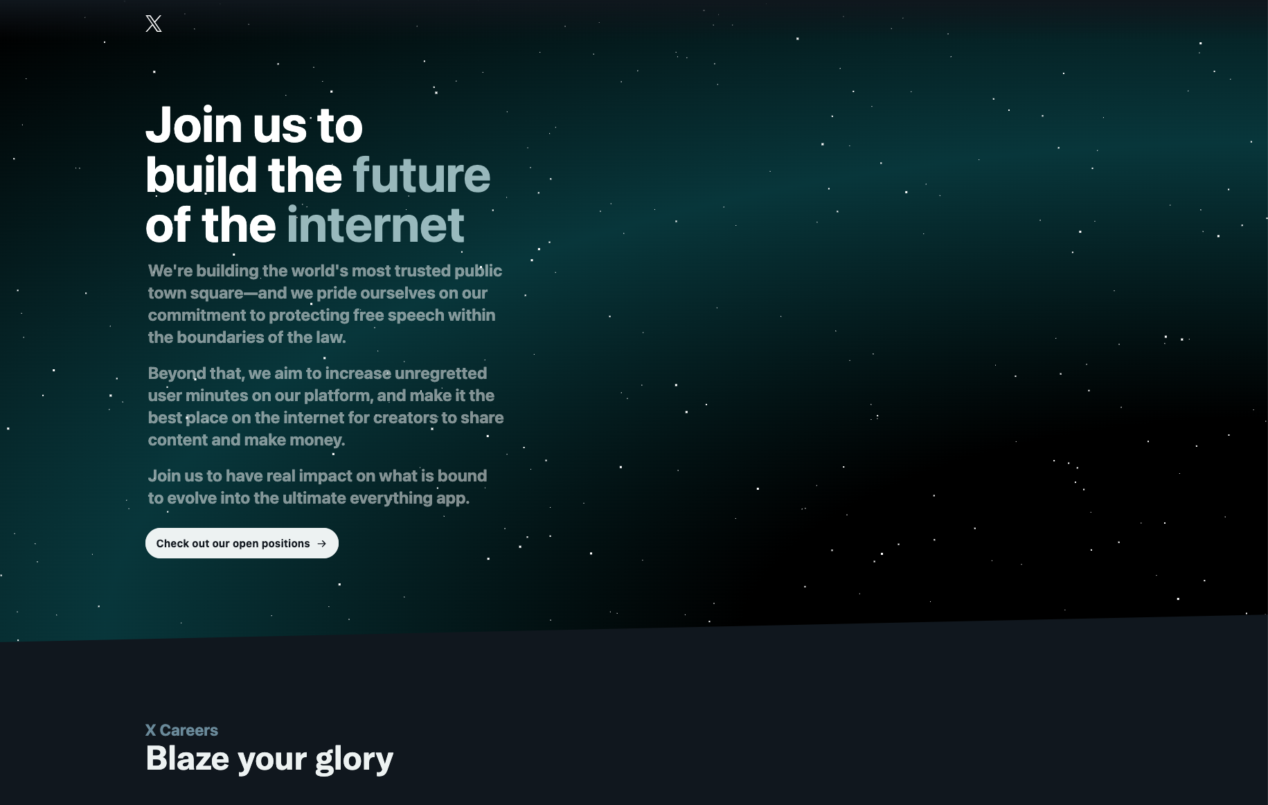
It’s almost impossible to talk about rebrands of 2023 without the rebrand that broke the internet. From the whispers and hearsay of Twitter arose the dramatic shift to X with a decidedly Elon Musk-shaped shadow.
From 2006, Twitter earned a spot in the lexicon of modern internet users, even growing to become the source of new vocabulary such as the verb “to tweet.” However, the friendly, warm, and welcoming blue bird was changed to an exclusive, stark X almost overnight, generating an overwhelming sense of confusion from the general public. According to the brand, the change in name came from the shift in brand strategy, from its role as a social media platform to an “everything” platform meant to encompass a comprehensive ecosystem. But there was no denying that the rollout of this rebrand felt poorly orchestrated and the overall rebrand felt incomplete.
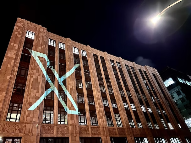
Even with a few announcement measures like the letter "X" projected onto buildings, the general rebrand was shrouded in mystery. With nearly 20 years of branding in the works, the sudden change to X replaced a gentler approach that would have honored the associations that the audience had built toward the brand.
With a fairly ambiguous connection to Twitter’s brand positioning, the overly simplified logo was more of an homage to Musk’s historical preference for the letter X (a la X.com, SpaceX, X Holdings, etc.) along with dark colors and modern feel. To add, the launch of the new logo before the change in the interface made the rollout felt sloppy and a little undercooked. Without a few necessary ties to the previous brand and a confusing rollout, the poorly executed rebrand resulted in a significant drop in downloads and traffic.
HUGO BOSS
For the first time since a logo adjustment in the 1990s, HUGO BOSS introduced a complete rebrand that delivered a refreshing new look and feel. From its fading brand presence highly tied to Gen X and Boomer audiences, the brand established a way to connect with a global demographic through its CLAIM 5 growth strategy.
The brand division into HUGO and BOSS provided a sharper angle for the target audience of each, with HUGO representing an older audience and BOSS for their younger audience. The new look for BOSS held true to the classic colors and muted tones from the brand’s roots, only uplifted with a noticeably bolder logo and visuals. Videos featured fast cuts and interesting camera angles in line with this youthful rebrand.
With its #beyourownboss campaign, the brand leveraged the social relevance of young trendsetters like Future and Kendall Jenner along with engaging social-first content like a podcast, reels, stories, and behind-the-scenes. The contemporary and bold look embraced the messaging geared toward “young, unconventional, and progressive people who live life on their own terms,” according to Daniel Grieder, CEO of HUGO BOSS AG.
With two differentiated audiences and a clear, strategic shift, the brand made big moves to maintain its relevance while sticking to its bread and butter of sharp tailoring and classic styles native to the premium apparel brand.
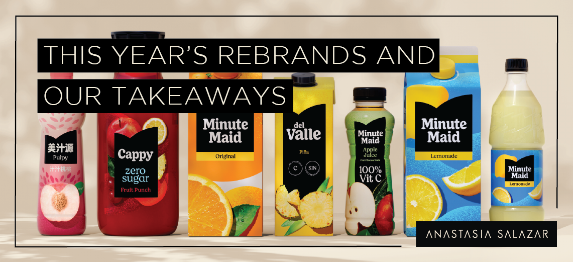
Minute Maid
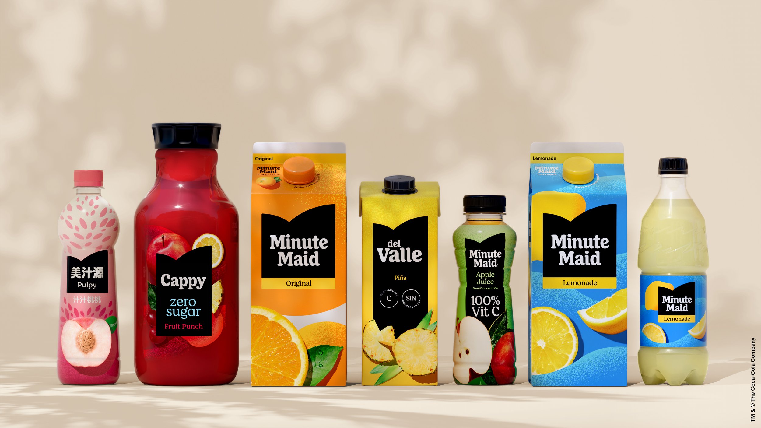
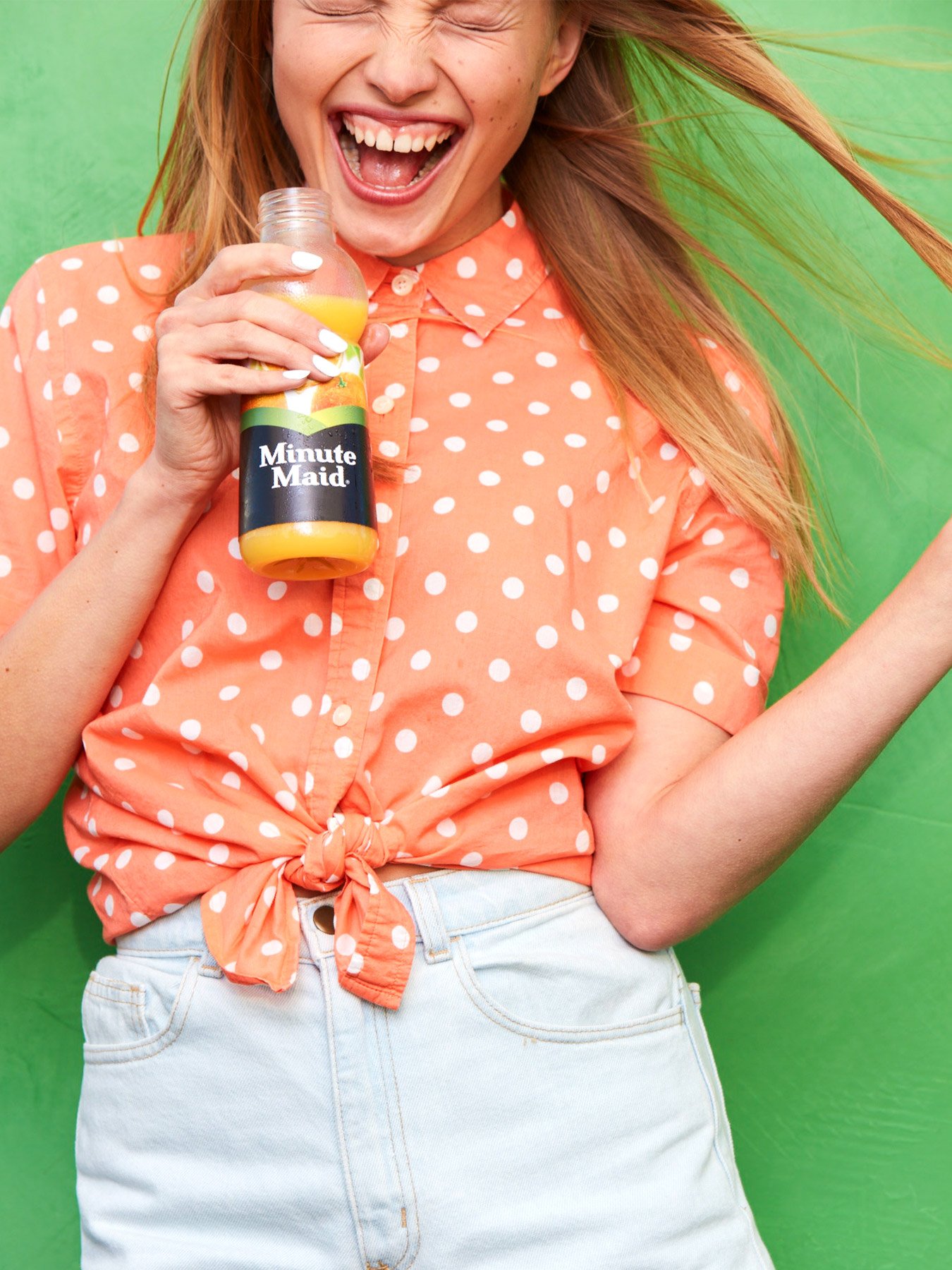

The rebranding of Minute Maid came with a hefty list of challenges, including the fact that it has maintained its position as a leading juice brand since 1946, and the fact that it is available in more than 100 countries. But with solid reasoning, a clear concept, and a strategically united front through the packaging, ad campaigns and messaging, the result was a thoughtful and impactful rebrand.
While Minute Maid was badly in need of an update, its worldwide presence also required a flexible design system that would make sense globally while being adaptable locally to consumers in various countries. The rebrand followed in the footsteps of recent globally-unifying refreshes for other Coca-Cola labels, including Fanta, Coca-Cola, and Sprite.
And in keeping with the times, the visuals were executed with an eye for trends including simplified fruit illustrations, table settings with perfectly placed objects, and round, friendly typography. However, the brand was careful not to go too far in the direction of ultra-modern and ground-breaking as to make the rebrand feel inauthentic. The visual outcome was so successful because in the end, the look was still recognizably Minute Maid.
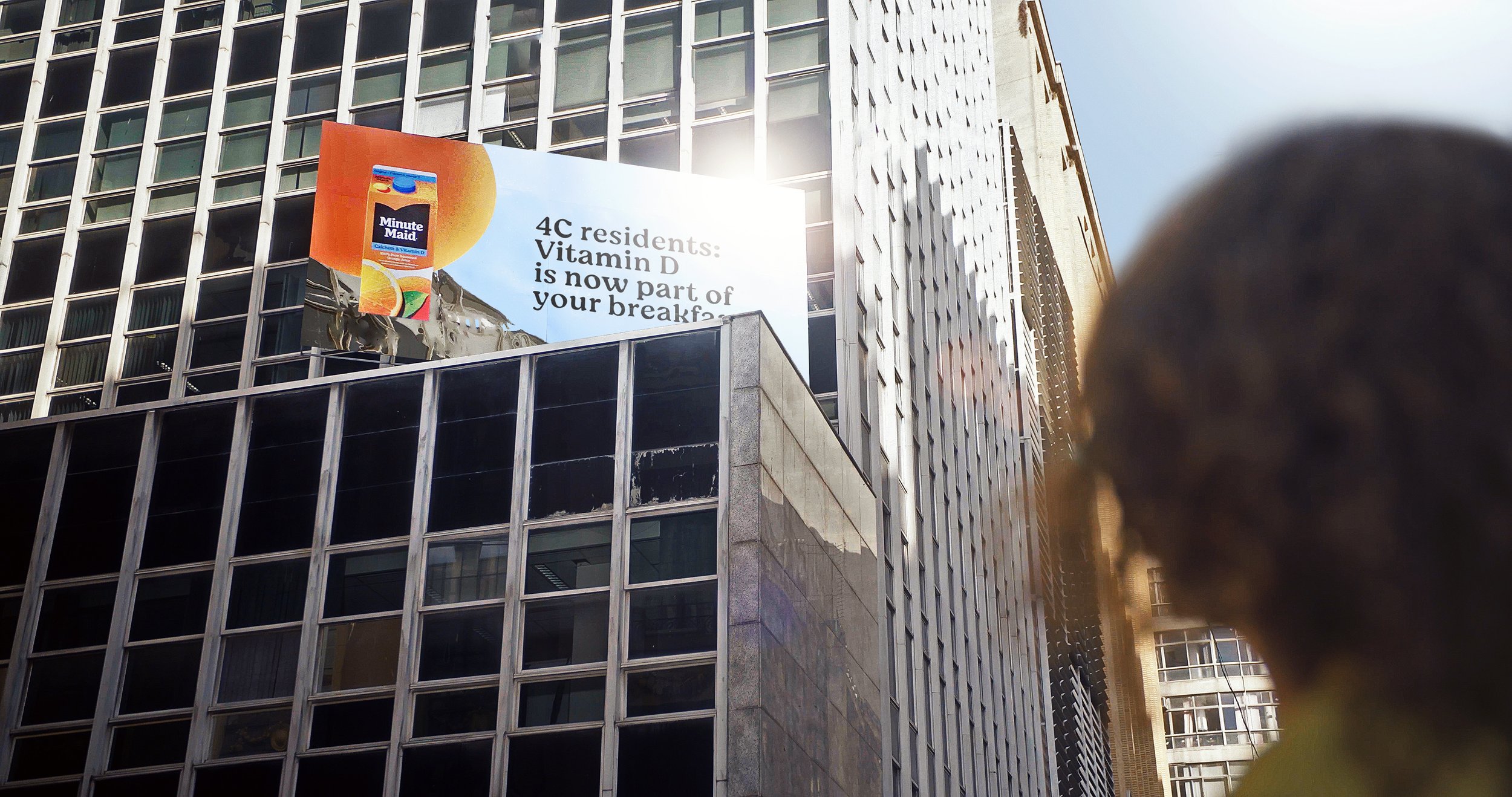
The out-of-home campaign also kept messaging simple and straightforward, sticking to the wholesome core of their product and the benefit that it serves. The brand emphasized its uncomplicated message of providing consumers with healthy nutrients to fuel their day, tying their billboards together through the common thread of vitamin D.
The Moral of the Story
These rebrands are a cautionary tale on not throwing the baby out with the bathwater. A rebrand is a careful balance between preserving what works, scrapping what doesn’t, and building around a well-crafted brand strategy. Here’s what we’re taking away from the rebrands this year:
X (Twitter): A stark and complete upheaval of a well-known brand is rarely a good idea. Take it slow, and tell the public what you’re thinking.
HUGO BOSS: Recognize when your target audience(s) have changed. Start from strategy and you’ve got the makings of a successful rebrand.
Minute Maid: A rebrand for a global giant is hard. But with straightforward messaging, a finger on the pulse, and slight tweaks, you can still make big impact.
A well-executed rebrand can better communicate your ever-changing brand to your audience, and with just a few case studies to learn from, you can kick off your process on the right foot.
Anastasia Salazar Ltd. is an independent design studio for tailored branding and digital designs. Reach out to learn how we can help you fuel growth and maximize your brand’s impact.